Preqin
Role: Senior Product Designer
Client: LeaderAmp
Duration: 6 months
Role: Product Designer
Client: LeaderAmp
Duration: 6 months
Role: Product Designer
📣
Redesigning a news aggregator tool @ Preqin
Redesigning an enterprise leadership coaching application
Redesigning an enterprise leadership coaching application
Preqin is a financial and performance data + analytics provider in the alternative assets sector. It offers a suite of products that have become essential tools for institutional investors and investment vehicles (assets, funds, deals and allocations) to enable making and receiving investments an informed process in every part of its lifecycle.
Preqin's business of making data available to paying customers is mainly served through its digital product offering 'Preqin Pro'. To efficiently handle all this data the system relies on an extensive suite of internal tools that collects, catalogues, and synthesises information through a combination of intelligent next-generation machine learning, data science, and artificial intelligence as well as human engagements of communications and relationship building.
LeaderAmp is an enterprise software that aims to enhance the performance of leadership teams in large organisations. It was founded by organisational psychologist Dr Matt Barney PhD based on academic work and experience of training leaders with an Olympic-style results-driven coaching approach.
LeaderAmp is an enterprise software that aims to enhance the performance of leadership teams in large organisations. It was founded by organisational psychologist Dr Matt Barney PhD based on academic work and experience of training leaders with an Olympic-style results-driven coaching approach.
What is the 'news aggregator' tool
Assessment
Assessment
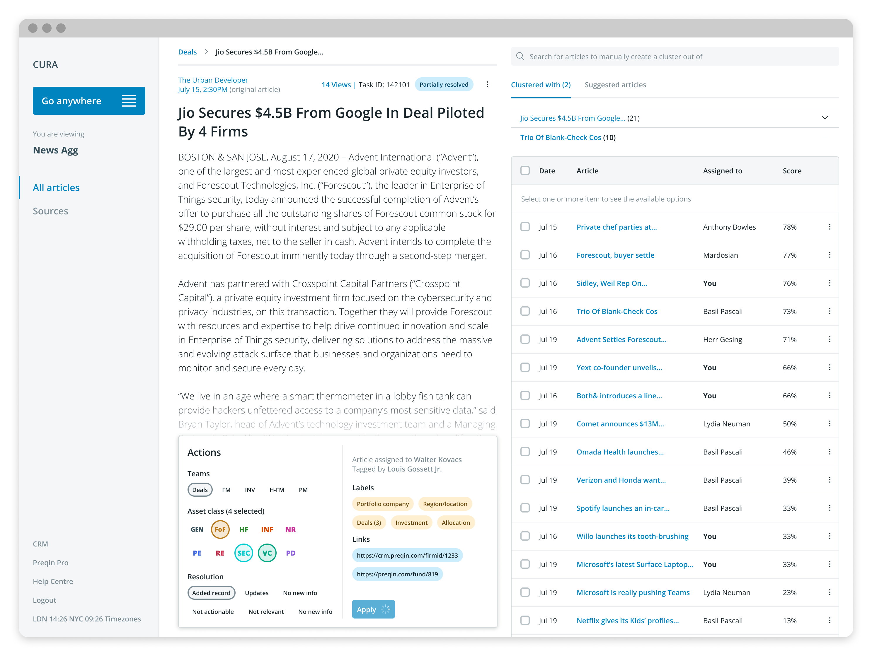
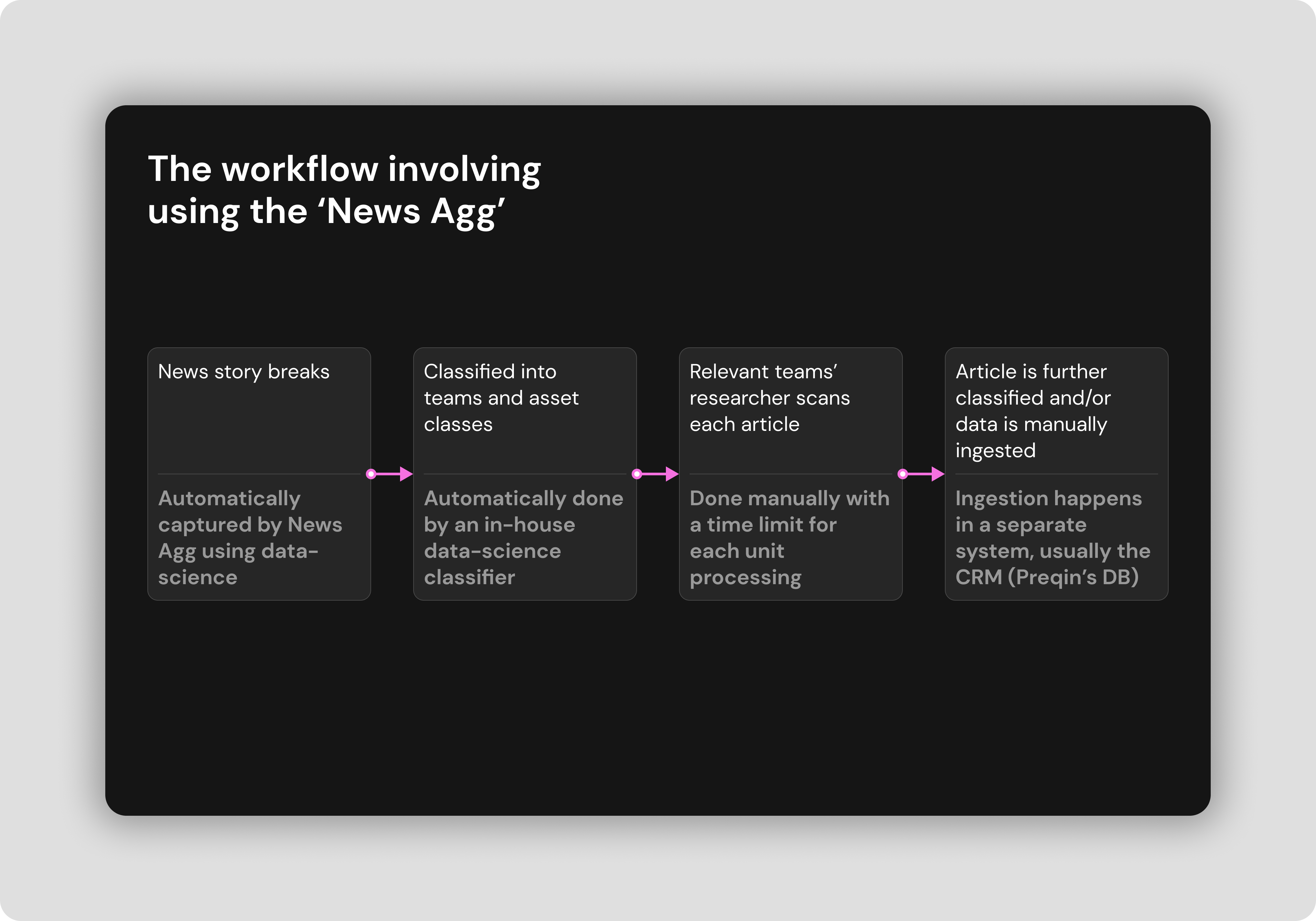
The news aggregator tool is an in-house (not customer-facing) product designed at Preqin to allow for data to be captured (into Preqin's CRM database) following events/news that are relevant to Preqin and are reported in public and private news outlets.
This relevant news could be a string of characters that are marked as being relevant or it could be figures that report a certain financial transaction. All the information captured is then manually sifted through and catalogued by members of various internal teams who all were the end users of the 'News Agg' app.
Before the user started the assessment, they took a Likert Scale questionnaire to calibrate the app. The new calibration screen adopted the same design language as the assessment itself, to get the user accustomed to it before they began the test.
Before the user started the assessment, they took a Likert Scale questionnaire to calibrate the app. The new calibration screen adopted the same design language as the assessment itself, to get the user accustomed to it before they began the test.
The team
Assessment
Assessment
Team makes the dream work :)
Assessment
Assessment
- 1 Senior product designer (me) +1 later on mid-project
- 1 Product manager/owner
- 1 QA lead
- 1 Engineering lead (plus a team of 5+ full-stack engineers)
- 1 Business representative
Before the user started the assessment, they took a Likert Scale questionnaire to calibrate the app. The new calibration screen adopted the same design language as the assessment itself, to get the user accustomed to it before they began the test.
Before the user started the assessment, they took a Likert Scale questionnaire to calibrate the app. The new calibration screen adopted the same design language as the assessment itself, to get the user accustomed to it before they began the test.
What were the problems of the existing app and why it needed to be redesigned?
Assessment
Assessment
Not meeting business SLA
Assessment
Assessment
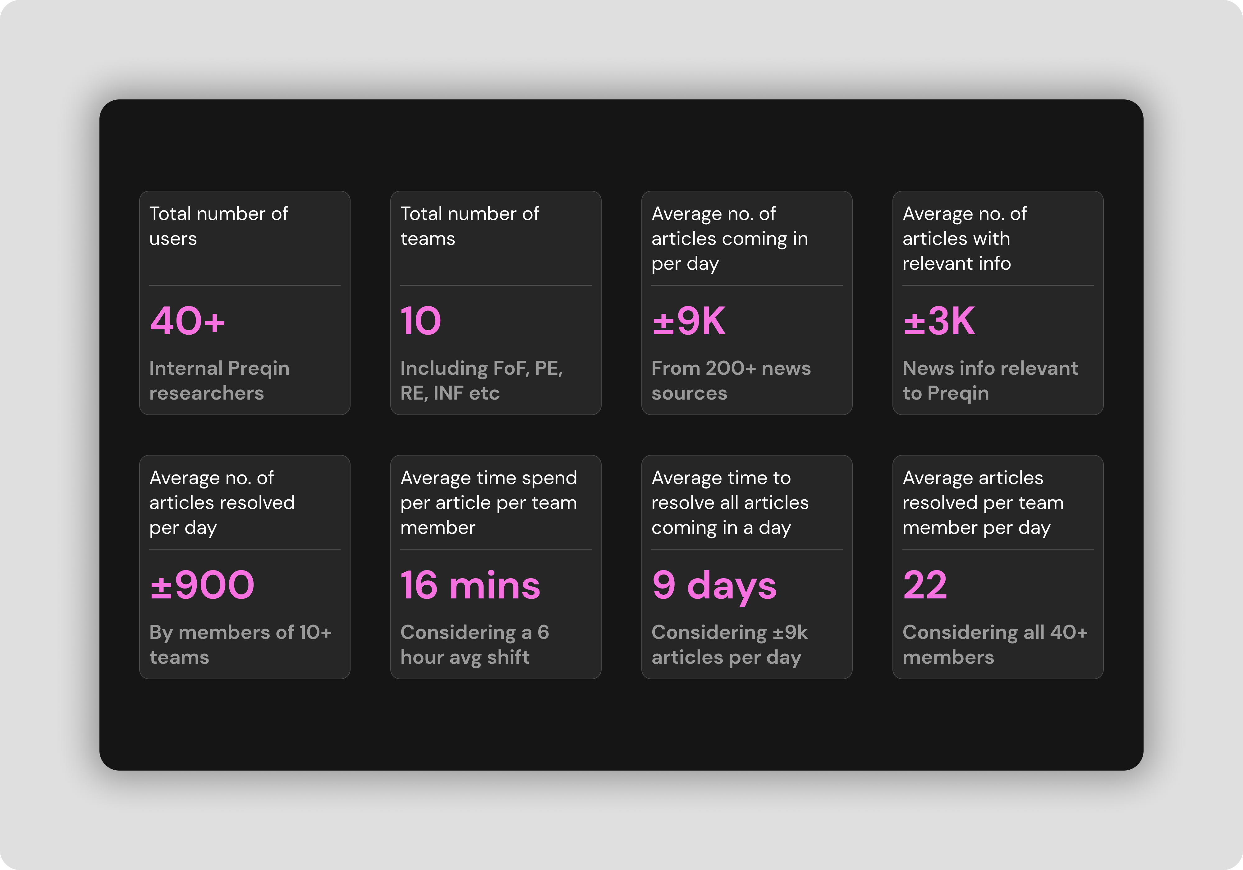
To have the best-in-class data for several thousand funds and other private equity instruments, the timeliness of it is paramount. The business was required to ingest every new piece of relevant data point, reflecting into the customer-facing product within 24 hours. Before the redesign, this was typically 220 hours (±9 days).
Before the user started the assessment, they took a Likert Scale questionnaire to calibrate the app. The new calibration screen adopted the same design language as the assessment itself, to get the user accustomed to it before they began the test.
Before the user started the assessment, they took a Likert Scale questionnaire to calibrate the app. The new calibration screen adopted the same design language as the assessment itself, to get the user accustomed to it before they began the test.
Faulty data caused by human errors
Assessment
Assessment
The work of ingesting data manually from one system (News Agg) to another (CRM) was painfully slow and because it needed to be done one article at a time it also resulted in a lot of human errors. These errors were either a copy-paste error or sometimes a copy-paste in the wrong area of the platform.
Before the user started the assessment, they took a Likert Scale questionnaire to calibrate the app. The new calibration screen adopted the same design language as the assessment itself, to get the user accustomed to it before they began the test.
Before the user started the assessment, they took a Likert Scale questionnaire to calibrate the app. The new calibration screen adopted the same design language as the assessment itself, to get the user accustomed to it before they began the test.
Inefficient data capture practice
Assessment
Assessment
The old NA worked in a way where each article came into the platform one at a time and whenever a new story went public. This meant the Preqin researchers (the users) were always playing catchup and trying to manually capture every news article's information and this was very inefficient.
Before the user started the assessment, they took a Likert Scale questionnaire to calibrate the app. The new calibration screen adopted the same design language as the assessment itself, to get the user accustomed to it before they began the test.
Before the user started the assessment, they took a Likert Scale questionnaire to calibrate the app. The new calibration screen adopted the same design language as the assessment itself, to get the user accustomed to it before they began the test.
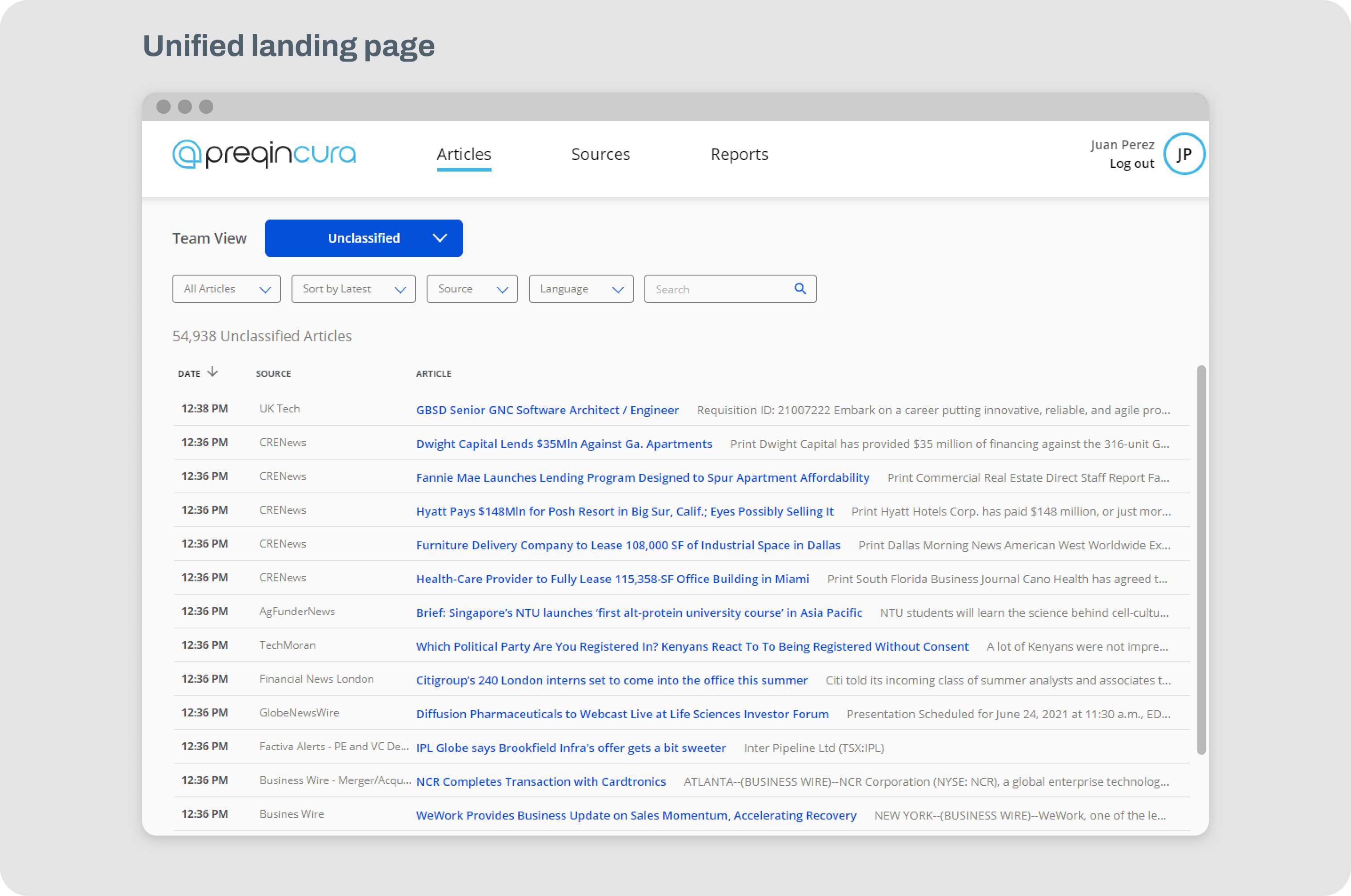
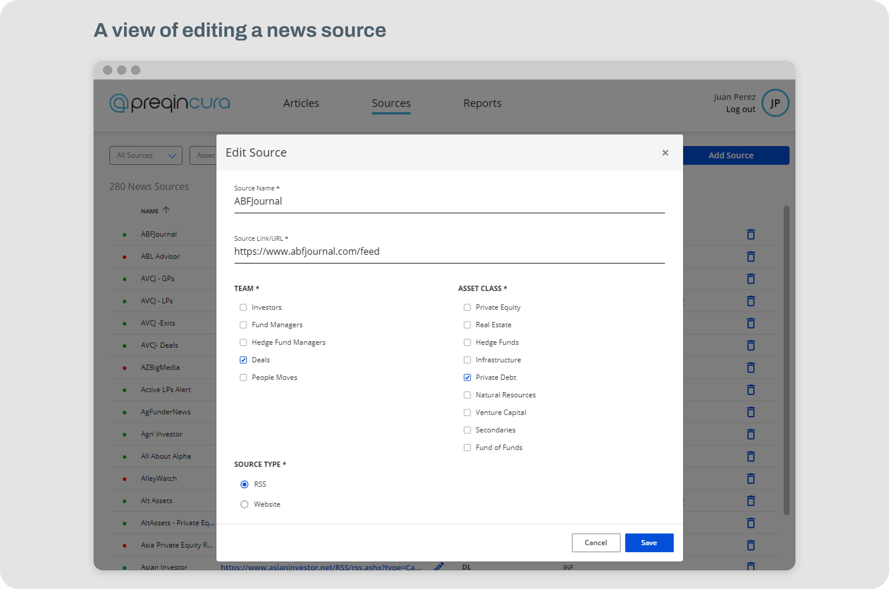
Some screenshots of the existing News Agg app
Problem validation and discovering user needs
Assessment
Assessment
We validated all the problems the business had proposed and studied it to dig deeper and understand actual 'user' needs. We discovered there were a whole host of problems to be solved - some relating to the product and others relating to process and operations.
Assessment
Assessment
A series of disconnected apps
Assessment
Assessment
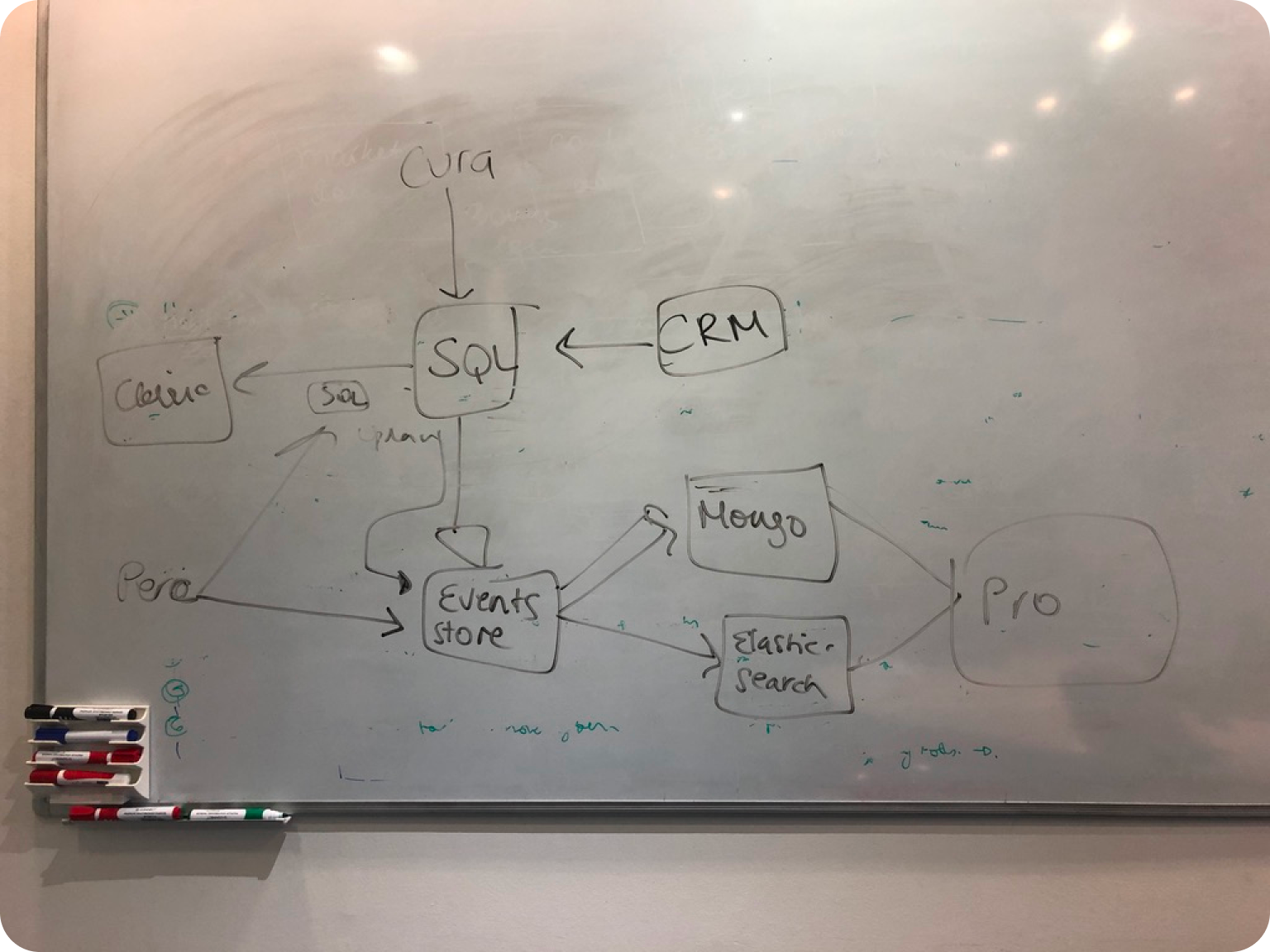
We discovered that one of the main problems was that each internal app had its own platform and they never 'talked' to each other. This meant working between software was broken and the teams that worked on them started developing a siloed working culture
Before the user started the assessment, they took a Likert Scale questionnaire to calibrate the app. The new calibration screen adopted the same design language as the assessment itself, to get the user accustomed to it before they began the test.
Before the user started the assessment, they took a Likert Scale questionnaire to calibrate the app. The new calibration screen adopted the same design language as the assessment itself, to get the user accustomed to it before they began the test.
We didn't have a 'research' function or a pool of trusted users
Assessment
Assessment
One of the problems operationally was that at Preqin we didn't have a research function and since it was never done on internal users, we didn't have a pool of participants that we could use for our workshops
Before the user started the assessment, they took a Likert Scale questionnaire to calibrate the app. The new calibration screen adopted the same design language as the assessment itself, to get the user accustomed to it before they began the test.
Before the user started the assessment, they took a Likert Scale questionnaire to calibrate the app. The new calibration screen adopted the same design language as the assessment itself, to get the user accustomed to it before they began the test.
Time related inefficiency was directly related to same or similar stories reported by multiple sources
Assessment
Assessment
Researchers were faced with similar or same articles relating to the same news story but at different times resulting in repetitive and time-inefficient output
Before the user started the assessment, they took a Likert Scale questionnaire to calibrate the app. The new calibration screen adopted the same design language as the assessment itself, to get the user accustomed to it before they began the test.
Before the user started the assessment, they took a Likert Scale questionnaire to calibrate the app. The new calibration screen adopted the same design language as the assessment itself, to get the user accustomed to it before they began the test.
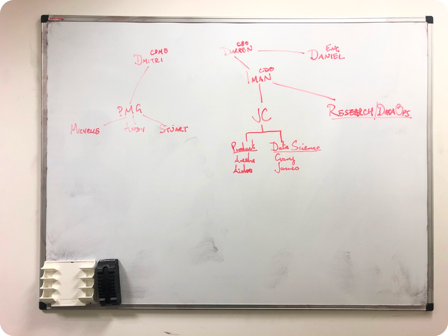
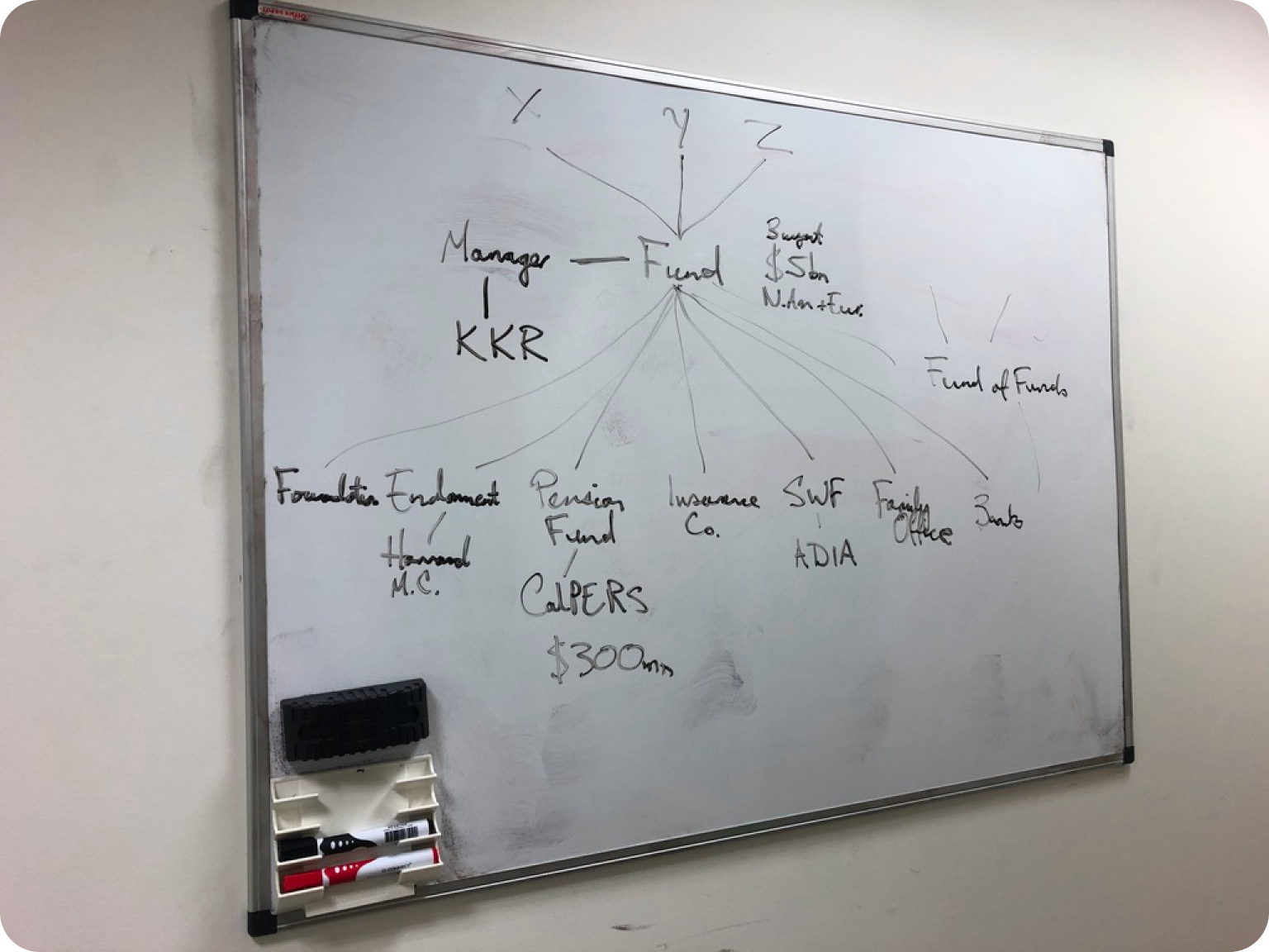
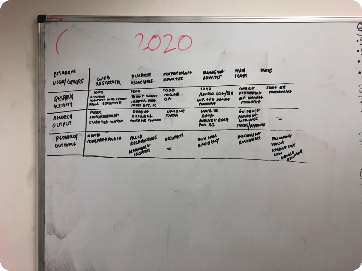
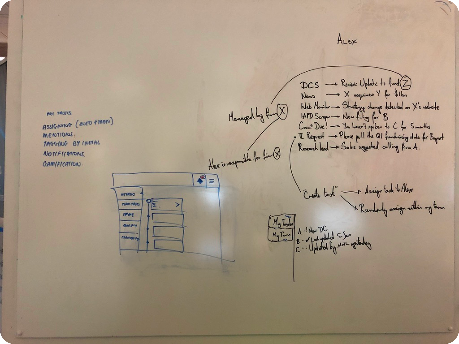
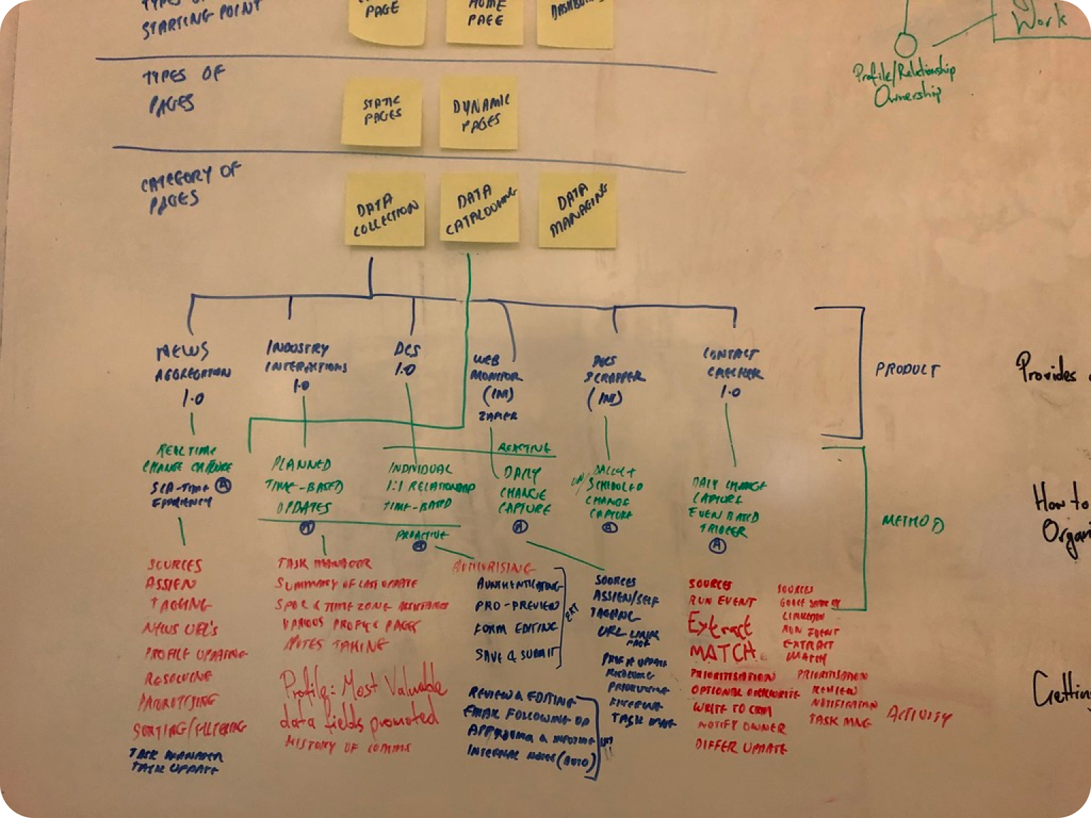
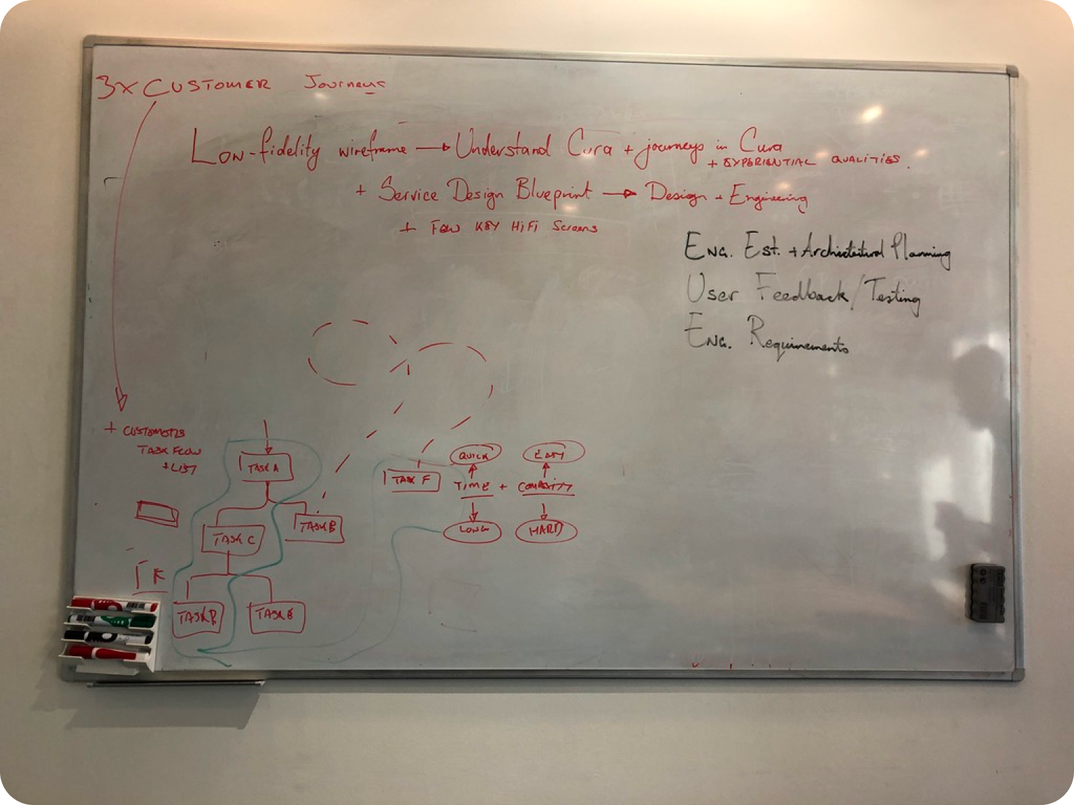
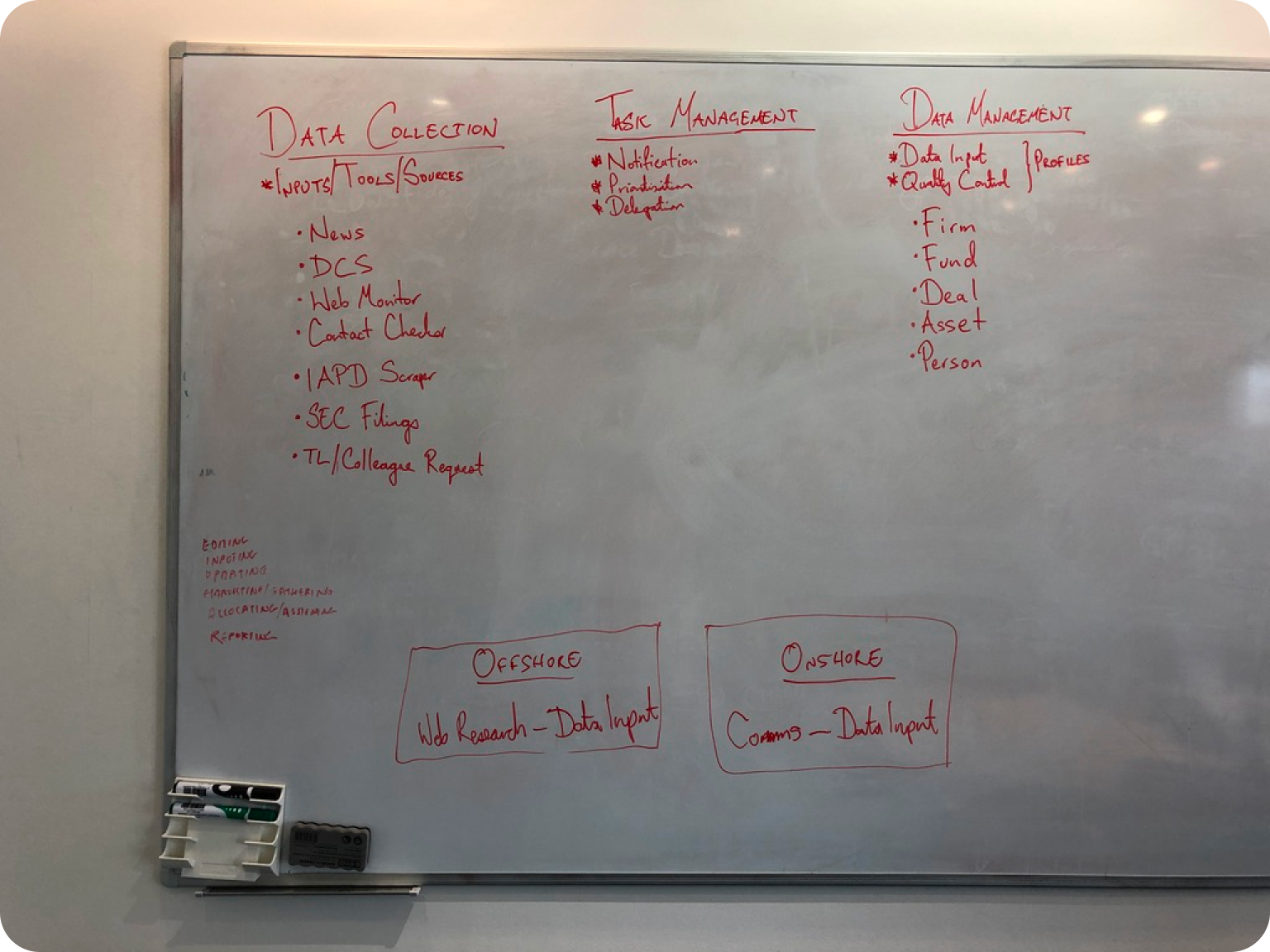
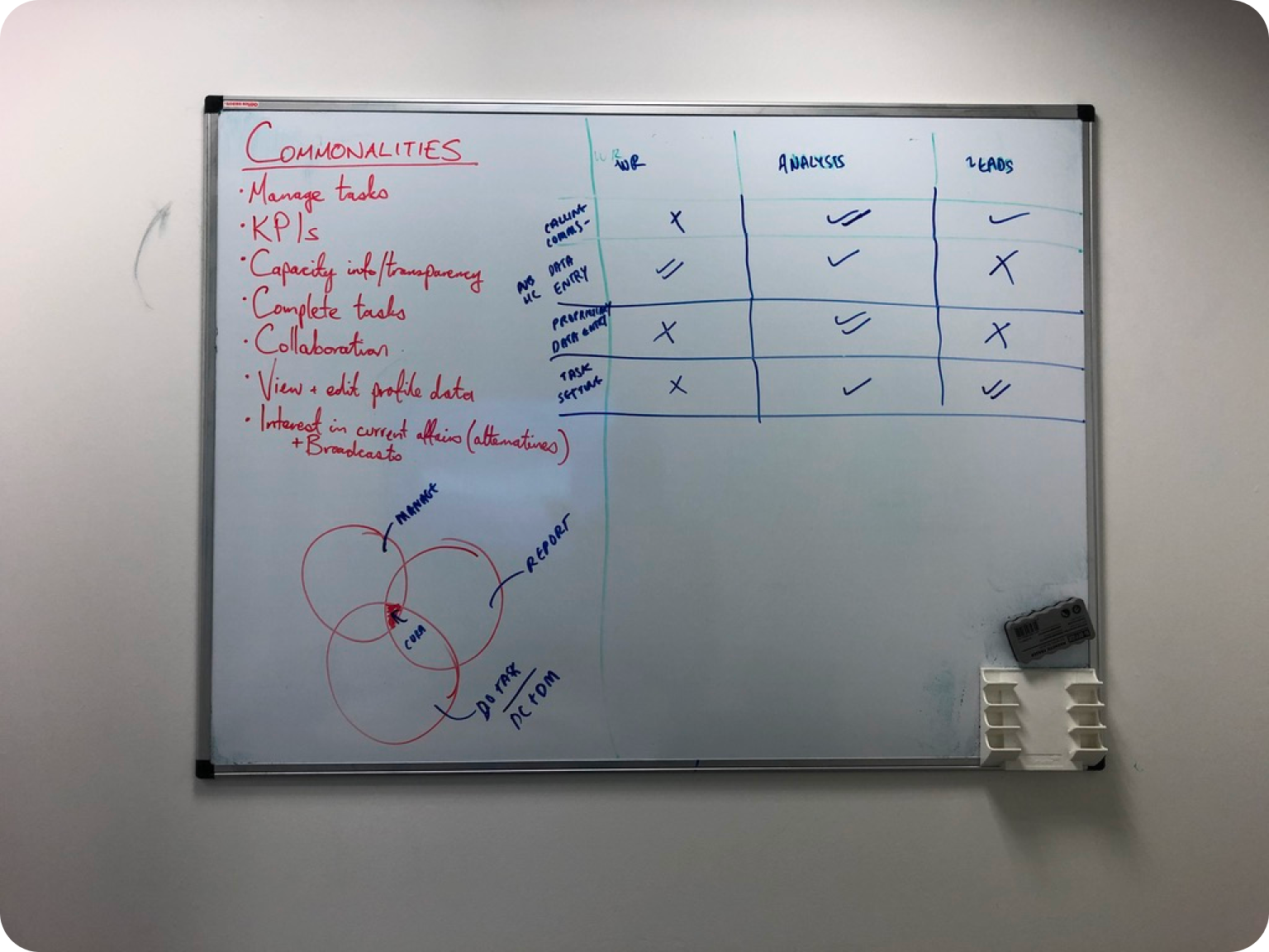
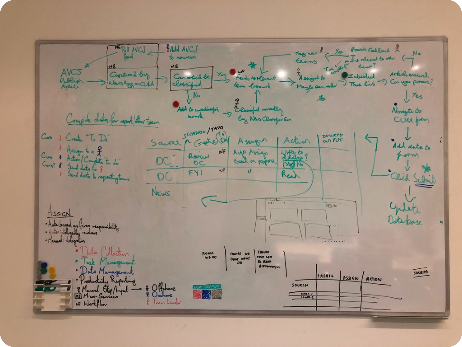
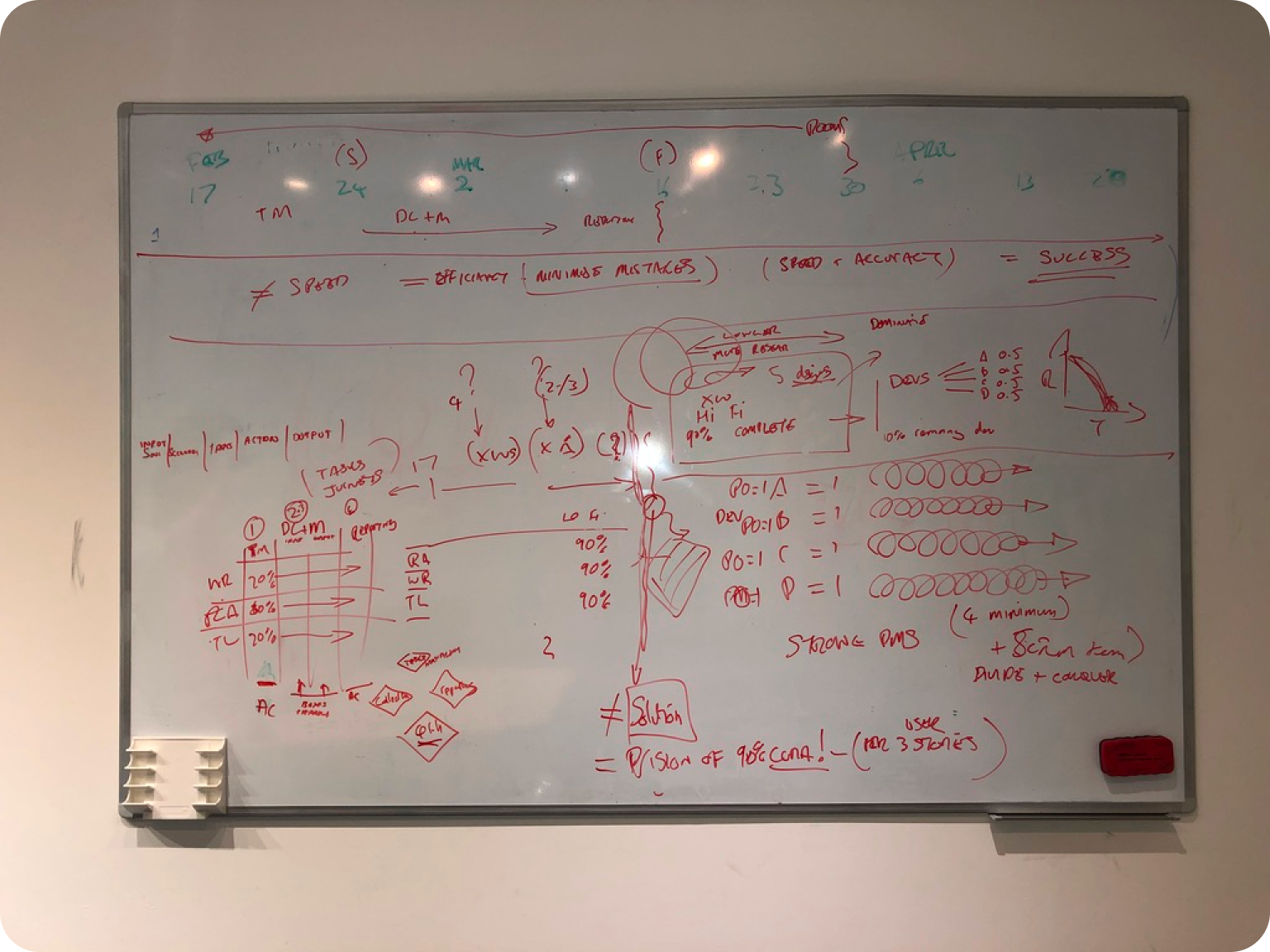
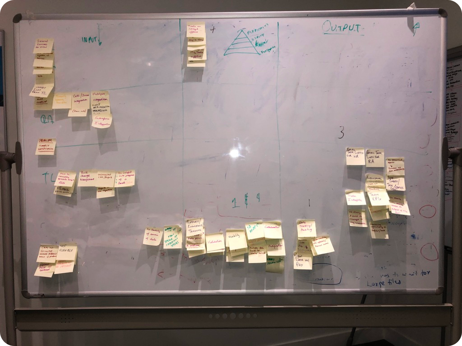
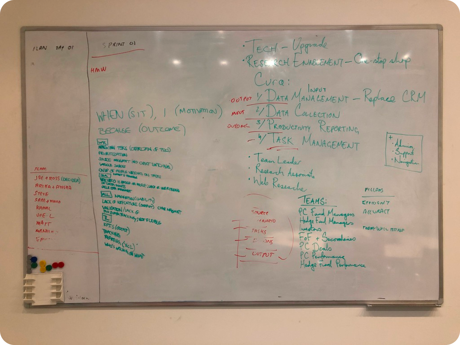
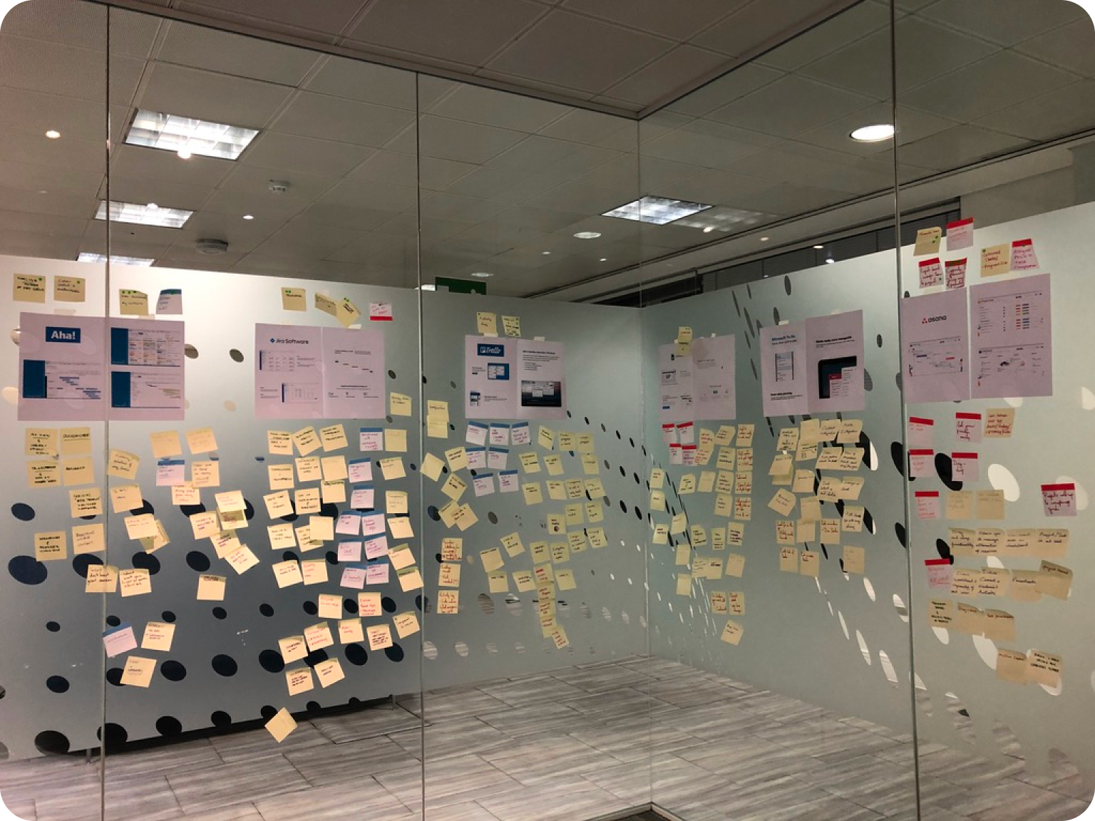
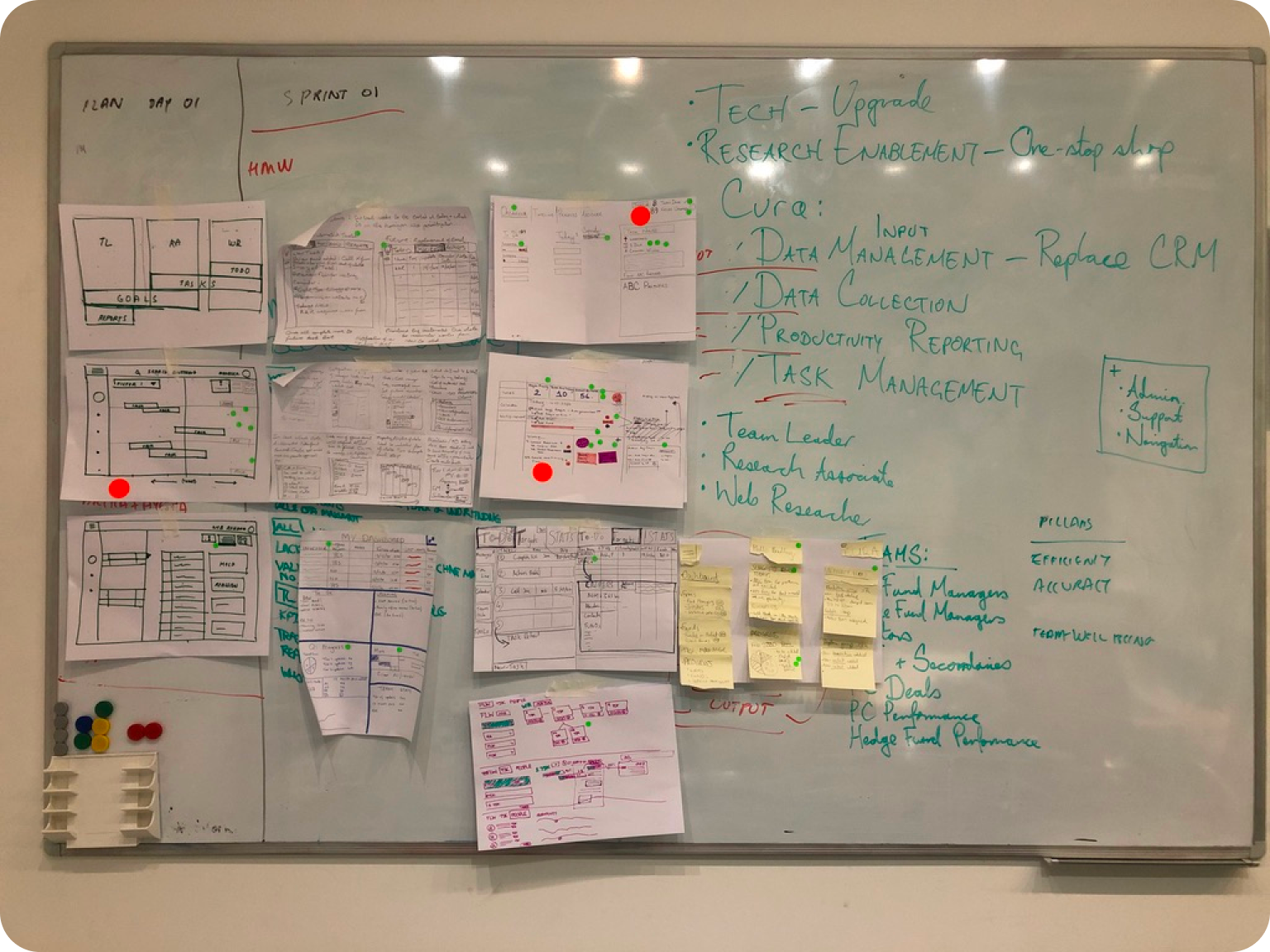
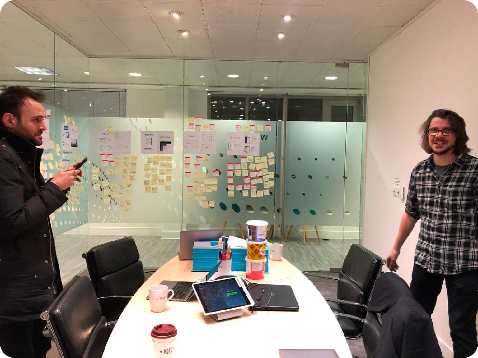
Photos from various workshops we conducted to uncover problem discovery
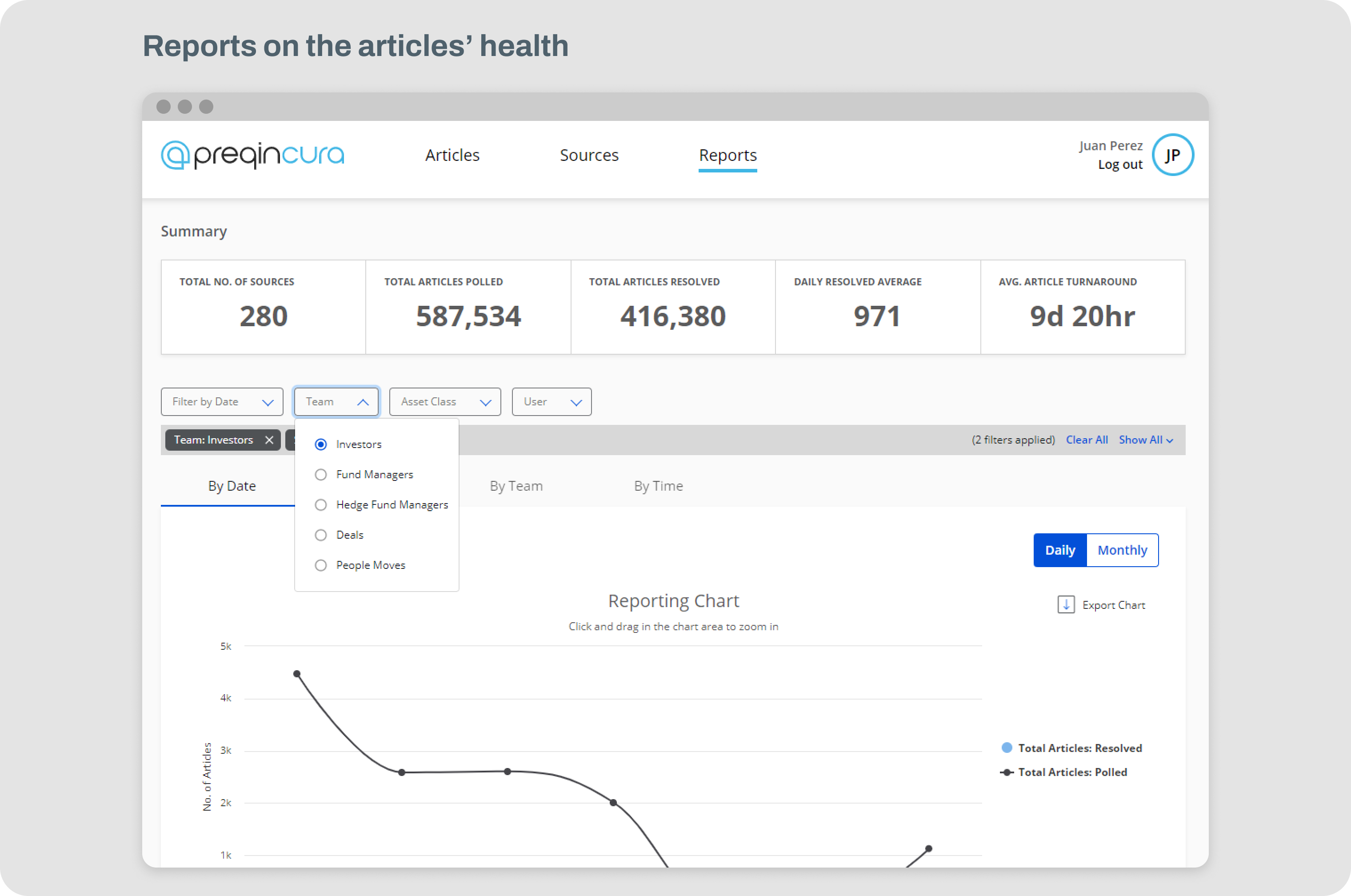
News Agg in numbers after we crunched the data from all the research
Assessment
Assessment
Project constraints
Assessment
Assessment
Archaic data modal
Assessment
Assessment
One of the key challenges was that the data model our internal tools used was all written decades ago and there was very little we could change in it. One aspect that it came with was that every internal app was a 'shared' platform. This meant every user had their login but what they saw was what everybody else saw as well.
Before the user started the assessment, they took a Likert Scale questionnaire to calibrate the app. The new calibration screen adopted the same design language as the assessment itself, to get the user accustomed to it before they began the test.
Before the user started the assessment, they took a Likert Scale questionnaire to calibrate the app. The new calibration screen adopted the same design language as the assessment itself, to get the user accustomed to it before they began the test.
No user personalisation
Assessment
Assessment
There were technical implementation constraints with being able to have users personalise views, data and rights. This meant we had to design our way around them
Before the user started the assessment, they took a Likert Scale questionnaire to calibrate the app. The new calibration screen adopted the same design language as the assessment itself, to get the user accustomed to it before they began the test.
Before the user started the assessment, they took a Likert Scale questionnaire to calibrate the app. The new calibration screen adopted the same design language as the assessment itself, to get the user accustomed to it before they began the test.
Solving the supplementary problem of building a research function and the user pool
Assessment
Assessment
Introducing Dovetail
Assessment
Assessment
I worked with the head of design to bring in new tooling and processes to make research a part of how product design activities happen at Preqin. One of the tools we brought in and started with was Dovetail. After using it on multiple projects, I was confident to extend its use so other designers could adopt it as well. I published and presented a playbook for using Dovetail. Below is the actual interactive prototype of the whole presentation
Before the user started the assessment, they took a Likert Scale questionnaire to calibrate the app. The new calibration screen adopted the same design language as the assessment itself, to get the user accustomed to it before they began the test.
Before the user started the assessment, they took a Likert Scale questionnaire to calibrate the app. The new calibration screen adopted the same design language as the assessment itself, to get the user accustomed to it before they began the test.
Creating a user pool
Assessment
Assessment
Given the product we were designing was an internal app, the access to the users was fairly straightforward. However, there was still a need to meet and agree with managers of various teams to have some members of their team help us conduct interviews to better understand the problems. We eventually catalogued a group of trusted user pool that we always used to improve the experience of all internal apps
👇
The playbook below is interactive, please feel free to click through it
Before the user started the assessment, they took a Likert Scale questionnaire to calibrate the app. The new calibration screen adopted the same design language as the assessment itself, to get the user accustomed to it before they began the test.
Before the user started the assessment, they took a Likert Scale questionnaire to calibrate the app. The new calibration screen adopted the same design language as the assessment itself, to get the user accustomed to it before they began the test.
Ideation and hypotheses
Assessment
Assessment
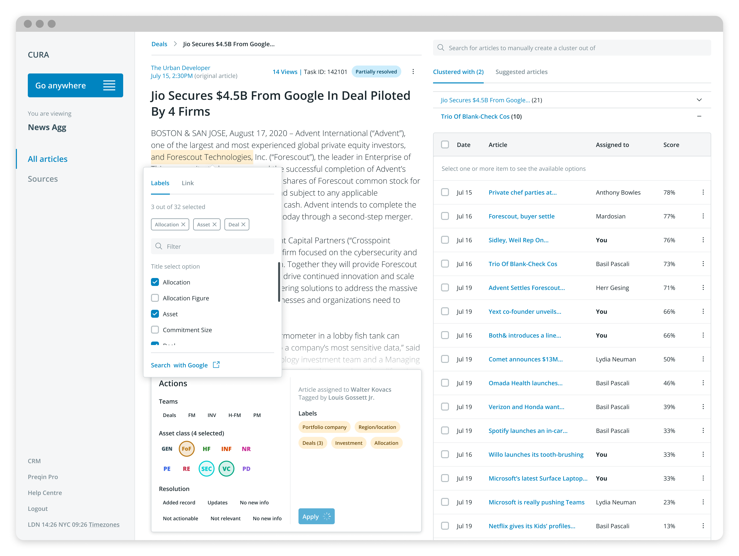
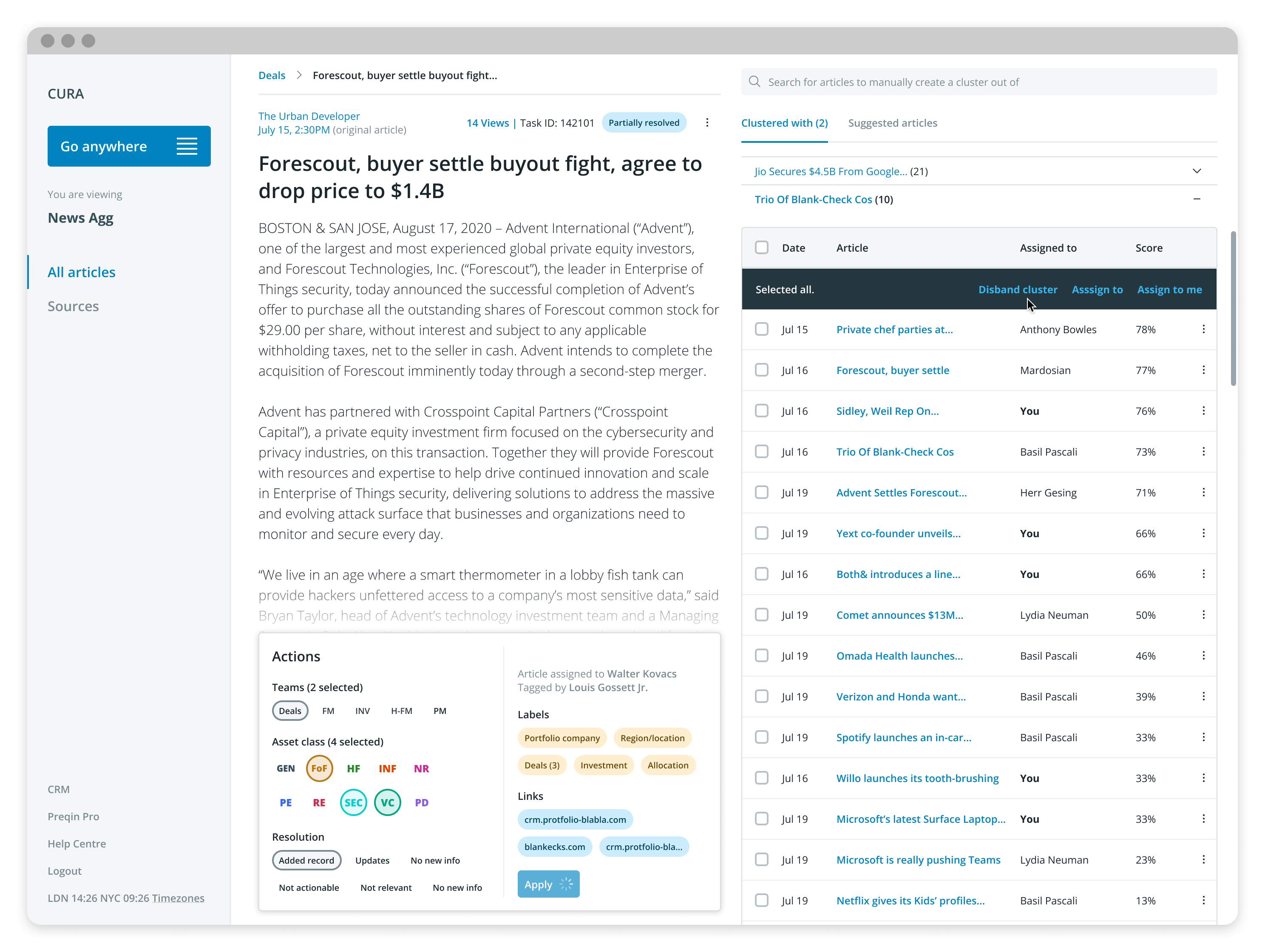
Grouping articles that all talked about the same news stories
Assessment
Assessment
Our research indicated this being a huge reason where most of the time was spent so we wanted to alleviate this first. Our hypothesis was "Clubbing articles together which are all related to a single news story and allowing researchers to resolve it all at once will significantly reduce the effort and time for processing news stories"
Before the user started the assessment, they took a Likert Scale questionnaire to calibrate the app. The new calibration screen adopted the same design language as the assessment itself, to get the user accustomed to it before they began the test.
Before the user started the assessment, they took a Likert Scale questionnaire to calibrate the app. The new calibration screen adopted the same design language as the assessment itself, to get the user accustomed to it before they began the test.
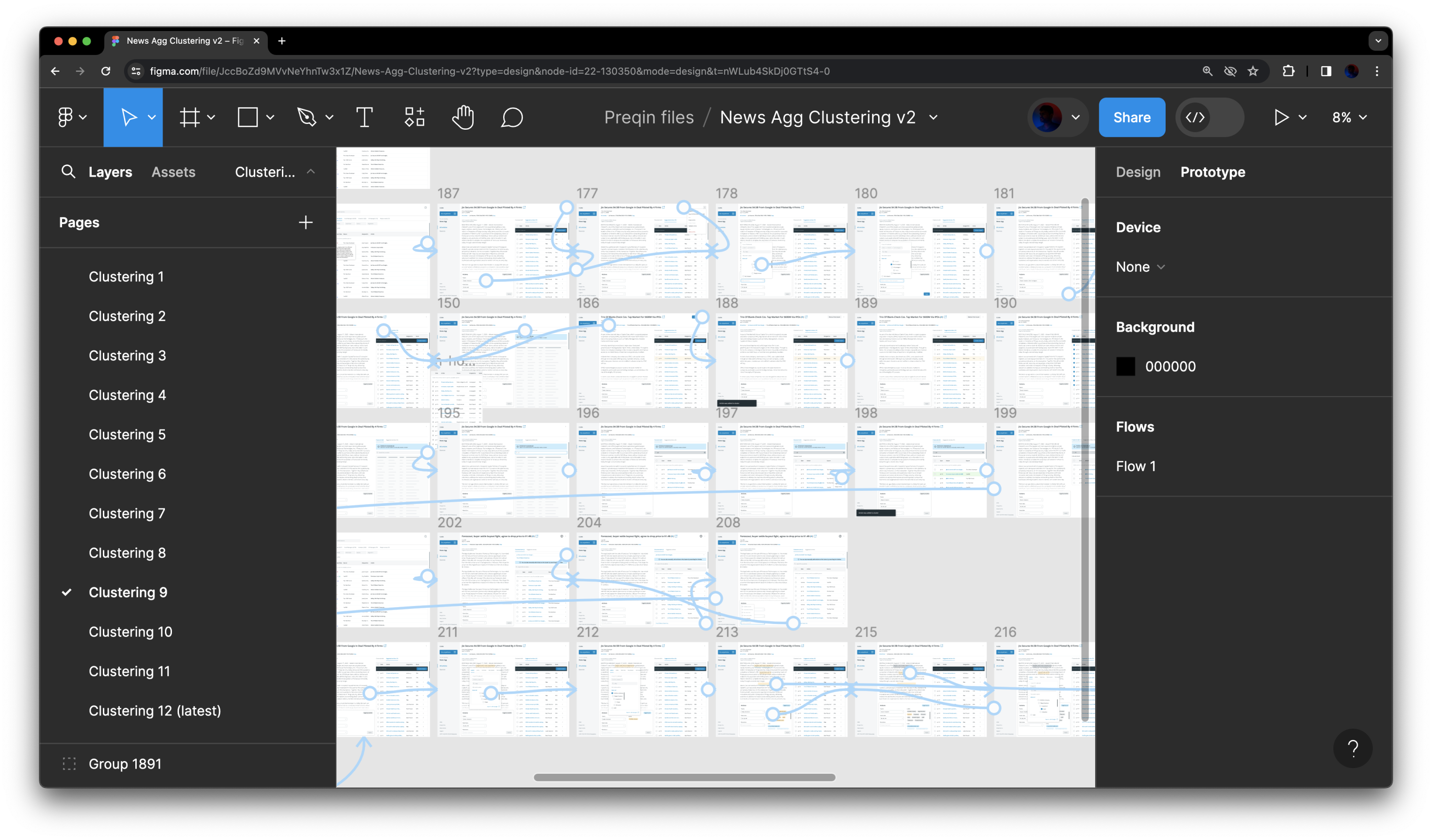
We designed and tested a dozen different ideas before finding the one that worked best
Platformising the experience into one single internal app
Assessment
Assessment
This work of making all internally facing apps into a single product had already started and the 'to-be-redesigned' News App agg would would sit within it to solve for the ecosystem problem that also was consistently reported across our research
Before the user started the assessment, they took a Likert Scale questionnaire to calibrate the app. The new calibration screen adopted the same design language as the assessment itself, to get the user accustomed to it before they began the test.
Before the user started the assessment, they took a Likert Scale questionnaire to calibrate the app. The new calibration screen adopted the same design language as the assessment itself, to get the user accustomed to it before they began the test.
In-product highlighting to reduce human errors
Assessment
Assessment
Highlighting items within the article and allowing the system to figure a way to write it into the system would again reduce time spent but will also reduce human errors and context-switching
Before the user started the assessment, they took a Likert Scale questionnaire to calibrate the app. The new calibration screen adopted the same design language as the assessment itself, to get the user accustomed to it before they began the test.
Before the user started the assessment, they took a Likert Scale questionnaire to calibrate the app. The new calibration screen adopted the same design language as the assessment itself, to get the user accustomed to it before they began the test.
Below is an example of the prototype used to present and test iteration of the designs with the research team
The whole landscape of the design delivery
Assessment
Assessment
I have additional team member help!
Assessment
Assessment
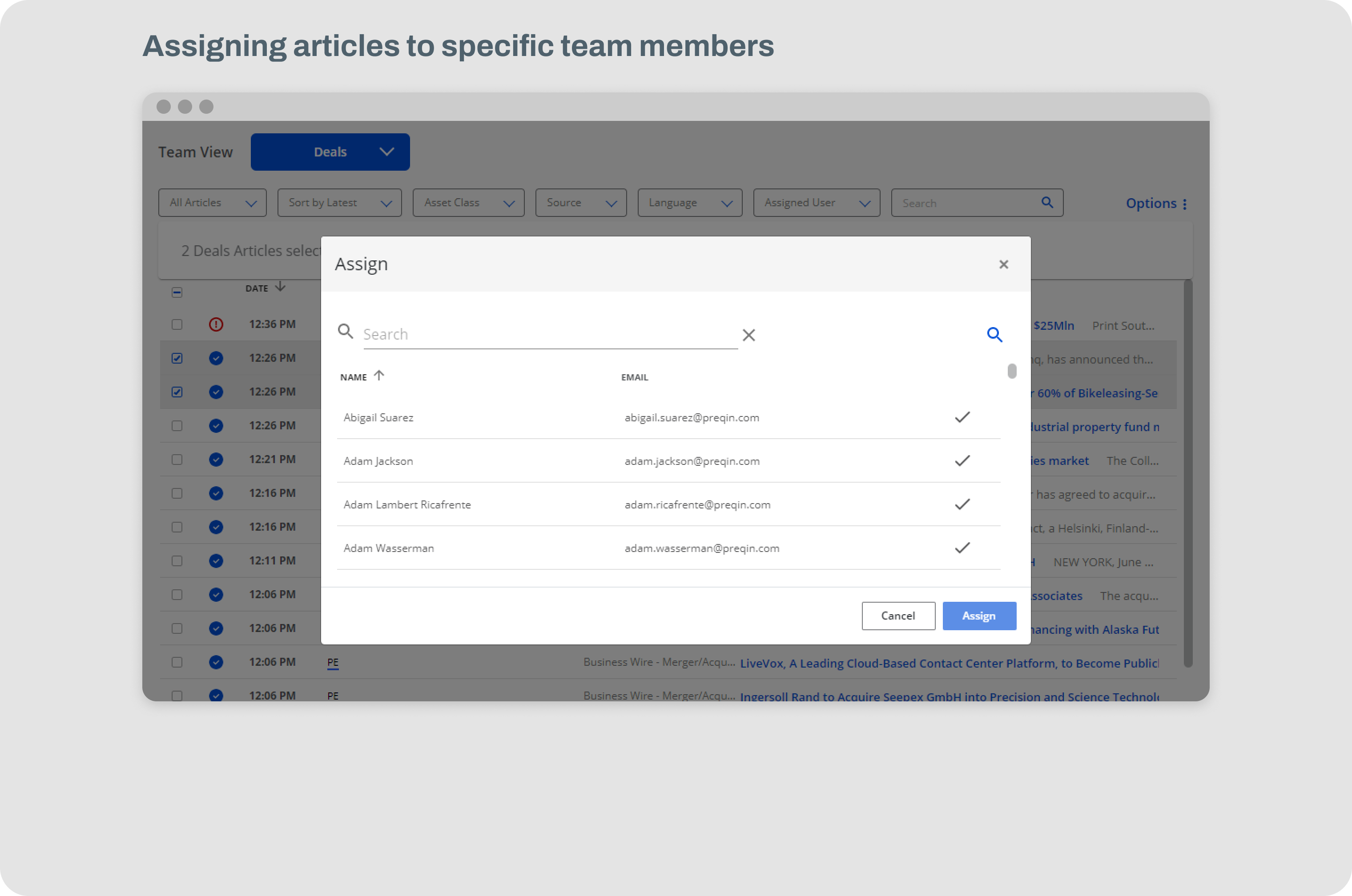
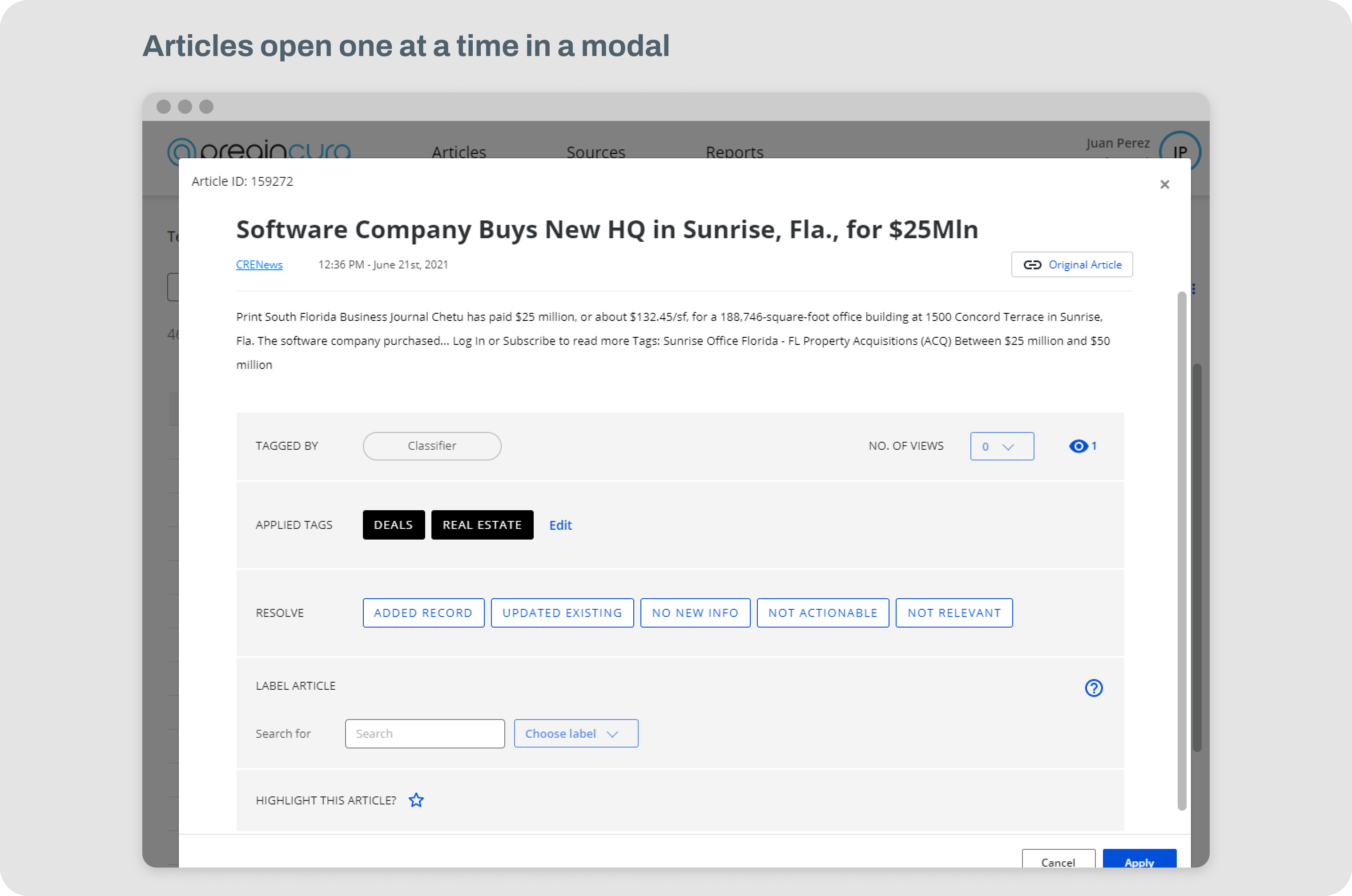
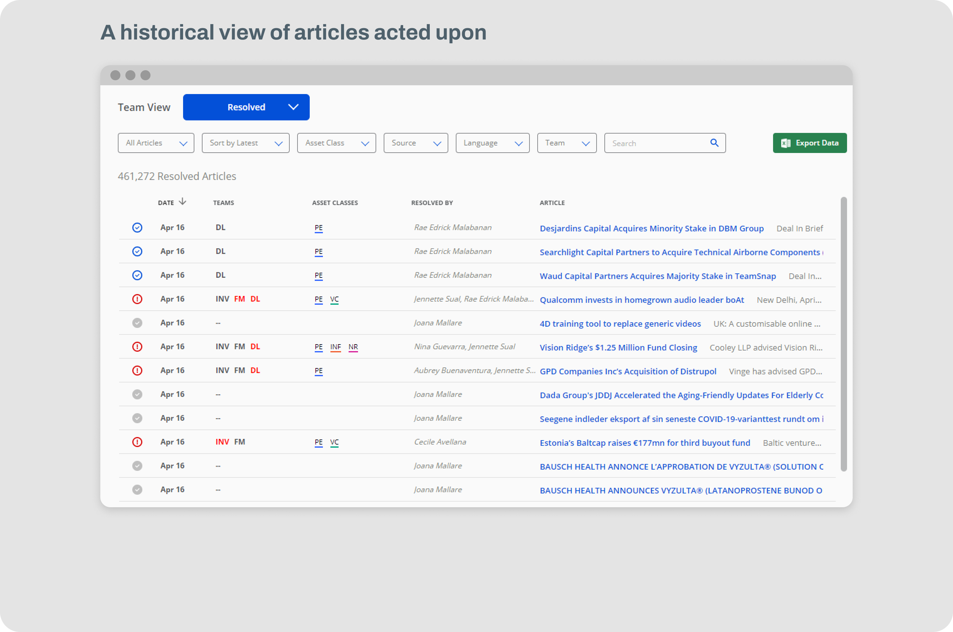
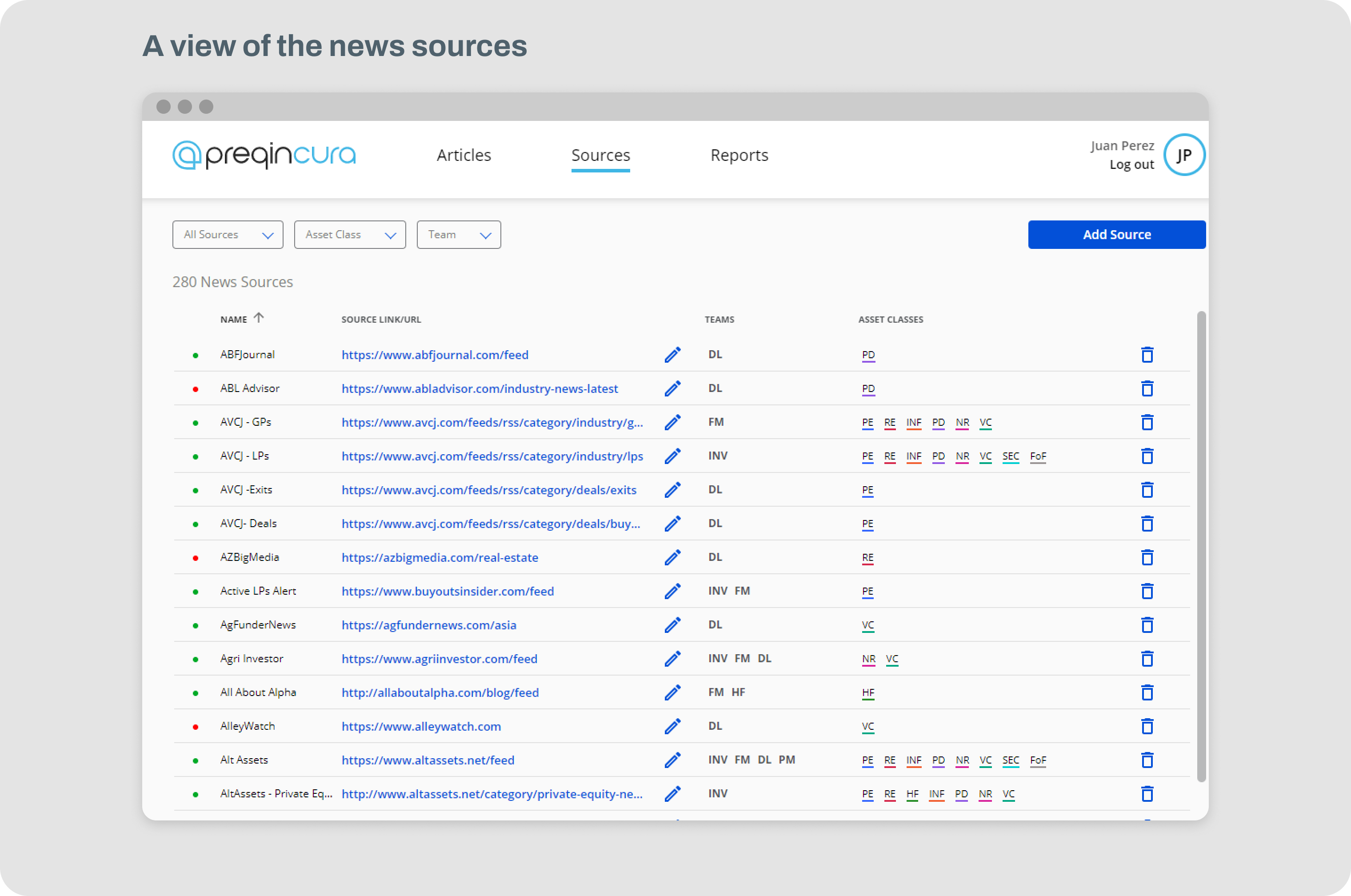
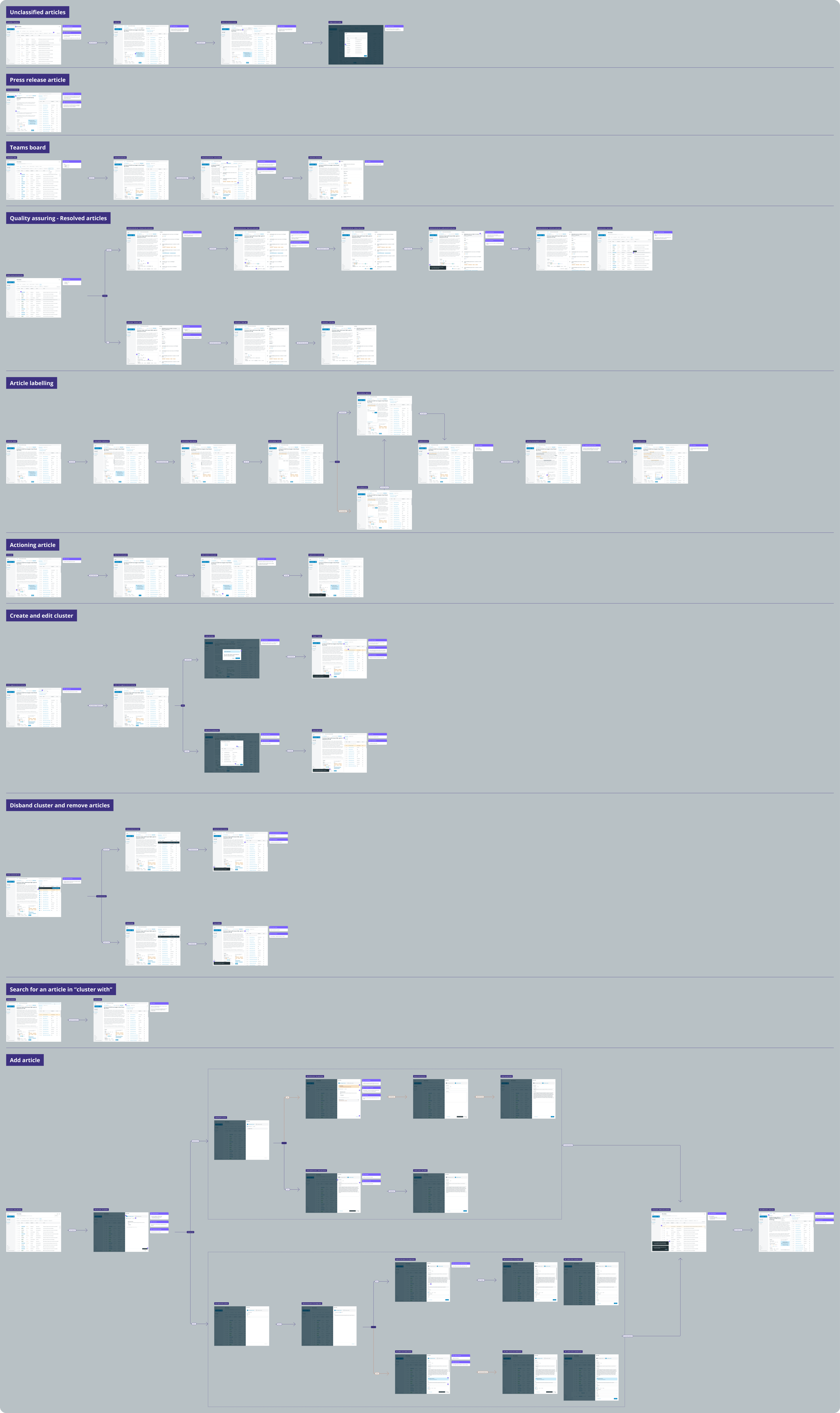
The product design team at Preqin was always growing and at this stage, I had help with converting all the ideas into deliverable assets. Below is a screenshot of the whole designed workflow and features that went into the redesign of the News Agg product
Before the user started the assessment, they took a Likert Scale questionnaire to calibrate the app. The new calibration screen adopted the same design language as the assessment itself, to get the user accustomed to it before they began the test.
Before the user started the assessment, they took a Likert Scale questionnaire to calibrate the app. The new calibration screen adopted the same design language as the assessment itself, to get the user accustomed to it before they began the test.
Examples of hi-fi designs and actual video demos of the product that were implemented
Assessment
Assessment
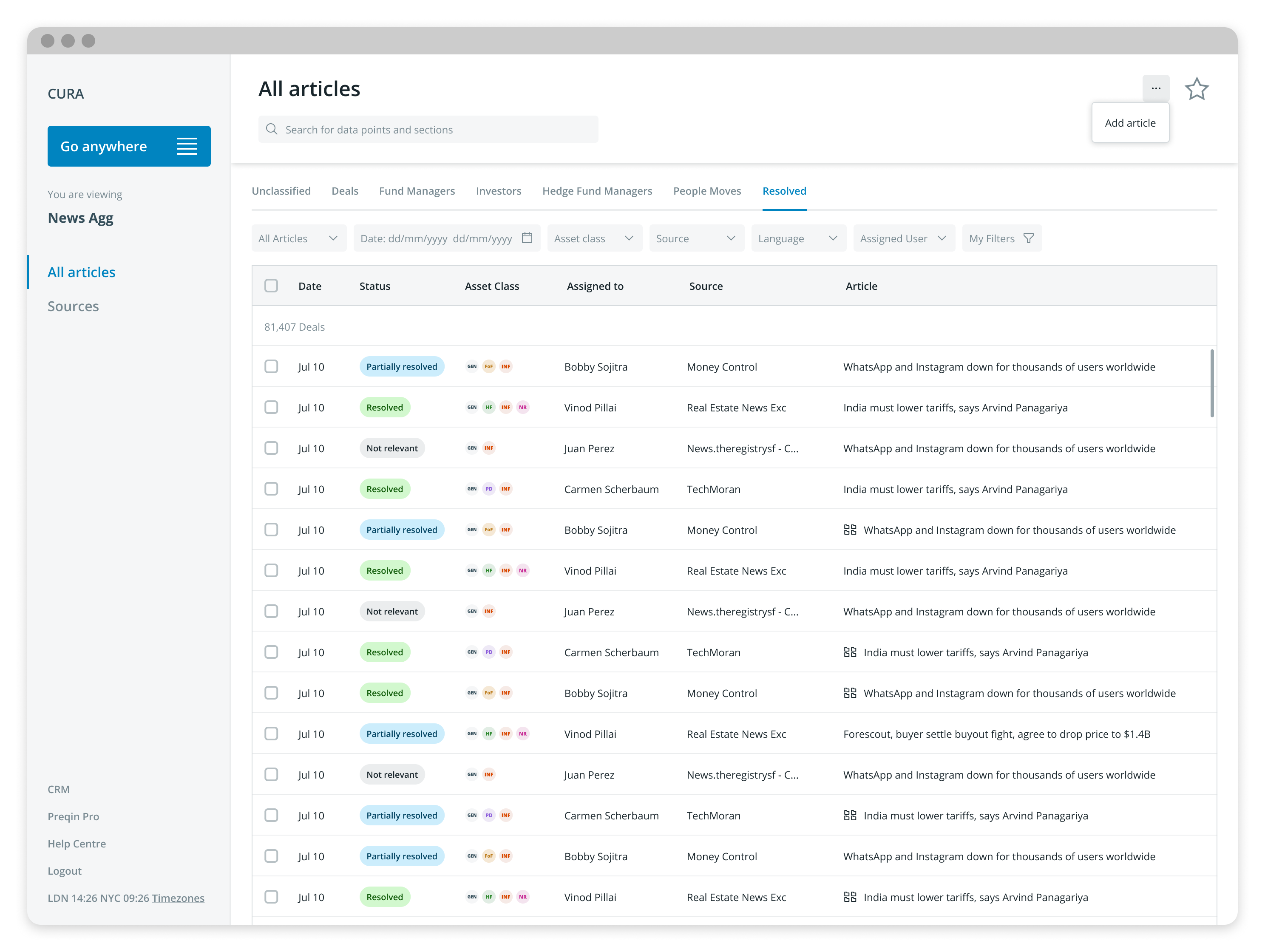
Hi-fi design examples
Assessment
Assessment
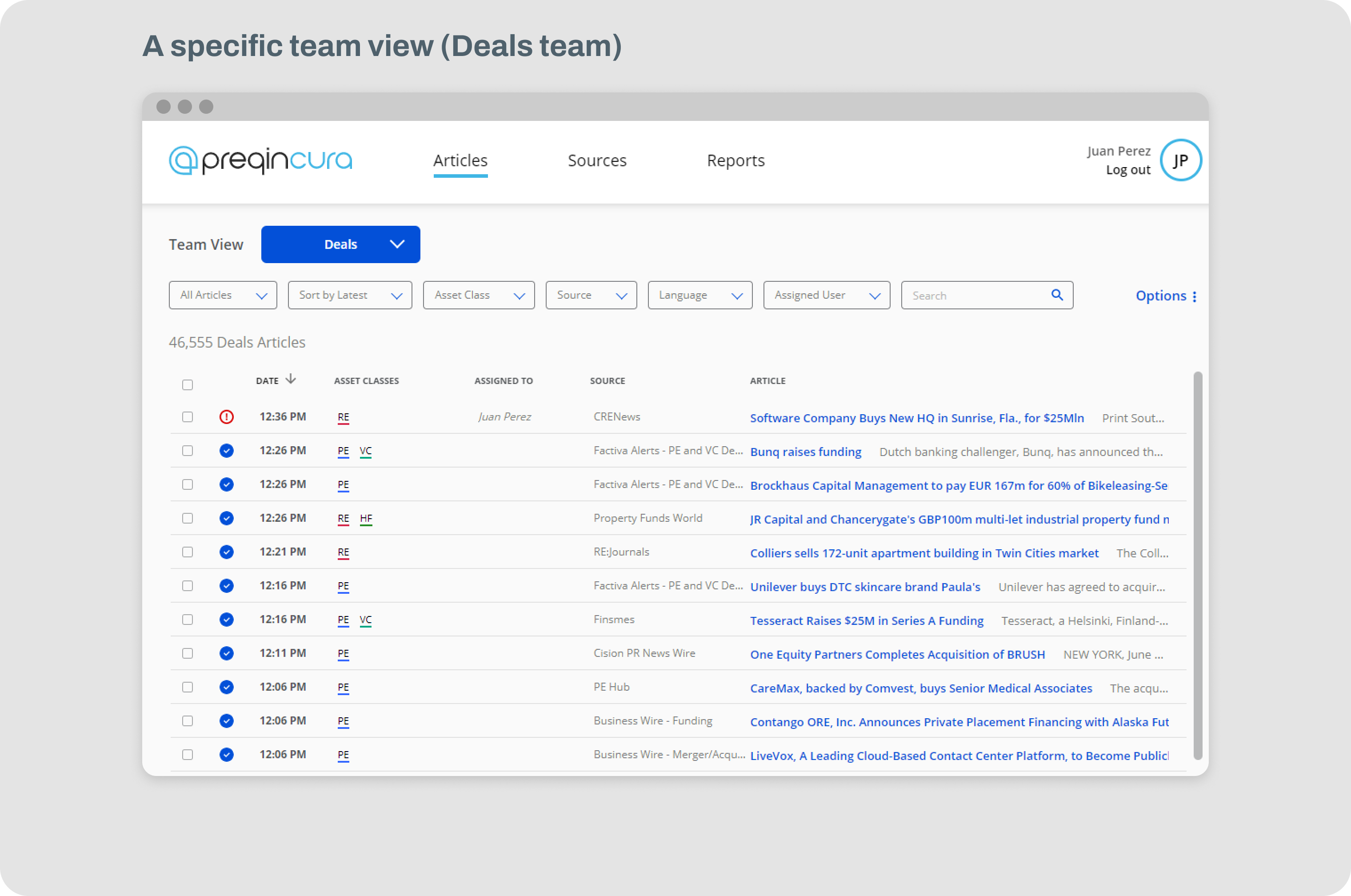
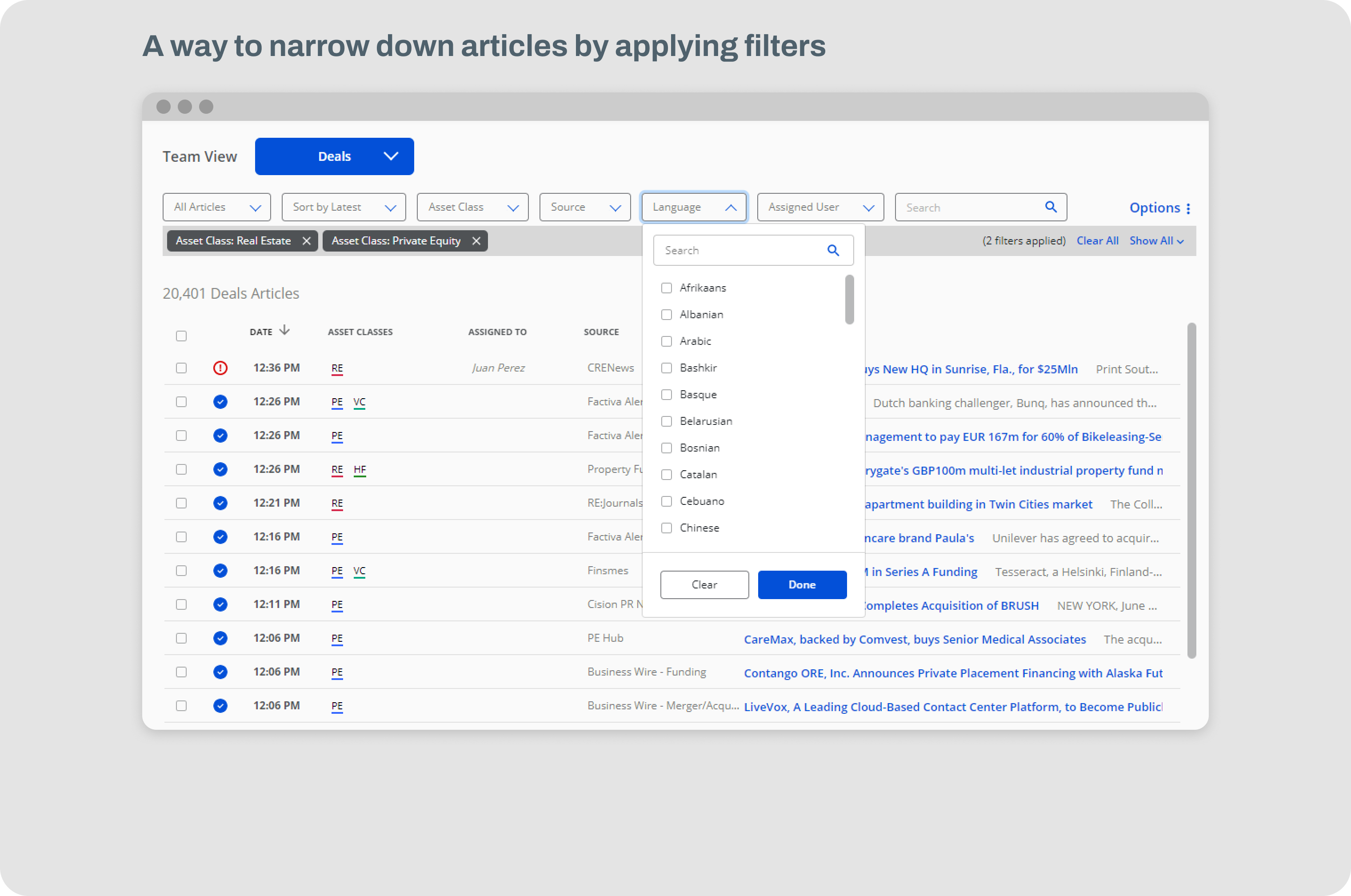
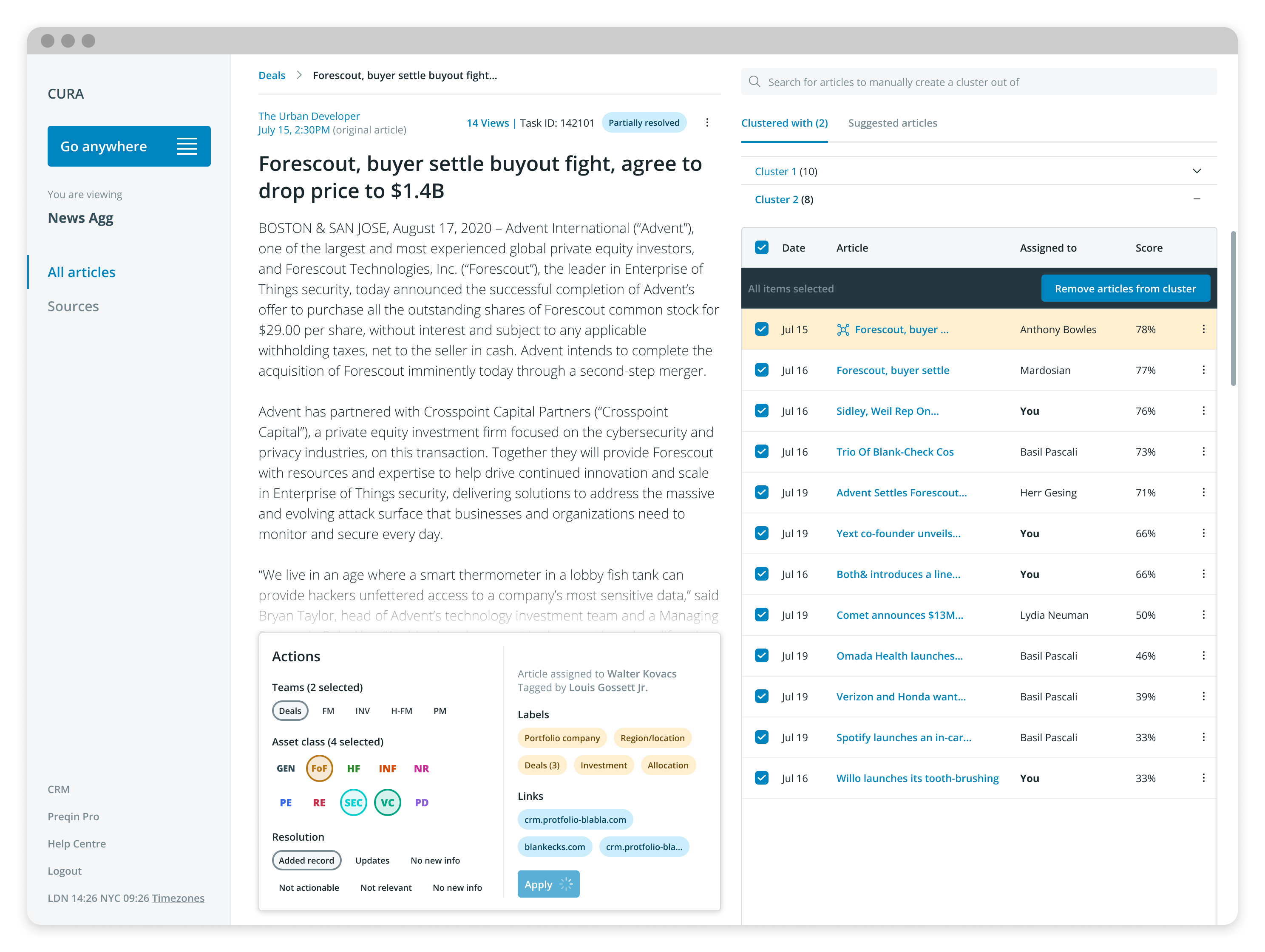
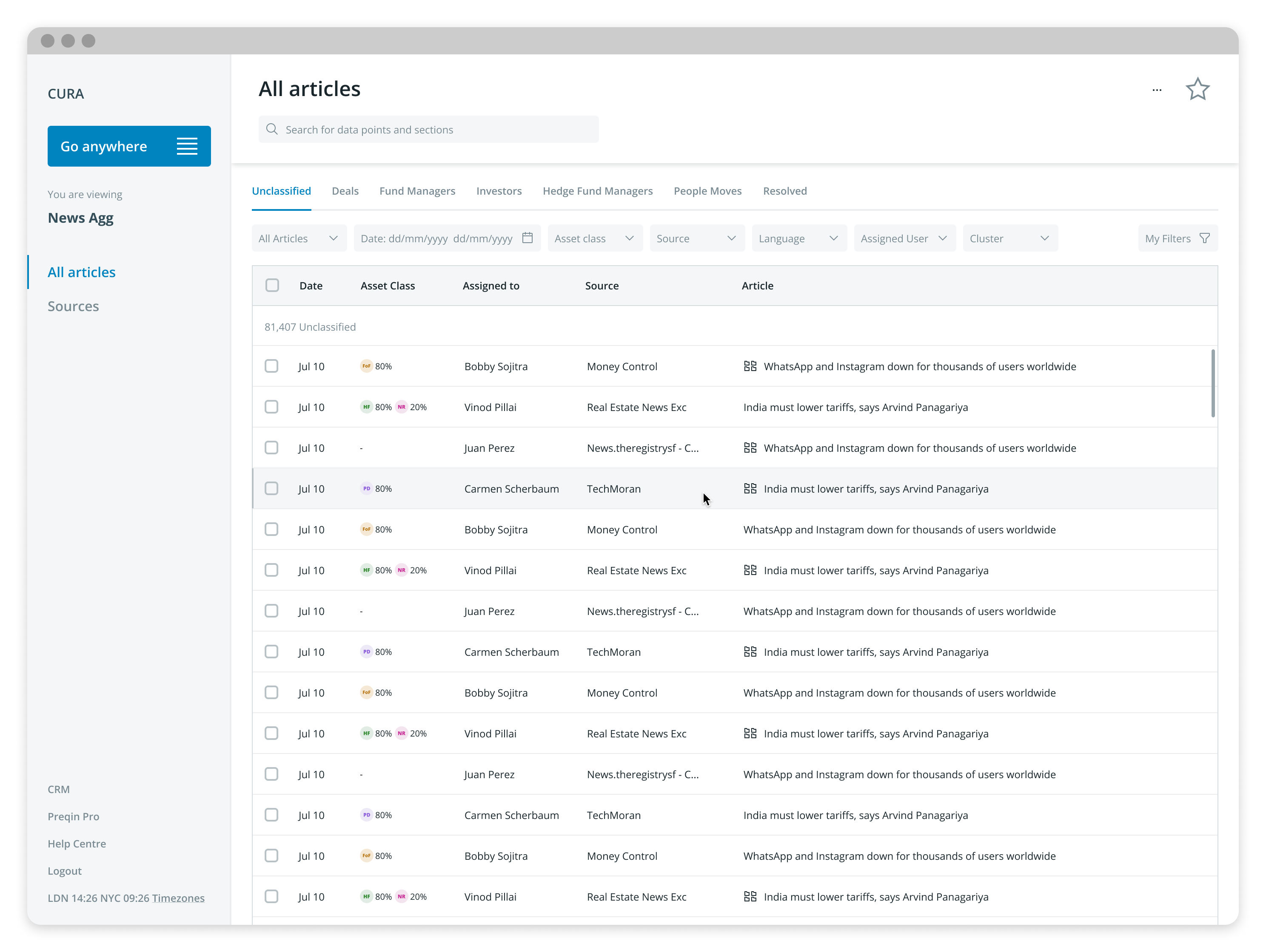
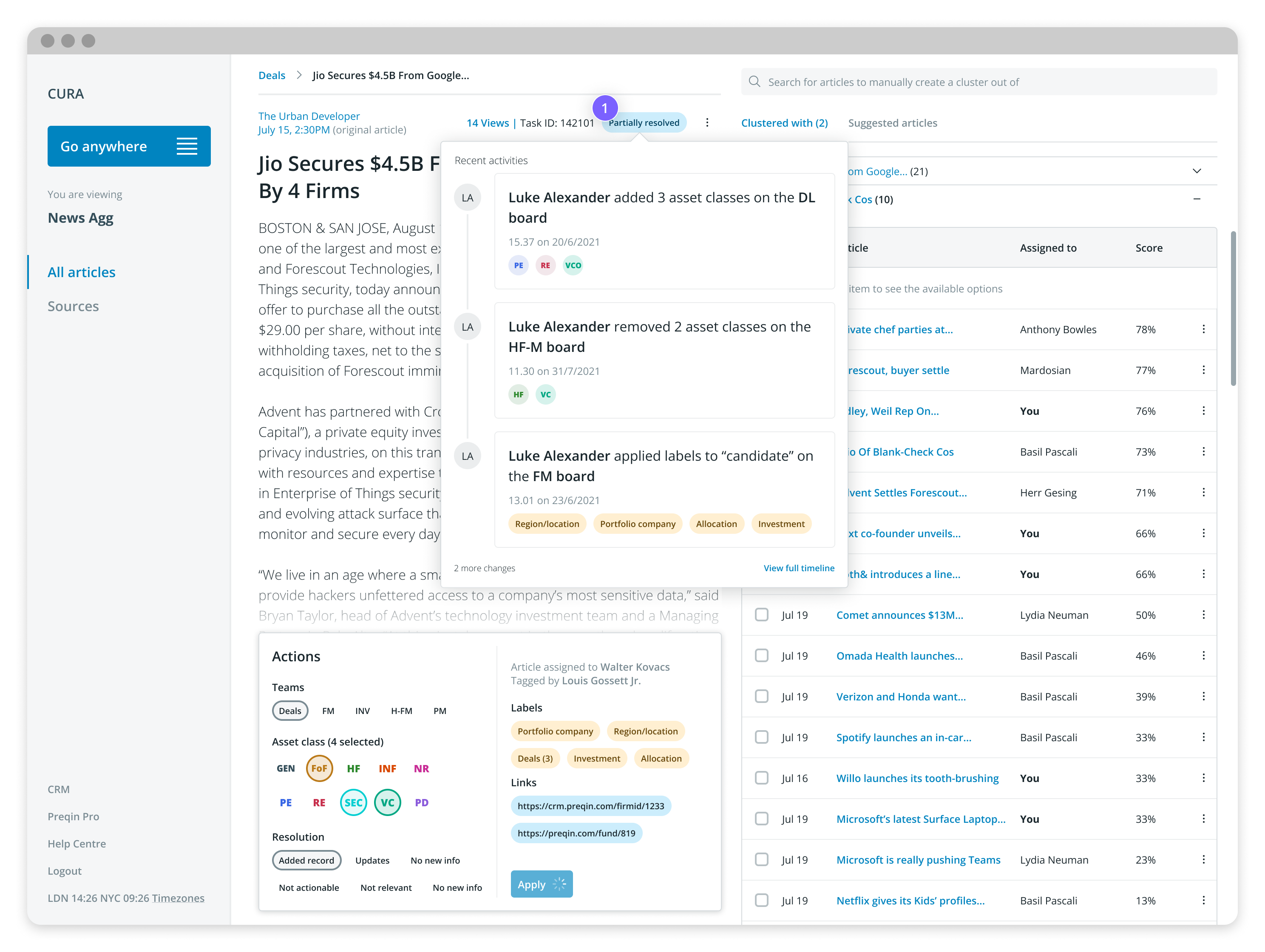
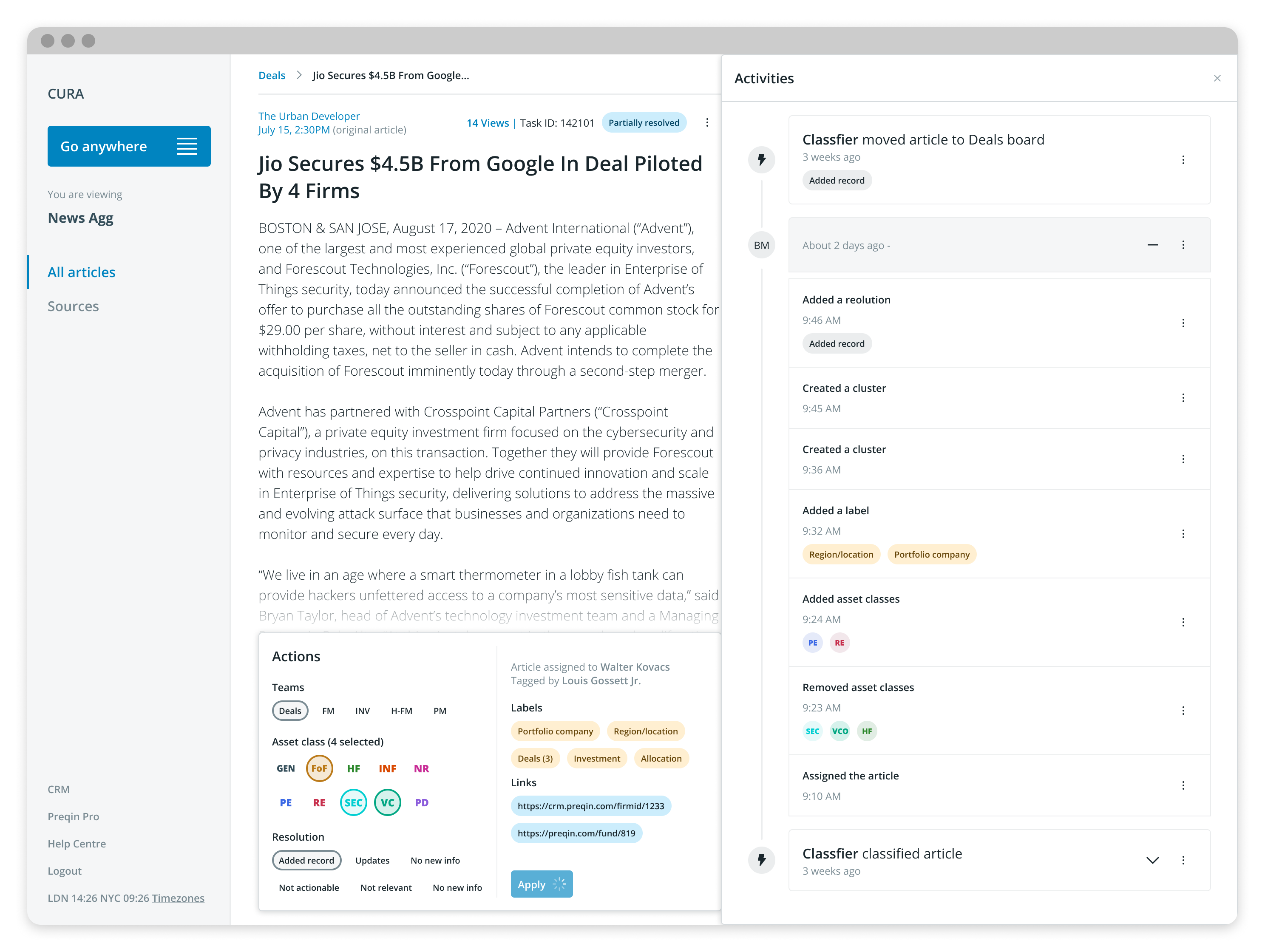
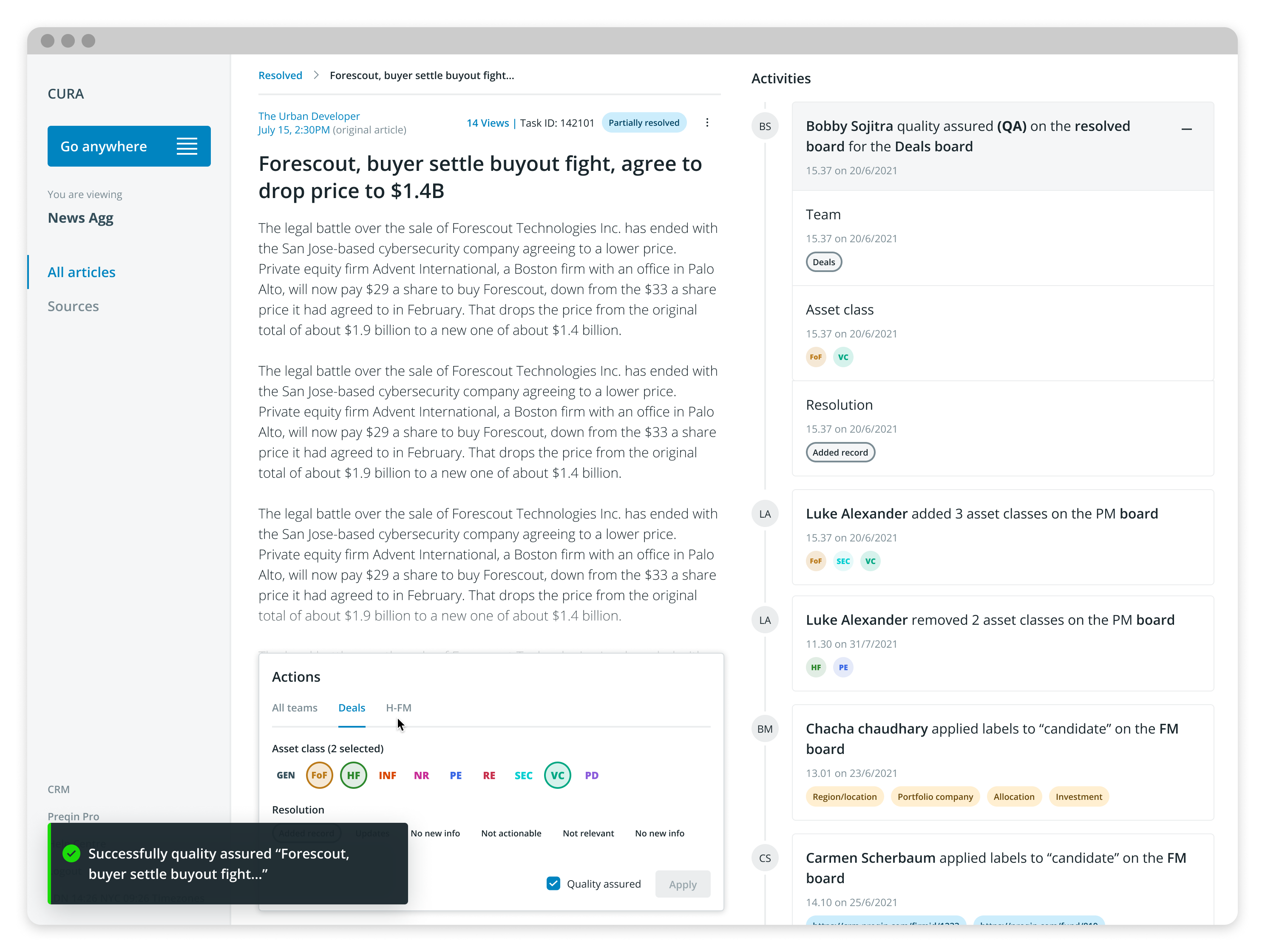
Below are some hi-fi design examples. They are not meant to show a flow or a path. ALl implemented designs, like all good products, will have changed after it was designed and first implemented
Before the user started the assessment, they took a Likert Scale questionnaire to calibrate the app. The new calibration screen adopted the same design language as the assessment itself, to get the user accustomed to it before they began the test.
Before the user started the assessment, they took a Likert Scale questionnaire to calibrate the app. The new calibration screen adopted the same design language as the assessment itself, to get the user accustomed to it before they began the test.
Actual product demo videos
Assessment
Assessment
Below are some screen recordings of the product demo. We managed to launch the whole product in several iterative cycles. A great amount of collaboration and teamwork successfully implemented all initially envisaged ideas
Before the user started the assessment, they took a Likert Scale questionnaire to calibrate the app. The new calibration screen adopted the same design language as the assessment itself, to get the user accustomed to it before they began the test.
Before the user started the assessment, they took a Likert Scale questionnaire to calibrate the app. The new calibration screen adopted the same design language as the assessment itself, to get the user accustomed to it before they began the test.
Impact and outcome
Assessment
Assessment
I have additional team member help!
Assessment
Assessment
The implemented solutions were met with a great deal of success. We didn't wait till the very end to measure and know if it was a success but after most of the envisaged solutions were successfully implemented after rigorous testing, we did do a final check on the scores to tally things up. As well as the data to prove the success, the News Agg team has also anecdotally reported a great amount of relief from all the problems they previously encountered with the old product and they have found doing the work using the new News Agg a much better experience
Before the user started the assessment, they took a Likert Scale questionnaire to calibrate the app. The new calibration screen adopted the same design language as the assessment itself, to get the user accustomed to it before they began the test.
Before the user started the assessment, they took a Likert Scale questionnaire to calibrate the app. The new calibration screen adopted the same design language as the assessment itself, to get the user accustomed to it before they began the test.
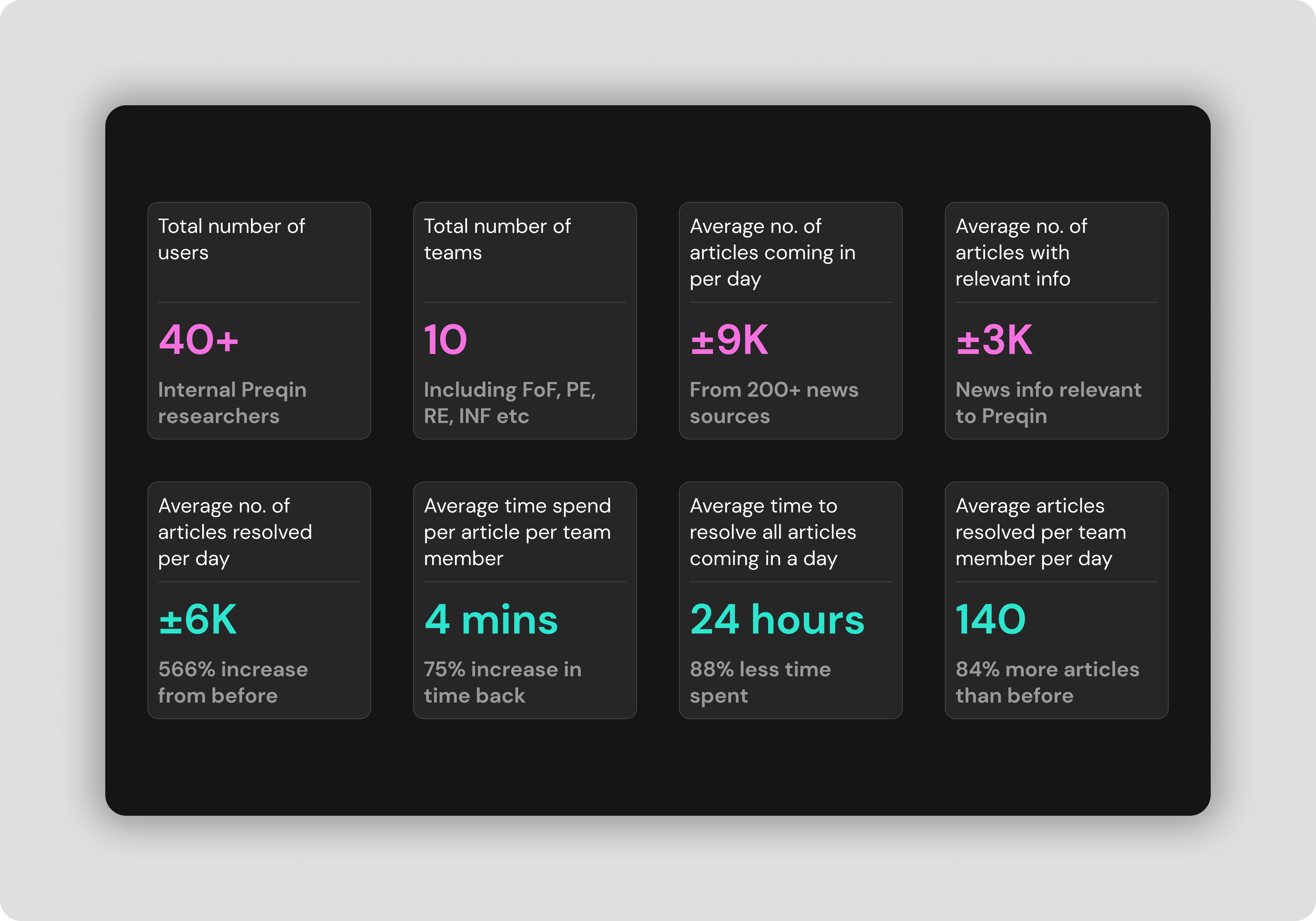
News Agg product keeps improving and lots of great stuff have continued to happen in the internal apps team within Preqin.
Footnote: LeaderAmp was designed in August 2016 and development work happened in parallel. The app went live in the Android Play Store and the Apple App Store. Some content has since been modified including LeaderAmp’s logo.
Footnote: LeaderAmp was designed in August 2016 and development work happened in parallel. The app went live in the Android Play Store and the Apple App Store. Some content has since been modified including LeaderAmp’s logo.
Other Projects

CAP table @ DealstackProduct Design
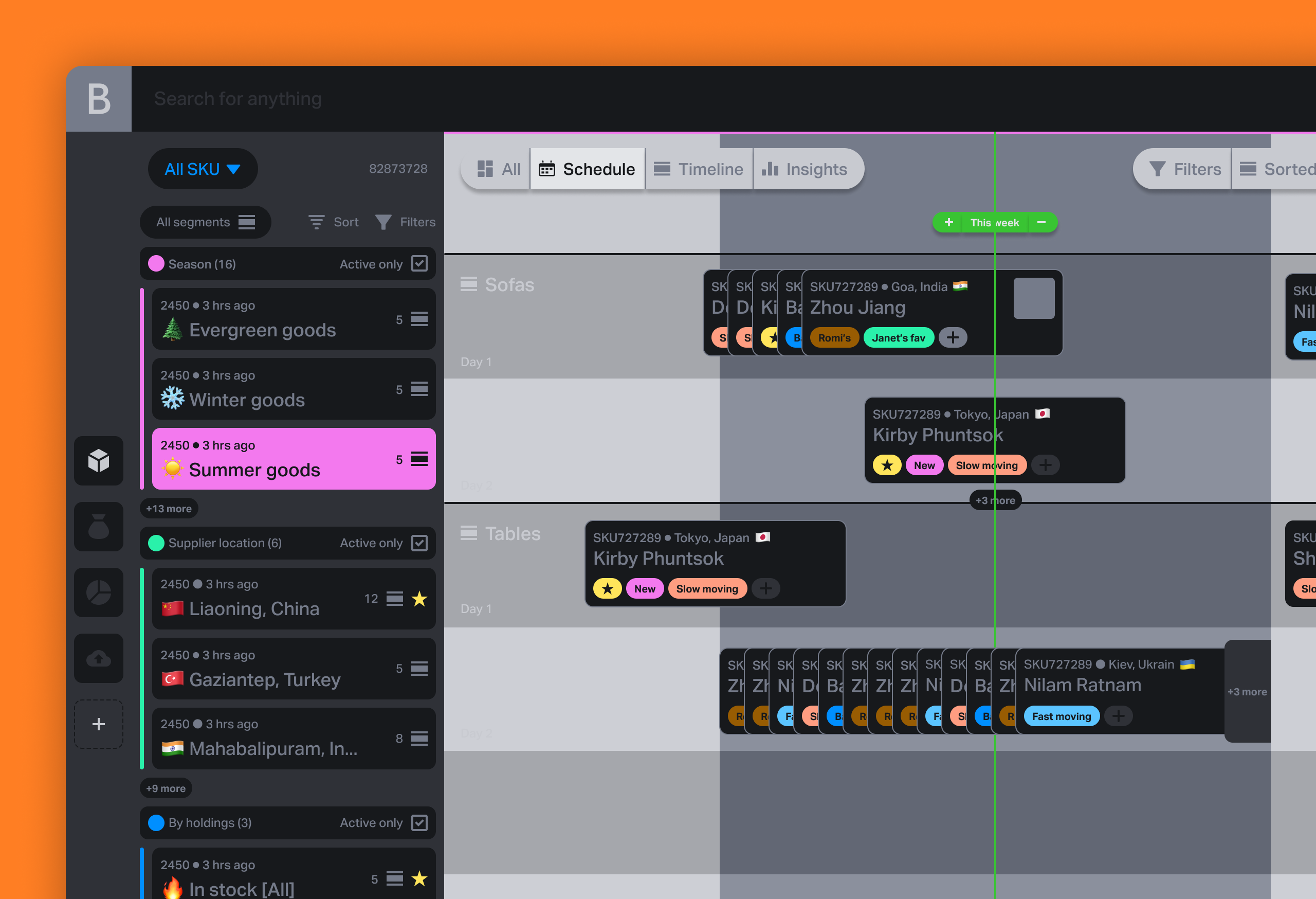
Various design works and thought leadership @ BeaconProduct Design & leadership

Document sharing workflow @ DealstackProduct Design

Tap Tap SignupUI + UX

Design systems design @ PreqinProduct Design

Repositioning by rebranding: the Moonraft brand storyProduct Design

SurePeople Proper HamburgerUI + UX

2018 CalendarGraphic Design
Rejected Web DesignsWeb Design
LogofolioGraphic Design
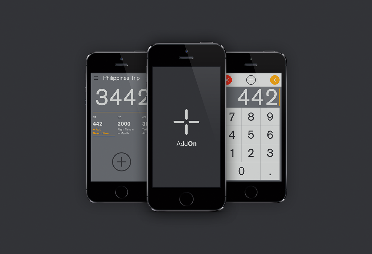
AddOn for numbersUI / UX
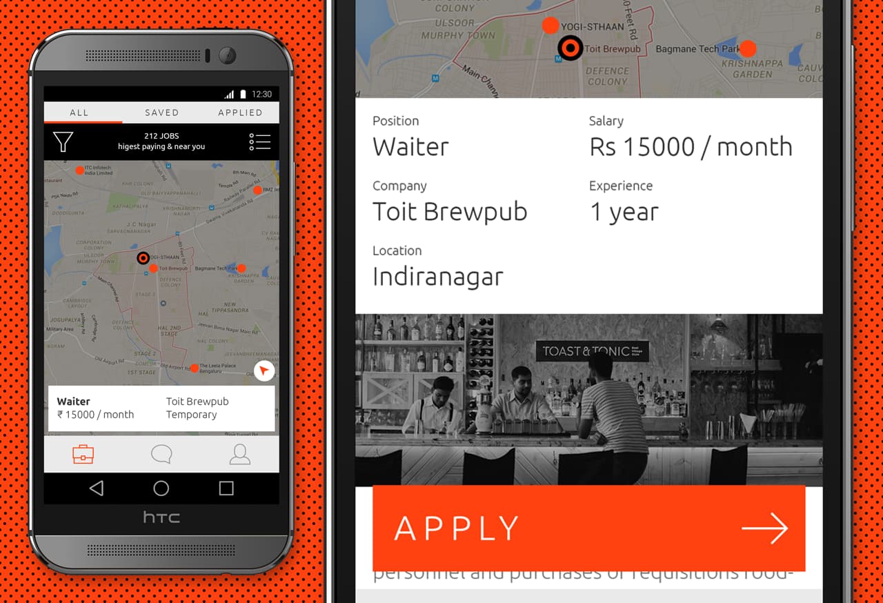
Designing an app for the grey collared job marketProduct Design

Pankaj & Priya wedding collateral designsGraphic Design

The MYLK propaganda designsGraphic Design

LogofolioGraphic Design
