Client: LeaderAmp
Duration: 6 months
Role: Product Designer
Client: LeaderAmp
Duration: 6 months
Role: Product Designer
Client: LeaderAmp
Duration: 6 months
Role: Product Designer
➛
Redesigning an enterprise leadership coaching application
Redesigning an enterprise leadership coaching application
Redesigning an enterprise leadership coaching application
LeaderAmp is an enterprise software that aims to enhance the performance of leadership teams in large organisations. It was founded by organisational psychologist Dr Matt Barney PhD based on academic work and experience of training leaders with an Olympic-style results-driven coaching approach.
LeaderAmp is an enterprise software that aims to enhance the performance of leadership teams in large organisations. It was founded by organisational psychologist Dr Matt Barney PhD based on academic work and experience of training leaders with an Olympic-style results-driven coaching approach.
LeaderAmp is an enterprise software that aims to enhance the performance of leadership teams in large organisations. It was founded by organisational psychologist Dr Matt Barney PhD based on academic work and experience of training leaders with an Olympic-style results-driven coaching approach.
LeaderAmp provides innovative leadership development solutions that extend the reach of coaches, bring a process to leader development programs, and help organisations identify and nurture future talent. Unlike most leader development offerings, our approach is based on years of scientific, evidenced-based research and methodologies created by organisational psychologist and company founder, Matt Barney, PhD Our web and mobile applications leverage scientific insights and utilise innovative digital technologies to bring together coaching, assessment and journaling together into a single app, while making leader coaching available on an organisation-wide scale.
LeaderAmp provides innovative leader development solutions that extend the reach of coaches, bring process to leader development programs, and help organisations identify and nurture future talent. Unlike most leader development offerings, our approach is based on years of scientific, evidenced-based research and methodologies created by organisational psychologist and company founder, Matt Barney, Ph.D. Our web and mobile applications leverage scientific insights and utilise innovative digital technologies to bring together coaching, assessment and journaling together into a single app, while making leader coaching available on an organisation-wide scale.
LeaderAmp provides innovative leader development solutions that extend the reach of coaches, bring process to leader development programs, and help organisations identify and nurture future talent. Unlike most leader development offerings, our approach is based on years of scientific, evidenced-based research and methodologies created by organisational psychologist and company founder, Matt Barney, Ph.D. Our web and mobile applications leverage scientific insights and utilise innovative digital technologies to bring together coaching, assessment and journaling together into a single app, while making leader coaching available on an organisation-wide scale.
Matt recognised the high financial and time costs for companies when they hire externally at a leadership position — and the even higher costs when it isn’t the right hire. The LeaderAmp app was developed to tackle these costs. Instead, companies could identify key traits within employees and, with the right coaching and training, support them to rise to leadership roles.
Matt recognised the high financial and time costs for companies when they hire externally at a leadership position — and the even higher costs when it isn’t the right hire. The LeaderAmp app was developed to tackle these costs. Instead, companies could identify key traits within employees and, with the right coaching and training, support them to rise to leadership roles.
Matt recognised the high financial and time costs for companies when they hire externally at a leadership position — and the even higher costs when it isn’t the right hire. The LeaderAmp app was developed to tackle these costs. Instead, companies could identify key traits within employees and, with the right coaching and training, support them to rise to leadership roles.
Some screenshots of the existing app
Some screenshots of the existing app
Some screenshots of the existing app
The Environment
The Environment
The Environment
LeaderAmp was an existing app and a few years old. It had been built through a technology partnership with Dataphi Labs and had grown organically in response to ad hoc client needs. Dataphi recognised the need for a design-driven solution to organise the platform.
LeaderAmp was an existing app and a few years old. It had been built through a technology partnership with Dataphi Labs and had grown organically in response to ad hoc client needs. Dataphi recognised the need for a design-driven solution to organise the platform.
LeaderAmp was an existing app and a few years old. It had been built through a technology partnership with Dataphi Labs and had grown organically in response to ad hoc client needs. Dataphi recognised the need for a design-driven solution to organise the platform.
My Role
My Role
My Role
I was hired by Dataphi Labs to reimagine the platform, providing consistency and clarity while meeting the individual needs of LeaderAmp’s customers.
I was hired by Dataphi Labs to reimagine the platform, providing consistency and clarity while meeting the individual needs of LeaderAmp’s customers.
I conducted multiple design thinking workshops and stakeholder interviews. I gained insight into the wider LeaderAmp business needs and context. This process led me to create a UX canvas to systematically design a solution while recognising the need to take a framework approach to solve the problem.
This underpinned my work output: the wireframes and the UI components throughout the app including a new logo, visual design and the icon designs.
The new LeaderAmp cross-platform hybrid app was finalised and launched in March 2017 on the Android Play Store and the Apple App Store.
The Aim
The Aim
The Aim
The entire user experience needed to improve significantly while keeping the app flexible to cater to the requirements of different customers. A desktop back-end (Admin facing) control-panel needed to be designed to manage users, generate reports and monitor user progress.
The entire user experience needed to improve significantly while keeping the app flexible to cater to the requirements of different customers. A desktop back-end (Admin facing) control-panel needed to be designed to manage users, generate reports and monitor user progress.
The entire user experience needed to improve significantly while keeping the app flexible to cater to the requirements of different customers. A desktop back-end (Admin facing) control-panel needed to be designed to manage users, generate reports and monitor user progress.
The Existing App Journey
The Existing App Journey
The Existing App Journey
The app journey required selected employees of a company to first take an assessment, which told them their strengths and weaknesses (scales). Having identified their coaching needs, the app supported them to achieve and track progress. After a period they reassess their goals and generate a report to review progress. Users could then choose additional scales to focus on and repeat the cycle.
The app journey required selected employees of a company to first take an assessment, which told them their strengths and weaknesses (scales). Having identified their coaching needs, the app supported them to achieve and track progress. After a period of time they reassess their goals and generate a report to review progress. Users could then choose additional scales to focus on and repeat the cycle.
The app journey required selected employees of a company to first take an assessment, which told them their strengths and weaknesses (scales). Having identified their coaching needs, the app supported them to achieve and track progress. After a period of time they reassess their goals and generate a report to review progress. Users could then choose additional scales to focus on and repeat the cycle.
A general user flow of the app.
A general user flow of the app.
Challenges
Challenges
Challenges
Several areas within the existing app were identified as design challenges within the following flows:
• Login
• Assessment
• Stakeholder
• Coaching
• Navigation
• Re-assessment
• Control Panel
Several areas within the existing app were identified as design challenges, within the following flows:
• Login
• Assessment
• Stakeholder
• Coaching
• Navigation
• Re-assessment
• Control Panel
Several areas within the existing app were identified as design challenges, within the following flows:
• Login
• Assessment
• Stakeholder
• Coaching
• Navigation
• Re-assessment
• Control Panel
The UX Umbrella (Framework) for the app
The UX Umbrella (Framework) for the app
The UX Umbrella (Framework) for the app
Although the different pieces identified had their own challenges, to work apps need to be founded on an overarching UX framework (UX Umbrella). This allows users to move through the app on individual journeys, ensuring consistency of design and experience.
Although the different pieces identified had their own challenges, to work apps need to be founded on an overarching UX framework (UX Umbrella). This allows users to move through the app on individual journeys, ensuring consistency of design and experience.
The UX umbrella needs to meet specific business needs and requirements. LeaderAmp needed their product to be flexible enough to accommodate additional features or to remove some (for some customers), without compromising reaching the goal of any flow.
The LeaderAmp UX Umbrella
The LeaderAmp UX Umbrella
Login
Login
Login
The revised design incorporated a new login and signup flow. The platform is a B2B2C model that allowed end users (employees) to be directly invited by their employer, was important to consider. The email templates (for invitation and generation of an authorisation code) were redesigned to engage with the user earlier on, while distributing complexity evenly across different stages.
The revised design incorporated new login and signup flows. The platform being a B2B2C model that allowed end users (employees) to be directly invited by their employer, was taken into consideration. The email templates (for invitation and generation of an authorisation code) were redesigned to engage with the user earlier, while distributing complexity evenly across different stages.
The revised design incorporated new login and signup flows. The platform being a B2B2C model that allowed end users (employees) to be directly invited by their employer, was taken into consideration. The email templates (for invitation and generation of an authorisation code) were redesigned to engage with the user earlier, while distributing complexity evenly across different stages.
Examples of the Login stage
Examples of the Login stage
Assessment
Assessment
Assessment
Before the user started the assessment, they took a Likert Scale questionnaire to calibrate the app. The new calibration screen adopted the same design language as the assessment itself, to get the user accustomed to it before they began the test.
Before the user started the assessment, they took a Likert Scale questionnaire to calibrate the app. The new calibration screen adopted the same design language as the assessment itself, to get the user accustomed to it before they began the test.
Before the user started the assessment, they took a Likert Scale questionnaire to calibrate the app. The new calibration screen adopted the same design language as the assessment itself, to get the user accustomed to it before they began the test.
Examples of the Calibration stage
Examples of the Calibration stage
The test methodology meant that the total number of questions for the user couldn’t be predicted, but a new omnipresent progress bar reduced uncertainty.
The test methodology meant that the total number of questions for the user couldn’t be predicted, but a new omnipresent progress bar reduced uncertainty.
The test methodology meant that the total number of questions for the user couldn’t be predicted, but a new omnipresent progress bar reduced uncertainty.
Examples of the Assessment stage
Examples of the Assessment stage
Stakeholder
Stakeholder
Stakeholder
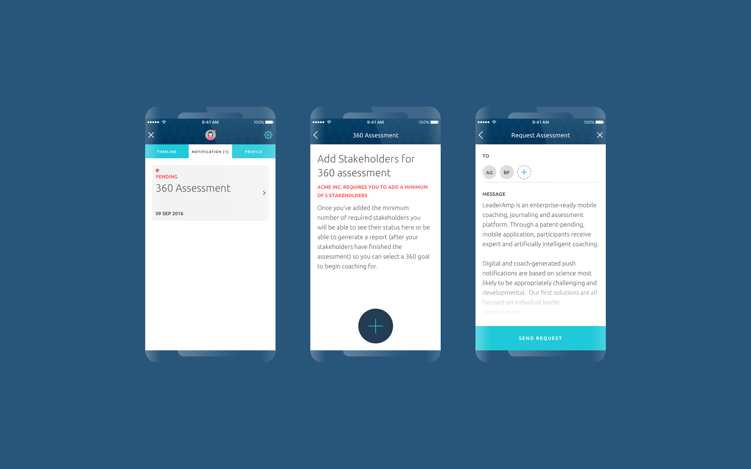
Previously users were required to complete the Stakeholder stage (identifying people to give 360 feedback) before they reached the Coaching stage. This sequential approach delayed users from reaching the core of LeaderAmp. The new design incorporated an unintrusive notification screen for the Stakeholder stage that could be dismissed, allowing them to keep working and return to this later.
Previously users were required to complete the Stakeholder stage (identifying people to give 360 feedback) before they reached the Coaching stage. This sequential approach delayed users from reaching the core of LeaderAmp. The new design incorporated an nonintrusive notification screen for the Stakeholder stage that could be dismissed, allowing them to keep working and return to this later.
Previously users were required to complete the Stakeholder stage (identifying people to give 360 feedback) before they reached the Coaching stage. This sequential approach delayed users from reaching the core of LeaderAmp. The new design incorporated an nonintrusive notification screen for the Stakeholder stage that could be dismissed, allowing them to keep working and return to this later.
Examples of the Stakeholder stage
Examples of the Stakeholder stage
Coaching
Coaching
Coaching
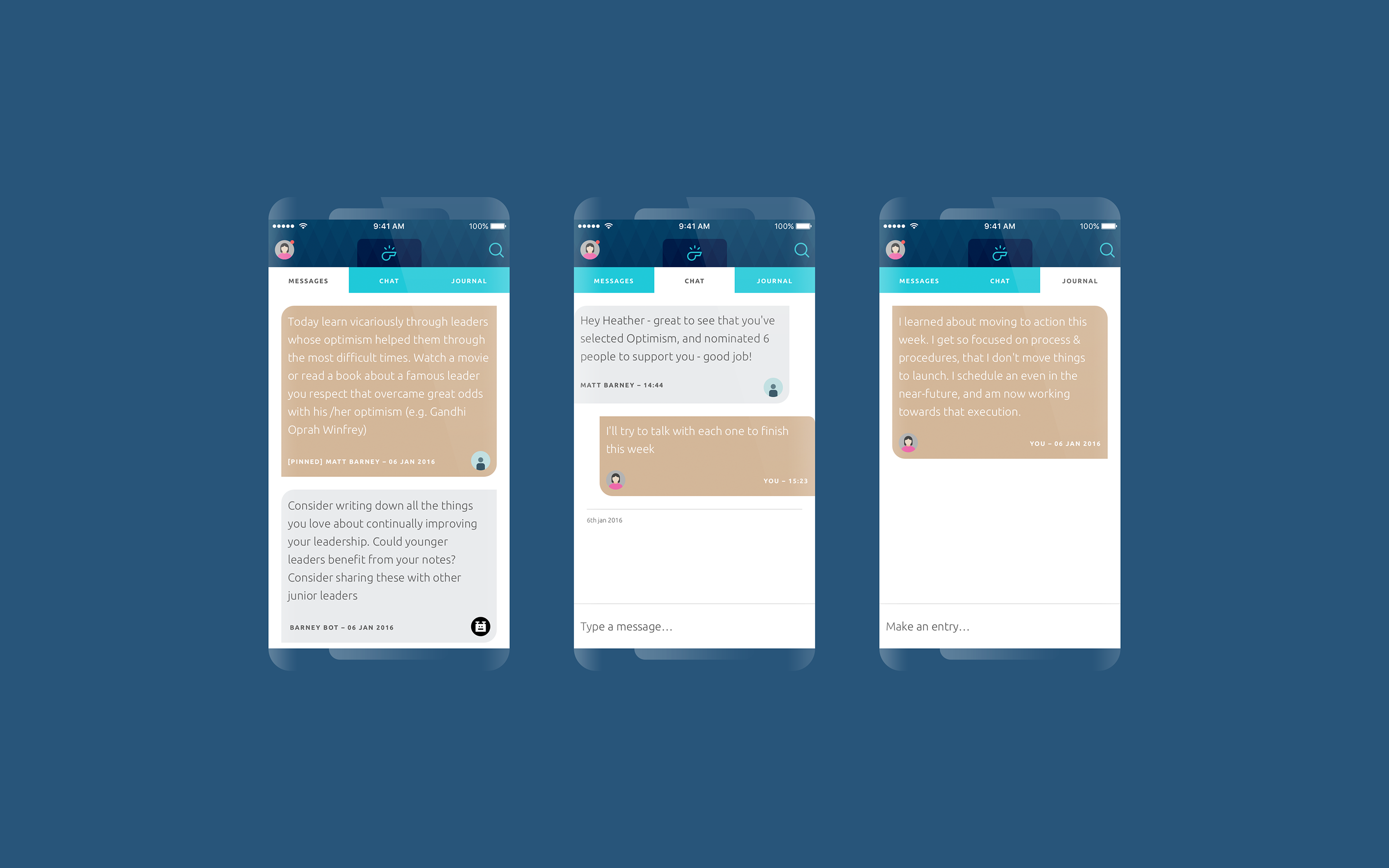
The use of a new navigation system (shown below) enabled us to adopt a flow-in-a-flow layout. The Coaching stage was divided into messages (one-way asynchronous broadcasts), chat (allowing a 1–2–1 personal or AI coach chat relating to individual needs) and journal (allowing the users to record snippets and summarise their learnings).
The use of a new navigation system (shown below) enabled us to adopt a flow-in-a-flow layout. The Coaching stage was divided into messages (one way asynchronous broadcasts), chat (allowing a 1–2–1 personal or AI coach chat relating to individual needs) and journal (allowing the users to record snippets and summarise their learnings).
The use of a new navigation system (shown below) enabled us to adopt a flow-in-a-flow layout. The Coaching stage was divided into messages (one way asynchronous broadcasts), chat (allowing a 1–2–1 personal or AI coach chat relating to individual needs) and journal (allowing the users to record snippets and summarise their learnings).
Examples of the Coaching stage
Examples of the Coaching stage
Navigation
Navigation
Navigation
The navigation system was segmented three ways:
Wizard navigation (allowing the user to accomplish a goal by clicking through steps)
Folder navigation (allowing navigation items to have flow-in-a-flow steps and sub-steps), and
Global navigation (such as a hamburger menu, allowing the users to navigate to all available itemised content).
The navigation system was segmented three ways:
Wizard navigation (allowing the user to accomplish a goal by clicking through steps)
- Folder navigation (allowing navigation items to have flow-in-a-flow steps and sub-steps), and
Global navigation (such as a hamburger menu, allowing the users to navigate to all available itemised content).
Examples of the navigation types
Examples of the navigation types
Re-assessment
Re-assessment
Re-assessment
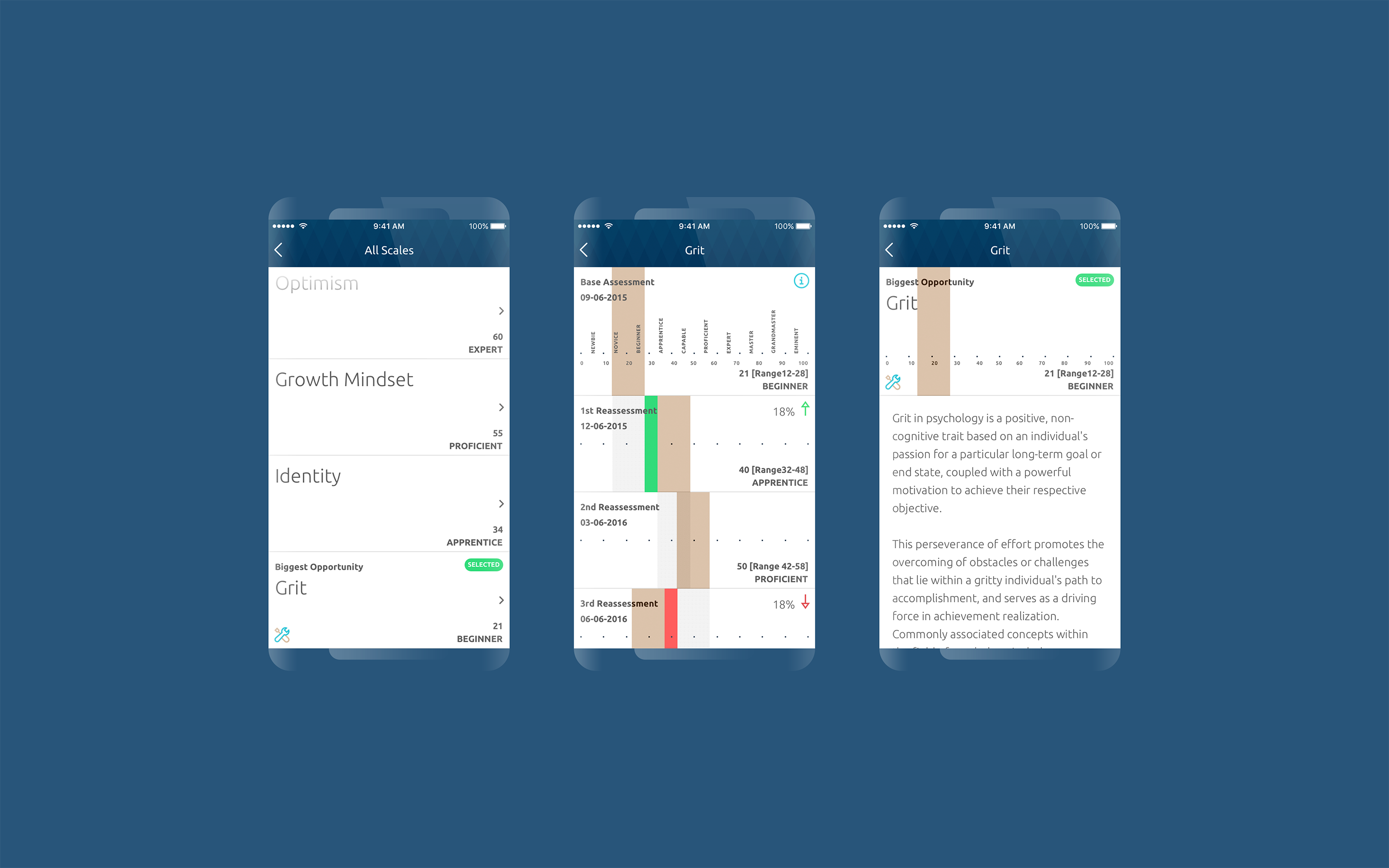
The first time the user took an assessment it recorded a base score using a complex algorithm combining absolute score, confidence interval and fuzzy logic. This wasn’t shared with the user at that time but was used to track progress at each quarterly reassessment. A report was generated that recorded performance as either ‘improvement’ or ‘no-change’ (if the confidence-interval range was still within that of the previous assessment). The new design let the user select and compare the differences between any two assessment scores.
The first time the user took an assessment it recorded a base score , using a complex algorithm combining absolute score, confidence interval and fuzzy logic. This wasn’t shared with the user at that time but was used to track progress at each quarterly reassessment. A report was generated that recorded performance as either ‘improvement’ or ‘no-change’ (if the confidence-interval range was still within that of the previous assessment). The new design let the user select and compare difference between any two assessment scores.
The first time the user took an assessment it recorded a base score , using a complex algorithm combining absolute score, confidence interval and fuzzy logic. This wasn’t shared with the user at that time but was used to track progress at each quarterly reassessment. A report was generated that recorded performance as either ‘improvement’ or ‘no-change’ (if the confidence-interval range was still within that of the previous assessment). The new design let the user select and compare difference between any two assessment scores.
Examples of the Re-assessment stage
Examples of the Re-assessment stage
Examples of the Re-assessment stage
Control Panel
Control Panel
Control Panel
The Control Panel is the desktop app for managing and controlling several functions of the mobile app. The main purpose was to serve three types of users:
The Super Admin (LeaderAmp)
The Admin
The Coach
The Control Panel is the desktop app for managing and controlling several functions of the mobile app. It’s main purpose was to serve three types of users:
The Super Admin (LeaderAmp)
The Admin
- The Coach
The Control Panel is the desktop app for managing and controlling several functions of the mobile app. It’s main purpose was to serve three types of users:
The Super Admin (LeaderAmp)
The Admin
- The Coach
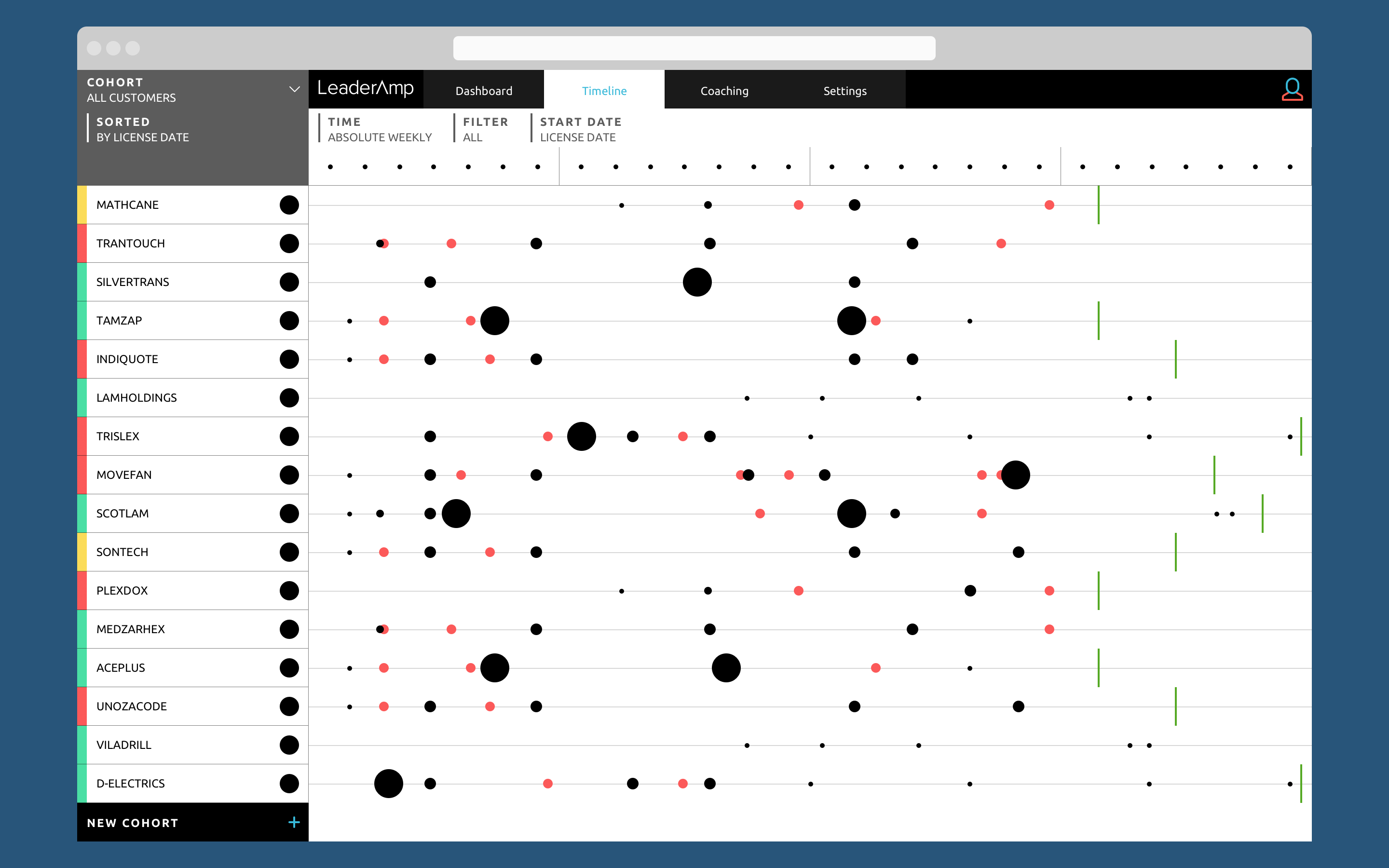
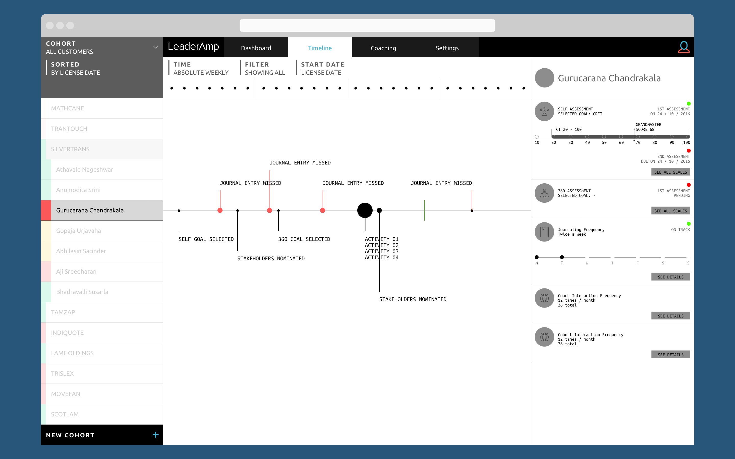
The Timeline within the Control Panel
The Timeline within the Control Panel
The Super-Admin’s task entailed configuring modules for a specific customer, toggling specific pre-configured LeaderAmp owned content (called battery: which involved a specific test, scales and items) and fine-tuning the output (calibrating the confidence interval range, if-then scenarios, error handling, alternative responses, etc.).
The Super-Admin’s task entailed configuring modules for a specific customer, toggling specific pre-configured LeaderAmp owned content (called battery: which involved a specific test, scales and items) and fine-tuning the output (calibrating the confidence interval range, if-then scenarios, error handling, alternative responses, etc.).
The Super-Admin and the Admin users would be interested in reviewing the overall health of the items within their governance. For example, the Super-Admin would want to know the stages its customers have reached. The Admin would be interested in the same information but for a specific individual.
Slicing within the Timeline
Slicing within the Timeline
The Coach’s panel was mainly to provide coaching nuggets to an individual or a cohort by sending custom messages, broadcast and tasks. The Coach could also send reminders.
The Coach’s panel was mainly to provide coaching nuggets to an individual or a cohort by sending custom messages, broadcast and tasks. The Coach could also send reminders.
The Coach’s panel was mainly to provide coaching nuggets to an individual or a cohort by sending custom messages, broadcast and tasks. The Coach could also send reminders.
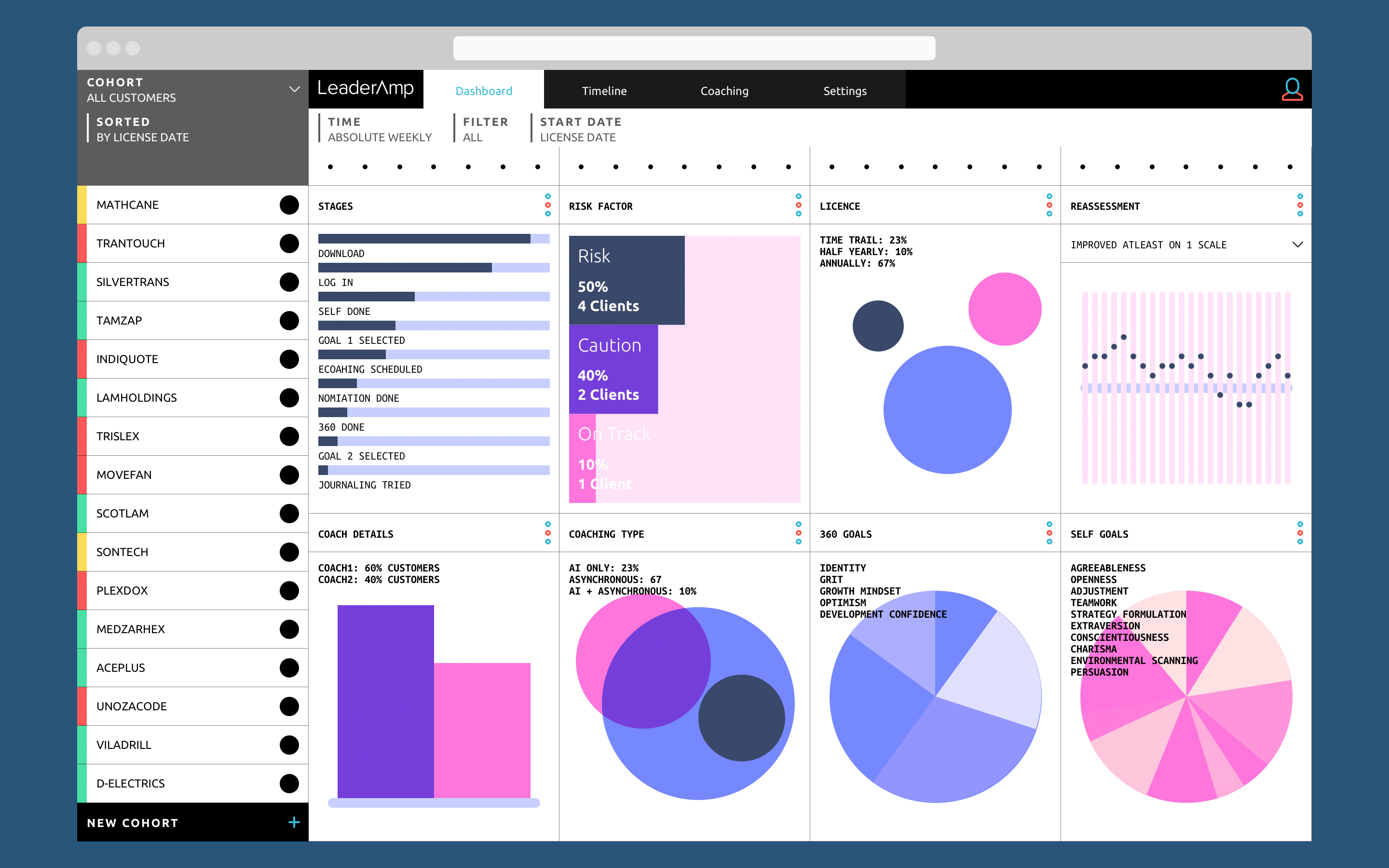
The Dashboard within the Control Panel
The Dashboard within the Control Panel
To meet these differing requirements, the desktop app was designed using the customer view.
A folder hierarchy approach ensured that depending upon the type of logged-in user, they could either only see the relevant customer or individual data.
A simple traffic-light design gave an indicative health overview. To further segment the content, the navigation had a flow-in-a-flow system divided between dashboard, timeline, coaching and settings. The access would again depend on the type of user.
To meet these differing requirements, the desktop app was designed using a customer view.
A folder hierarchy approach ensured that depending upon the type of logged in user, they could either see only relevant customer or individual data.
A simple traffic-light design gave an indicative health overview. To further segment the content, the navigation had a flow-in-a-flow system divided between dashboard, timeline, coaching and settings. The access would again depend on the type of user.
Footnote: LeaderAmp was designed in August 2016 and development work happened in parallel. The app went live in the Android Play Store and the Apple App Store. Some content has since been modified including LeaderAmp’s logo.
Footnote: LeaderAmp was designed in August 2016 and development work happened in parallel. The app went live in the Android Play Store and the Apple App Store. Some content has since been modified including LeaderAmp’s logo.
Footnote: LeaderAmp was designed in August 2016 and development work happened in parallel. The app went live in the Android Play Store and the Apple App Store. Some content has since been modified including LeaderAmp’s logo.
Other Projects

CAP table @ DealstackProduct Design
Redesigning a news aggregator tool @ PreqinProduct design
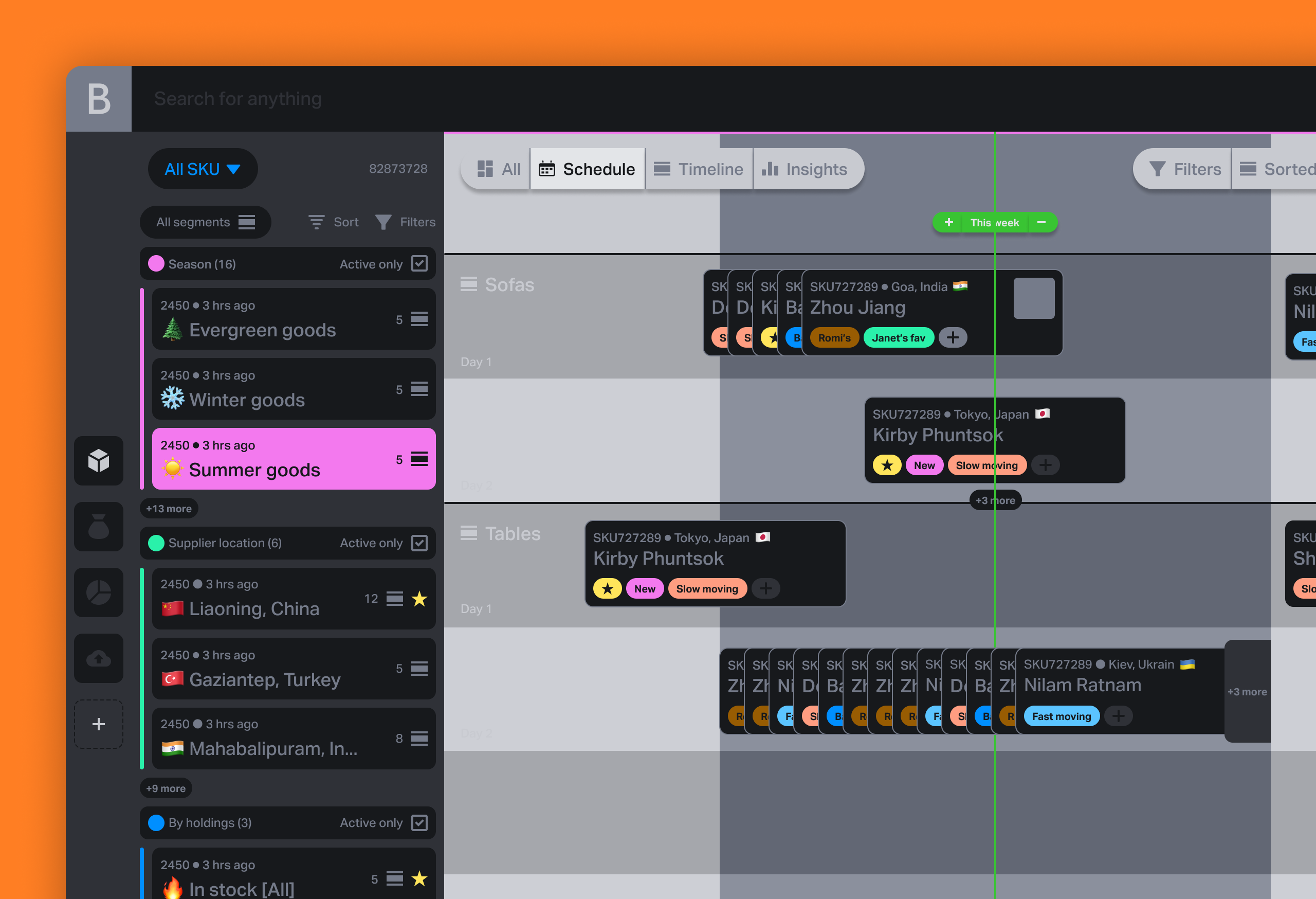
Various design works and thought leadership @ BeaconProduct Design & leadership

Document sharing workflow @ DealstackProduct Design

Tap Tap SignupUI + UX

Design systems design @ PreqinProduct Design

Repositioning by rebranding: the Moonraft brand storyProduct Design

SurePeople Proper HamburgerUI + UX

2018 CalendarGraphic Design
Rejected Web DesignsWeb Design

LogofolioGraphic Design
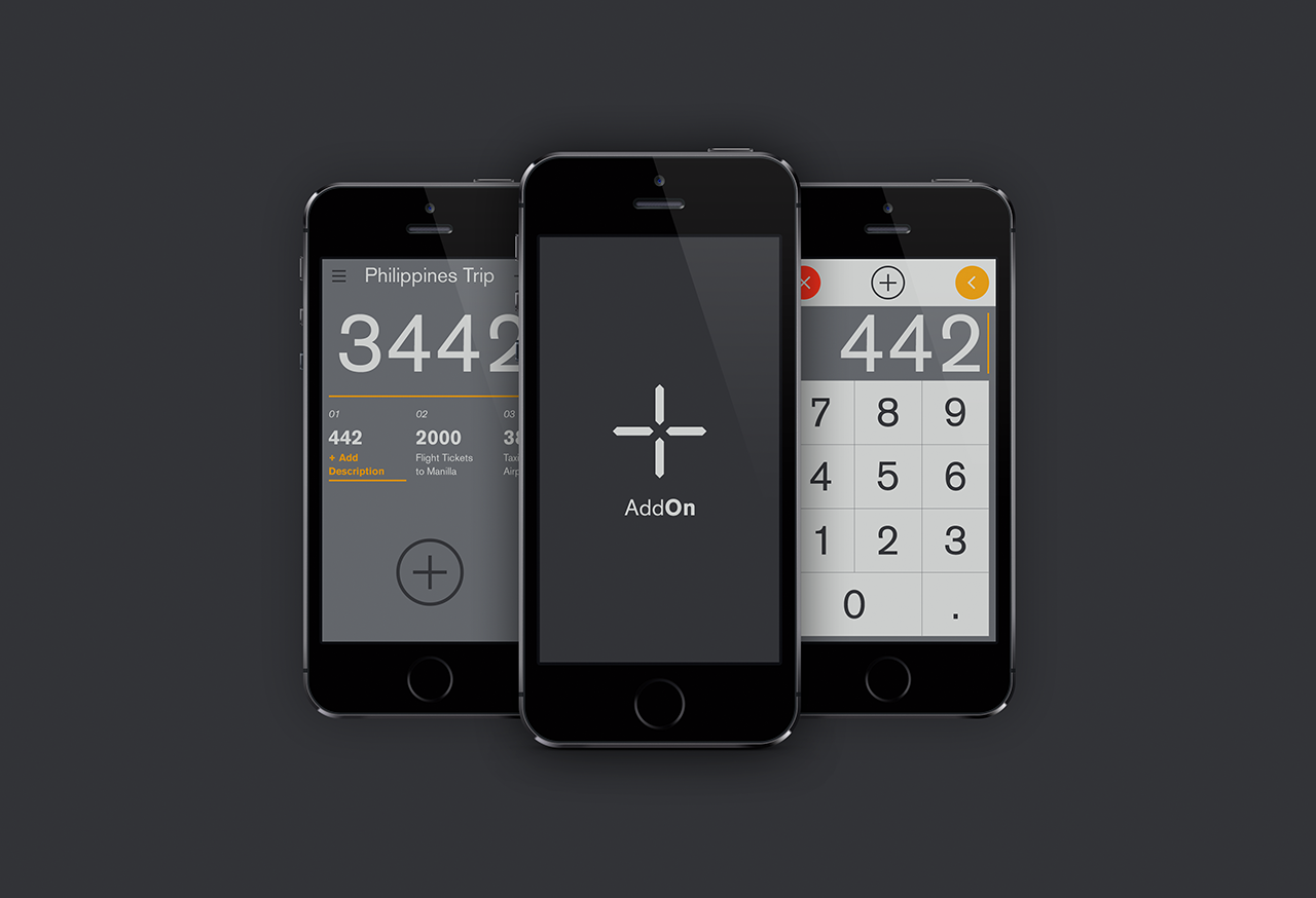
AddOn for numbersUI / UX
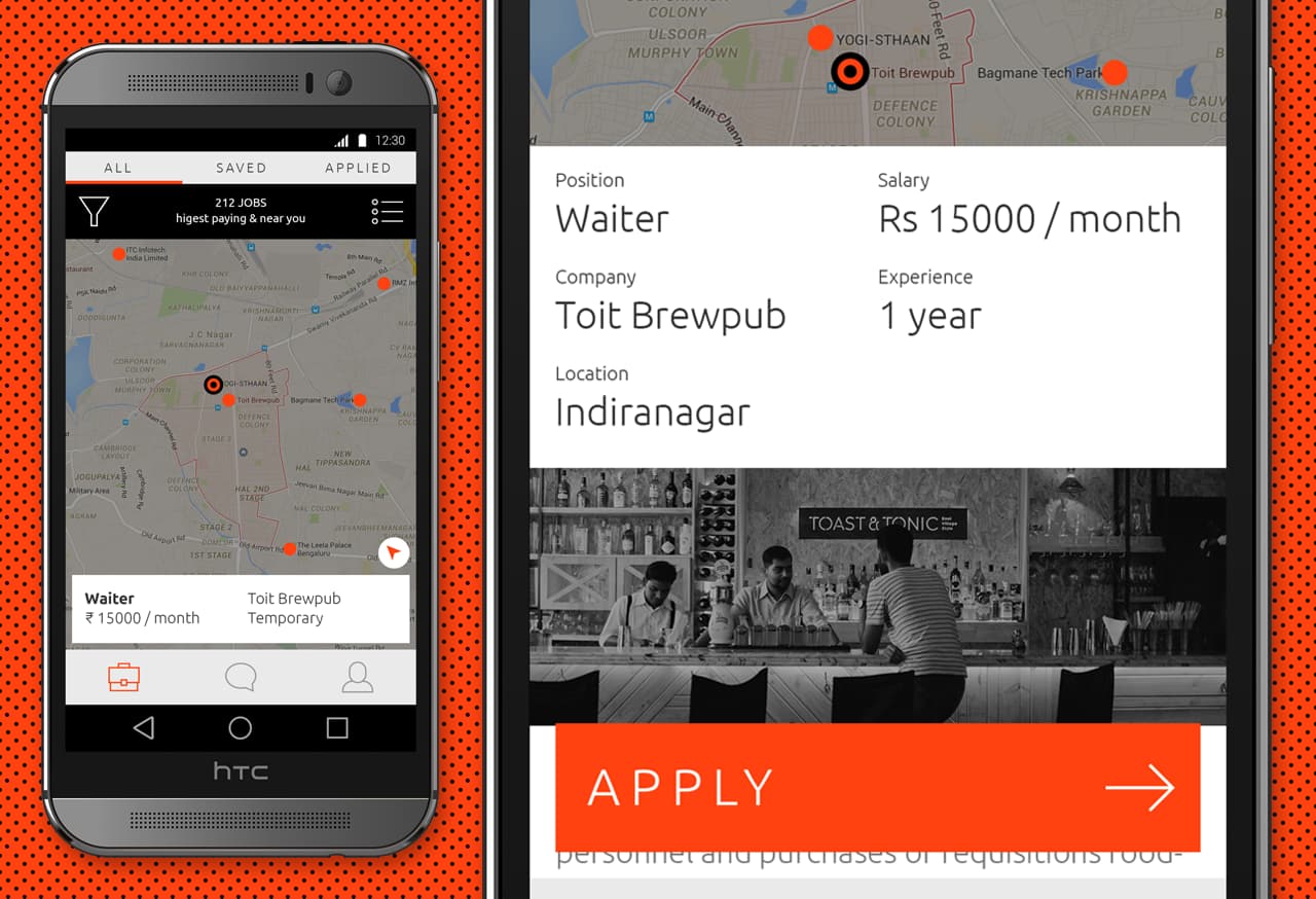
Designing an app for the grey collared job marketProduct Design

Pankaj & Priya wedding collateral designsGraphic Design

The MYLK propaganda designsGraphic Design

LogofolioGraphic Design


