Client: Leadcode
Duration: 3 months, fulltime
Role: Product Designer
Client: Leadcode
Duration: 3 months, fulltime
Role: Product Designer
Client: Leadcode
Duration: 3 months, fulltime
Role: Product Designer
▻
▻
▻
Redesigning a cross platform online advertising yield management application
Redesigning a cross-platform online advertising yield management application
Redesigning a cross-platform online advertising yield management application
Leadcode is an online advertising yield management platform for publishers. The platform lets you create, manage and monitor your campaigns on several places including Outbrain, Taboola, Facebook Ads, Google Adwords and Youtube in one place.
It emerged from one of it’s biggest client’s, Forbes’, need to monitor the performance of its content and it’s own advertising real estate in an buying and selling arbitraged environment.
Some screenshots of the existing app
The Environment
The Environment
The Environment
Leadcode had previously build the backend system required to connect and get different APIs talking to the system. But it was purely an engineering led effort, which meant although the capability to execute a function existed, it could only be operated and understood by a specialist. The UI that was built was essentially some open source programs loosely tied together in an ad-hoc manner, stretched beyond their capabilities.
Leadcode had previously build the backend system required to connect and get different APIs talking to the system. But it was purely an engineering led effort, which meant although the capability to execute a function existed, it could only be operated and understood by a specialist. The UI that was built was essentially some open source programs loosely tied together in an ad-hoc manner, stretched beyond their capabilities.
Leadcode had previously build the backend system required to connect and get different APIs talking to the system. But it was purely an engineering led effort, which meant although the capability to execute a function existed, it could only be operated and understood by a specialist. The UI that was built was essentially some open source programs loosely tied together in an ad-hoc manner, stretched beyond their capabilities.
My Role
My Role
My Role
I was hired by Leadcode to design the platform and untangle the complex engineering to build the first version of the product to attract investment by taking it to the market. I came in to design the UX workflow and architecture of the platform and to finally tie them with a UI for the end user.
I was hired by the head of marketing to be a liaison between the engineering team and the end user. I came in to design the UX workflow and architecture of the platform and to finally tie them with a UI for the end user.
I was hired by the head of marketing to be a liaison between the engineering team and the end user. I came in to design the UX workflow and architecture of the platform and to finally tie them with a UI for the end user.
The Aim
The Aim
The Aim
Leadcode wanted to come out with a platform that they can use within their existing client group and eventually wanted to create a white-label-able product for expanding their reach. The engagement was divided into two phases. The first to design the UX & UI of the product to create a new campaign and the second the UX (including data visualisation) & UI for the dashboard to monitor the performance of the launched campaign.
Leadcode wanted to come out with a platform that they can use within their existing client group and eventually wanted to create a white-label-able product for expanding their reach. The engagement was divided into two phases. The first to design the UX & UI of the product to create a new campaign and the second the UX (including data visualisation) & UI for the dashboard to monitor the performance of the launched campaign.
Leadcode wanted to come out with a platform that they can use within their existing client group and eventually wanted to create a white-label-able product for expanding their reach. The engagement was divided into two phases. The first to design the UX & UI of the product to create a new campaign and the second the UX (including data visualisation) & UI for the dashboard to monitor the performance of the launched campaign.
Challenges
Challenges
Challenges
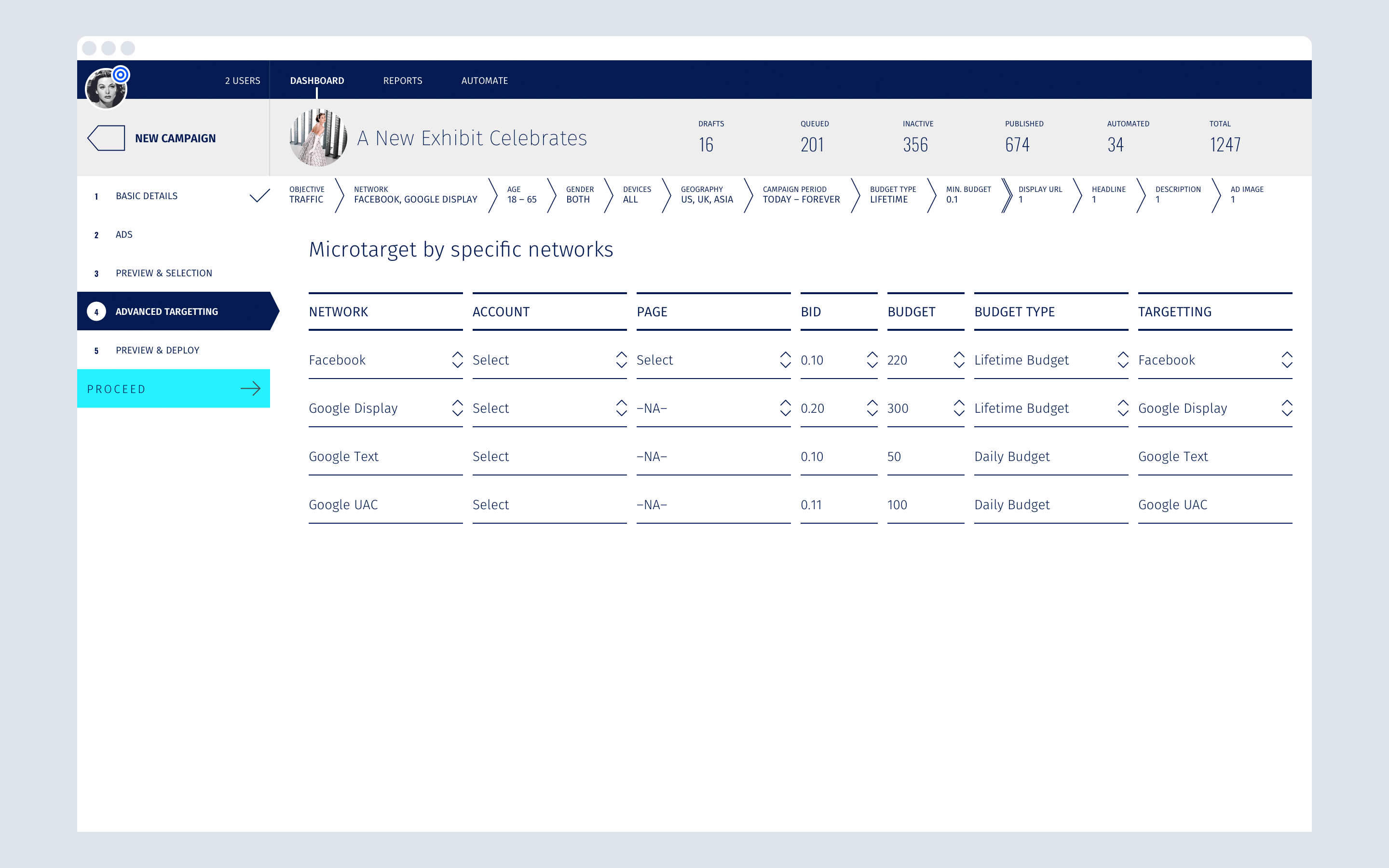
Several areas within the existing app were identified as design challenges within the following flows:
- Campaigns (the workflow to create and launch an advertising campaign)
- Reports (the dashboard to monitor and tweak the performance of a campaign)
- Targeting (a segment created within the campaign flow to manage the target audience of a campaign)
- Automate (the workflow to specify certain measures to be able to let the system achieve conditional automated actions based on rules set for bidding or campaign launches)
- Network (the workflow to manage the platforms on which the campaigns are launched)
The UX Umbrella (Framework) for the app
The UX Umbrella (Framework) for the app
The UX Umbrella (Framework) for the app
It became clear after digging around the system that the heart of the entire product, the property that was being arbitraged, was the articles.
It became clear after digging around the system that the heart of the entire product, the property that was being arbitraged, was the articles.
It became clear after digging around the system that the heart of the entire product, the property that was being arbitraged, was the articles.
The Leadcode UX Umbrella
Keeping the articles at the centre of the framework, enabled all kinds of tasks be performed on them. Then it was just a matter of making certain options be available contextually, which let the full potential of the platform emerge and it also meant that we could keep it relatively future proof.
Keeping the articles at the centre of the framework, enabled all kinds of tasks be performed on them. Then it was just a matter of making certain options be available contextually, which let the full potential of the platform emerge and it also meant that we could keep it relatively future proof.
Keeping the articles at the centre of the framework, enabled all kinds of tasks be performed on them. Then it was just a matter of making certain options be available contextually, which let the full potential of the platform emerge and it also meant that we could keep it relatively future proof.
With the articles view, various tasks like making changes to the campaign, changing the targeting, slicing and dicing information and changing other settings could be accomplished and the same view could stay true for the admin or other users like managers so they could see the activity or generate reports within all articles or each individual one. A floating menu lets you also perform tasks within each selection made contextually, for e.g. a user can create a new campaign or the admin might be able to archive selected campaigns.
With the articles view, various tasks like making changes to the campaign, changing the targeting, slicing and dicing information and changing other settings could be accomplished and the same view could stay true for the admin or other users like managers so they could see the activity or generate reports within all articles or each individual one. A floating menu lets you also perform tasks within each selection made contextually, for e.g. a user can create a new campaign or the admin might be able to archive selected campaigns.
With the articles view, various tasks like making changes to the campaign, changing the targeting, slicing and dicing information and changing other settings could be accomplished and the same view could stay true for the admin or other users like managers so they could see the activity or generate reports within all articles or each individual one. A floating menu lets you also perform tasks within each selection made contextually, for e.g. a user can create a new campaign or the admin might be able to archive selected campaigns.
New Campaign flow
New Campaign flow
New Campaign flow
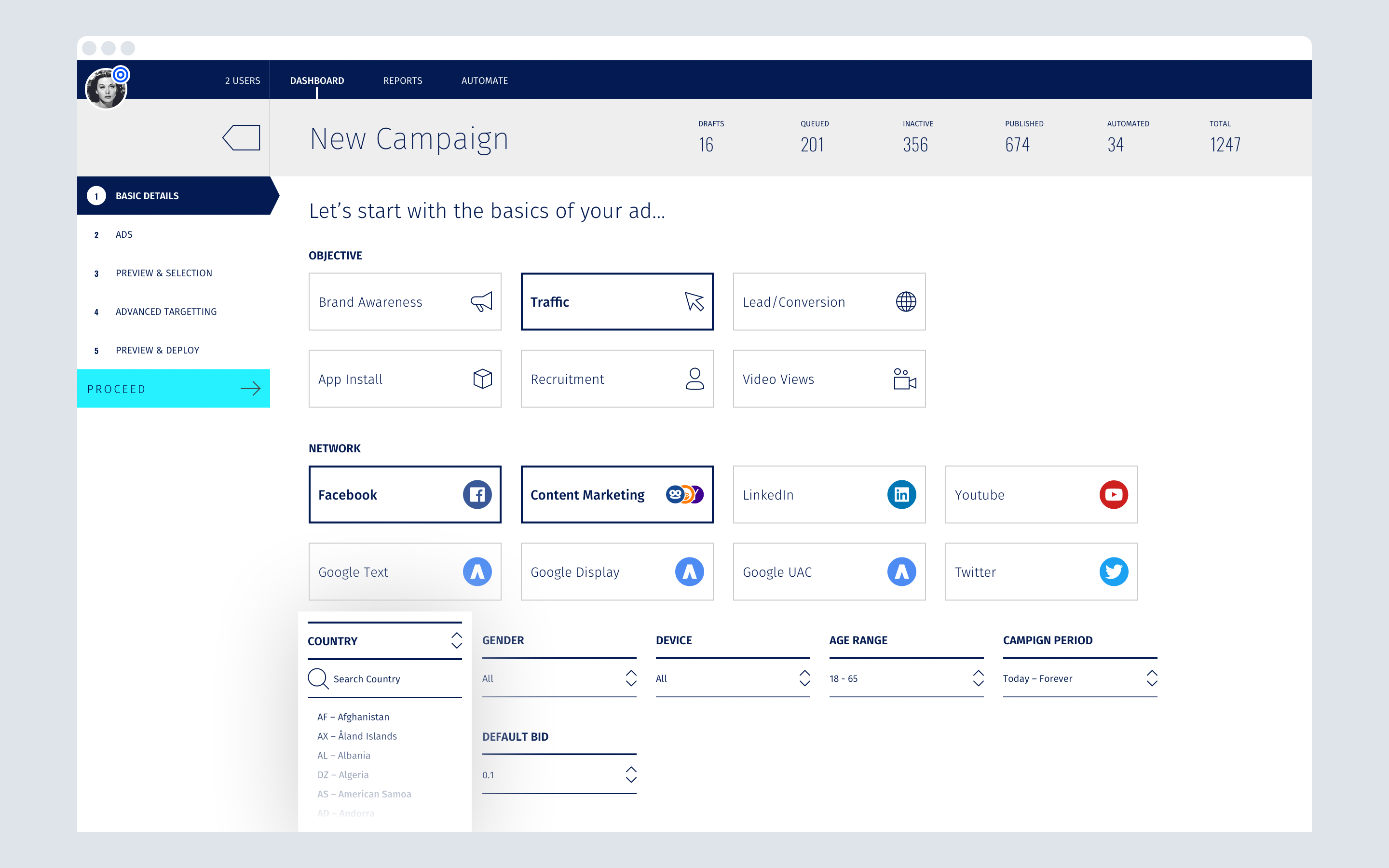
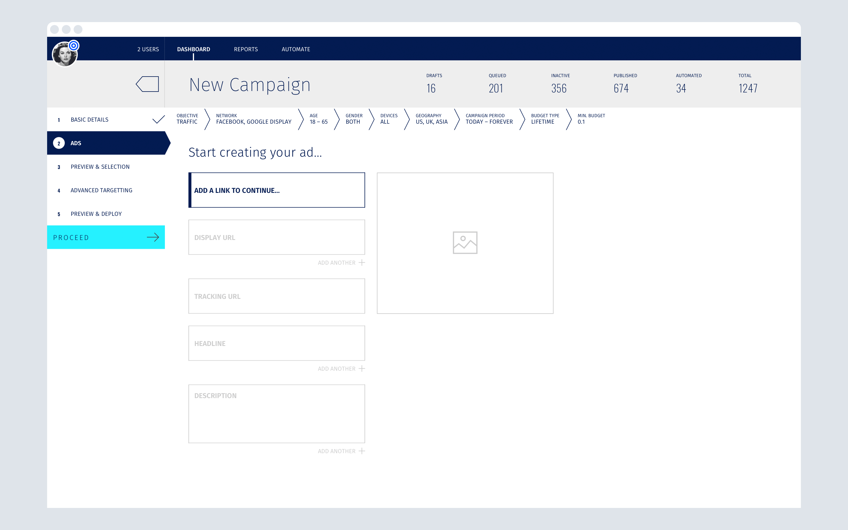
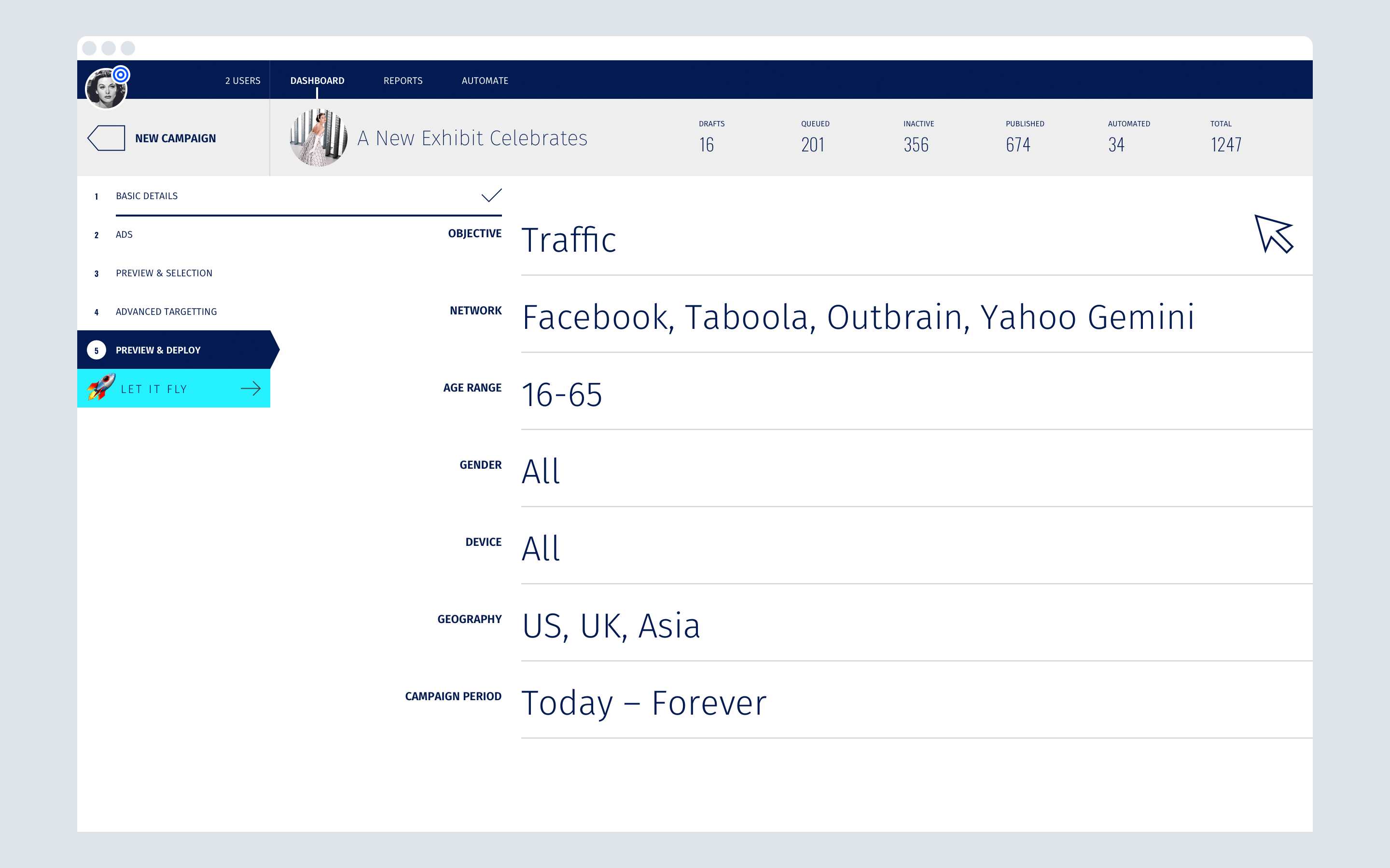
The flow to create a new campaign was directed using a 5W1H approach. A simple wizard guided you from start to finish and was designed to break the flow is smaller and relevant chunks while maintaining a linear flow.
The flow to create a new campaign was directed using a 5W1H approach. A simple wizard guided you from start to finish and was designed to break the flow is smaller and relevant chunks while maintaining a linear flow.
The flow to create a new campaign was directed using a 5W1H approach. A simple wizard guided you from start to finish and was designed to break the flow is smaller and relevant chunks while maintaining a linear flow.
Dashboard
Dashboard
Dashboard
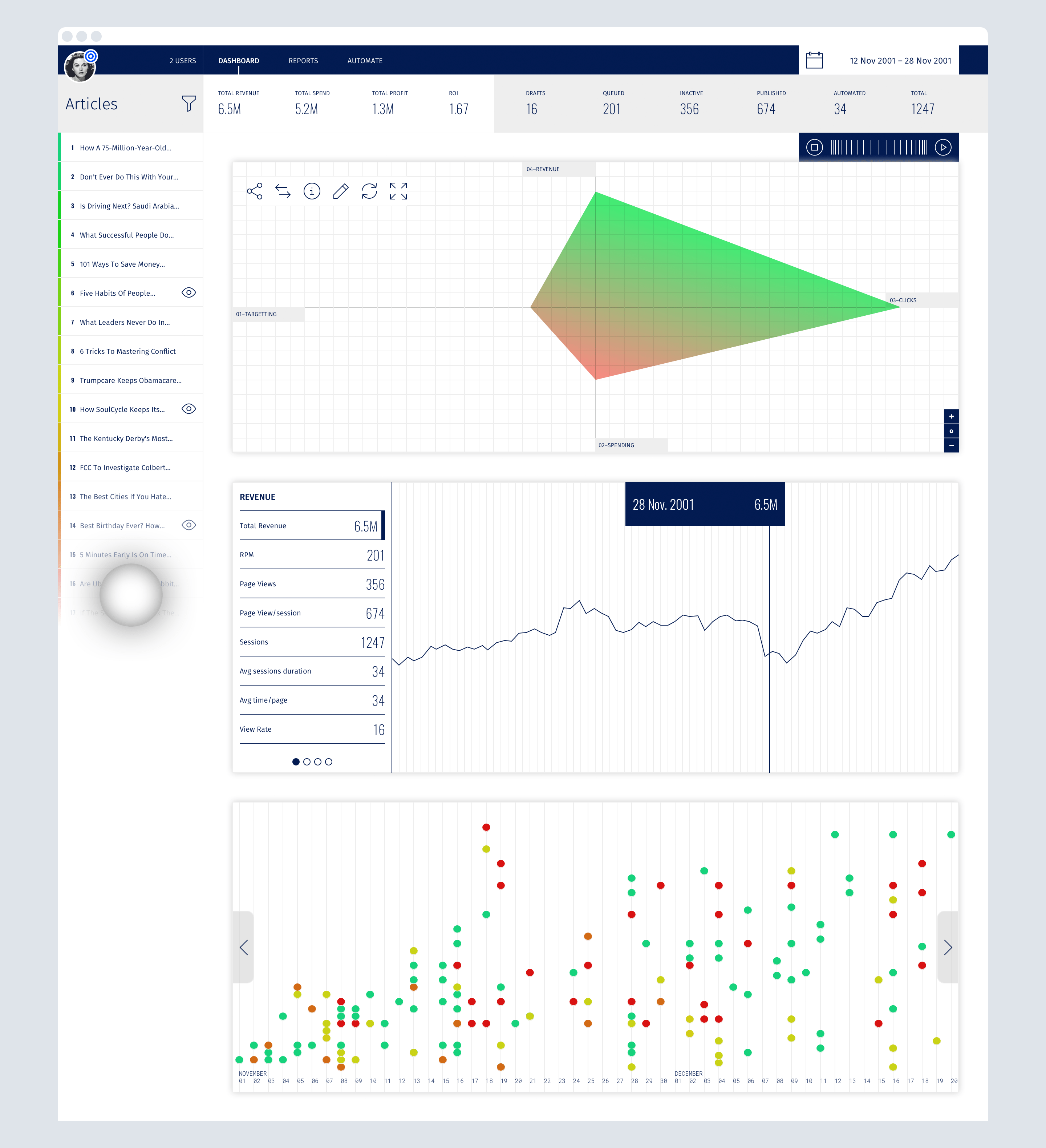
After several iterations on creating a single bird’s-eye view to encompass the graphical representation of the dashboard, we realised it was best plotted in a Versus Graph.
After several iterations on creating a single bird’s-eye view to encompass the graphical representation of the dashboard, we realised it was best plotted in a Versus Graph.
After several iterations on creating a single bird’s-eye view to encompass the graphical representation of the dashboard, we realised it was best plotted in a Versus Graph.
The result was a design that is essentially a dual versus graph. A date stamp along with a time-scroller enabled the user to see how a visual pattern would emerge, which could aid in timely intervention to mitigate risks of poorly performing articles.
The result was a design that is essentially a dual versus graph. A date stamp along with a time-scroller enabled the user to see how a visual pattern would emerge, which could aid in timely intervention to mitigate risks of poorly performing articles.
The result was a design that is essentially a dual versus graph. A date stamp along with a time-scroller enabled the user to see how a visual pattern would emerge, which could aid in timely intervention to mitigate risks of poorly performing articles.
The important information that needed to be understood was the relation between how much was earned vs. how much was spent, and the other was where it was spent (targeting) and how it made any difference (clicks). Hence they were chosen to be the coordinates for the visual bird’s-eye graph.
The important information that needed to be understood was the relation between how much was earned vs. how much was spent, and the other was where it was spent (targeting) and how it made any difference (clicks). Hence they were chosen to be the coordinates for the visual bird’s-eye graph.
The important information that needed to be understood was the relation between how much was earned vs. how much was spent, and the other was where it was spent (targeting) and how it made any difference (clicks). Hence they were chosen to be the coordinates for the visual bird’s-eye graph.
A bar graph for each specific instance and a timeline to plot activity were also shown to get a complete picture.
A bar graph for each specific instance and a timeline to plot activity were also shown to get a complete picture.
A bar graph for each specific instance and a timeline to plot activity were also shown to get a complete picture.
A note on filtering:
A note on filtering:
A note on filtering:
A crucial aspect in considering what information to present is in first understanding who is asking.
A crucial aspect in considering what information to present is in first understanding who is asking.
A crucial aspect in considering what information to present is in first understanding who is asking.
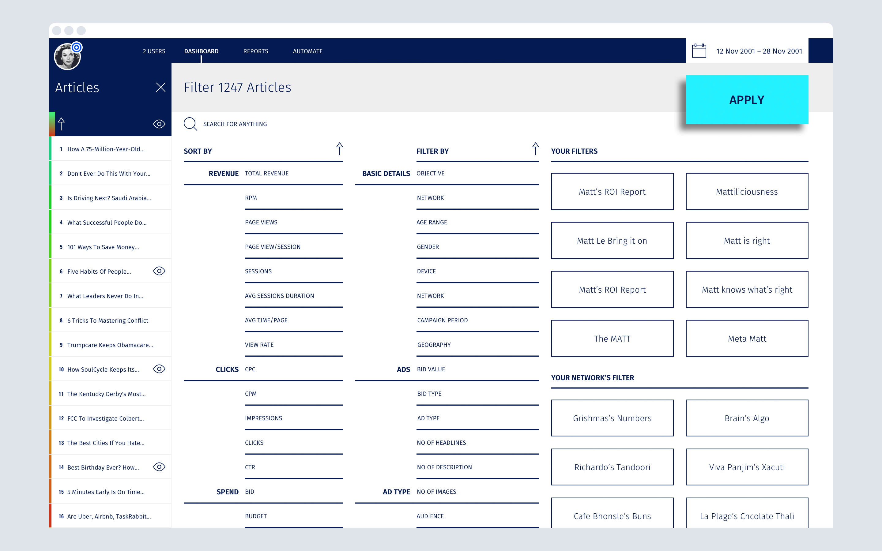
That remains to be true even in a system that has a lot of data and a lot of numbers to process. So besides being able to visually see a piece of data that could be important, I designed the system so even if it’s not visually apparent, it can be made so by digging in to the precise information that needs the right visualisation to reflect the level of attention it may or may not require. A full screen filtering mechanism helped to achieve this goal and quick selections of regularly made filters could be saved and accessed for different users according to what mattered to them.
That remains to be true even in a system that has a lot of data and a lot of numbers to process. So besides being able to visually see a piece of data that could be important, I designed the system so even if it’s not visually apparent, it can be made so by digging in to the precise information that needs the right visualisation to reflect the level of attention it may or may not require. A full screen filtering mechanism helped to achieve this goal and quick selections of regularly made filters could be saved and accessed for different users according to what mattered to them.
That remains to be true even in a system that has a lot of data and a lot of numbers to process. So besides being able to visually see a piece of data that could be important, I designed the system so even if it’s not visually apparent, it can be made so by digging in to the precise information that needs the right visualisation to reflect the level of attention it may or may not require. A full screen filtering mechanism helped to achieve this goal and quick selections of regularly made filters could be saved and accessed for different users according to what mattered to them.
Footnote: The Leadcode project I joined was essentially a working POC in order to be able to go full steam ahead in realising the potential of the platform with potential investors. The project culminated in Leadcode now being a full fledged, operational company working out of a permanent office and a vigorous hiring spree to bring that vision to life.
Footnote: The Leadcode project I joined was essentially a working POC in order to be able to go full steam ahead in realising the potential of the platform with potential investors. The project culminated in Leadcode now being a full fledged, operational company working out of a permanent office and a vigorous hiring spree to bring that vision to life.
Footnote: The Leadcode project I joined was essentially a working POC in order to be able to go full steam ahead in realising the potential of the platform with potential investors. The project culminated in Leadcode now being a full fledged, operational company working out of a permanent office and a vigorous hiring spree to bring that vision to life.
Other Projects

CAP table @ DealstackProduct Design
Redesigning a news aggregator tool @ PreqinProduct design
Various design works and thought leadership @ BeaconProduct Design & leadership

Document sharing workflow @ DealstackProduct Design

Tap Tap SignupUI + UX

Design systems design @ PreqinProduct Design

Repositioning by rebranding: the Moonraft brand storyProduct Design
SurePeople Proper HamburgerUI + UX

2018 CalendarGraphic Design
Rejected Web DesignsWeb Design
LogofolioGraphic Design
AddOn for numbersUI / UX
Designing an app for the grey collared job marketProduct Design

Pankaj & Priya wedding collateral designsGraphic Design

The MYLK propaganda designsGraphic Design

LogofolioGraphic Design


