Beacon
Role: Principal Product Designer
Client: LeaderAmp
Duration: 6 months
Role: Product Designer
Client: LeaderAmp
Duration: 6 months
Role: Product Designer
📦
Various design works and thought leadership @ Beacon
Redesigning an enterprise leadership coaching application
Redesigning an enterprise leadership coaching application
Beacon is a freight forwarding business with the ambition of becoming an end-to-end SAAS product for booking, managing and tracking your shipments using ocean, road and sea freight. It was also looking to validate business in inventory ordering (the leg before it needs to be in cargo) and last-mile delivery (the leg after the cargo disembarks at the final port) to the warehouse.
I joined Beacon when we were still figuring out product-market fit and in the run-up to delivering our first MLP (Minimum Lovable Product). During this phase, we also wanted to validate many other business assumptions and grow the product in the most meaningful direction – all amidst the outbreak of the COVID pandemic, the highest recorded prices for freight booking and a very interesting traffic jam that made the shipping and freight industry a very exciting time to be part of!
Below is a collection of work I did at Beacon as one of the two principal product designers there. As a principal we wore many hats and the nature of the work within the entire design function was gauged and measured by sensing the pulse of the need of the hour. We often flexed between delivering work as part of various teams, unblocking teams with design and delivery, conducting workshops, presenting high-level concepts to leadership, hands-on delivery, designing and maintaining the design system, conducting team rituals and onboarding (and reboarding) designers.
LeaderAmp is an enterprise software that aims to enhance the performance of leadership teams in large organisations. It was founded by organisational psychologist Dr Matt Barney PhD based on academic work and experience of training leaders with an Olympic-style results-driven coaching approach.
LeaderAmp is an enterprise software that aims to enhance the performance of leadership teams in large organisations. It was founded by organisational psychologist Dr Matt Barney PhD based on academic work and experience of training leaders with an Olympic-style results-driven coaching approach.
Business validation and concept development presentations on thinking about 'automation for customers'
Assessment
Assessment
Disruption management using automation
Assessment
Assessment
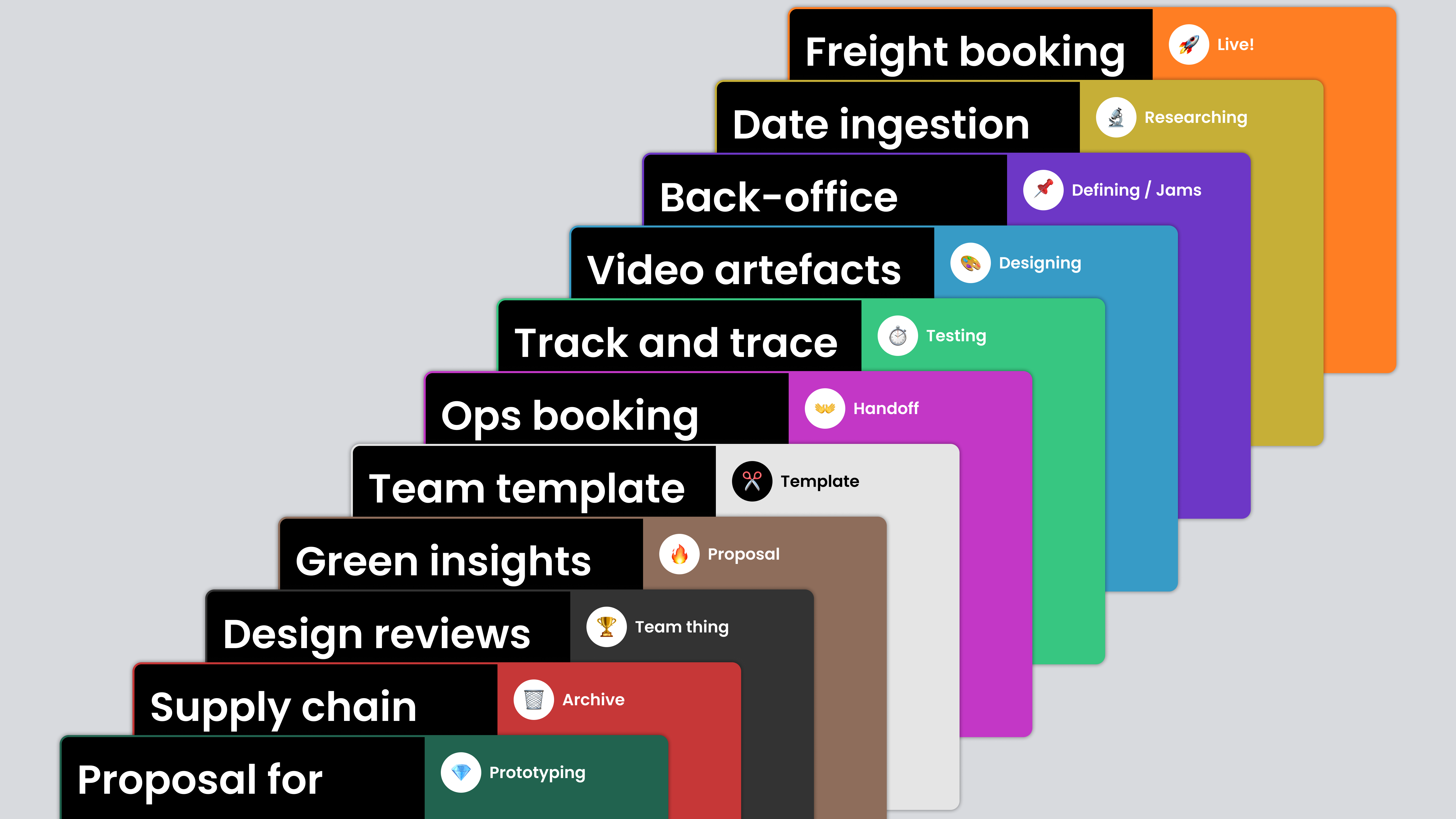
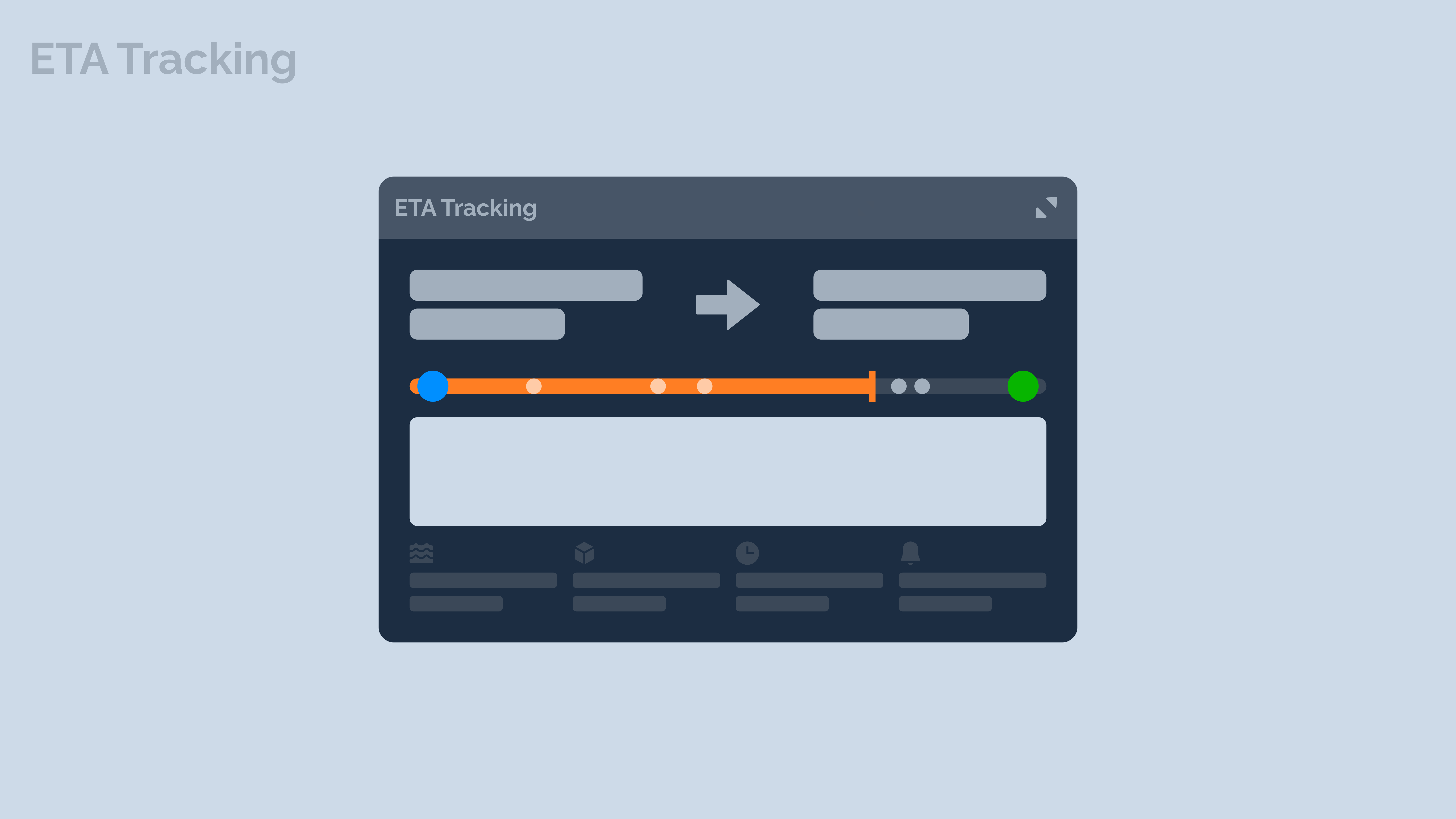
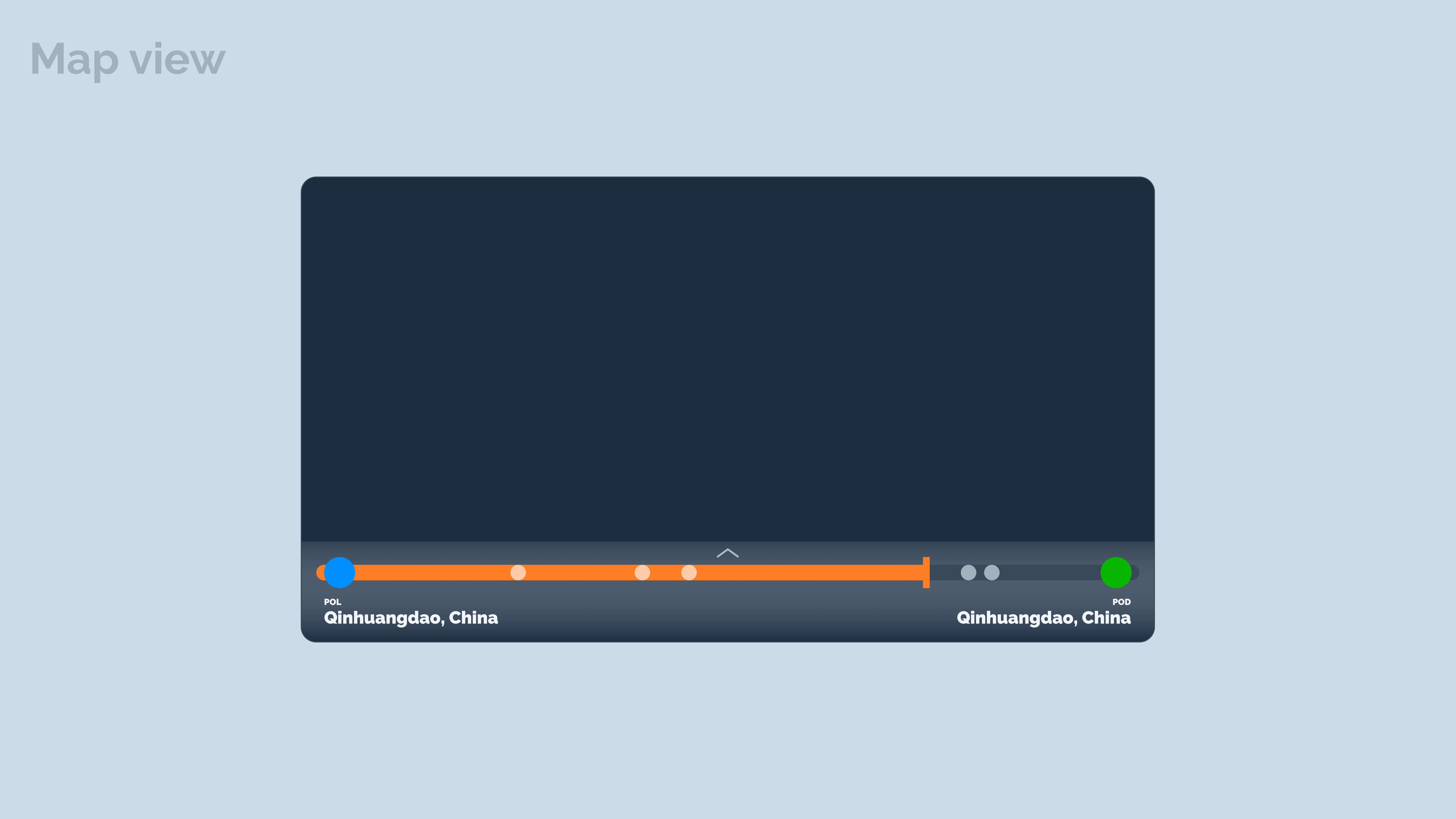
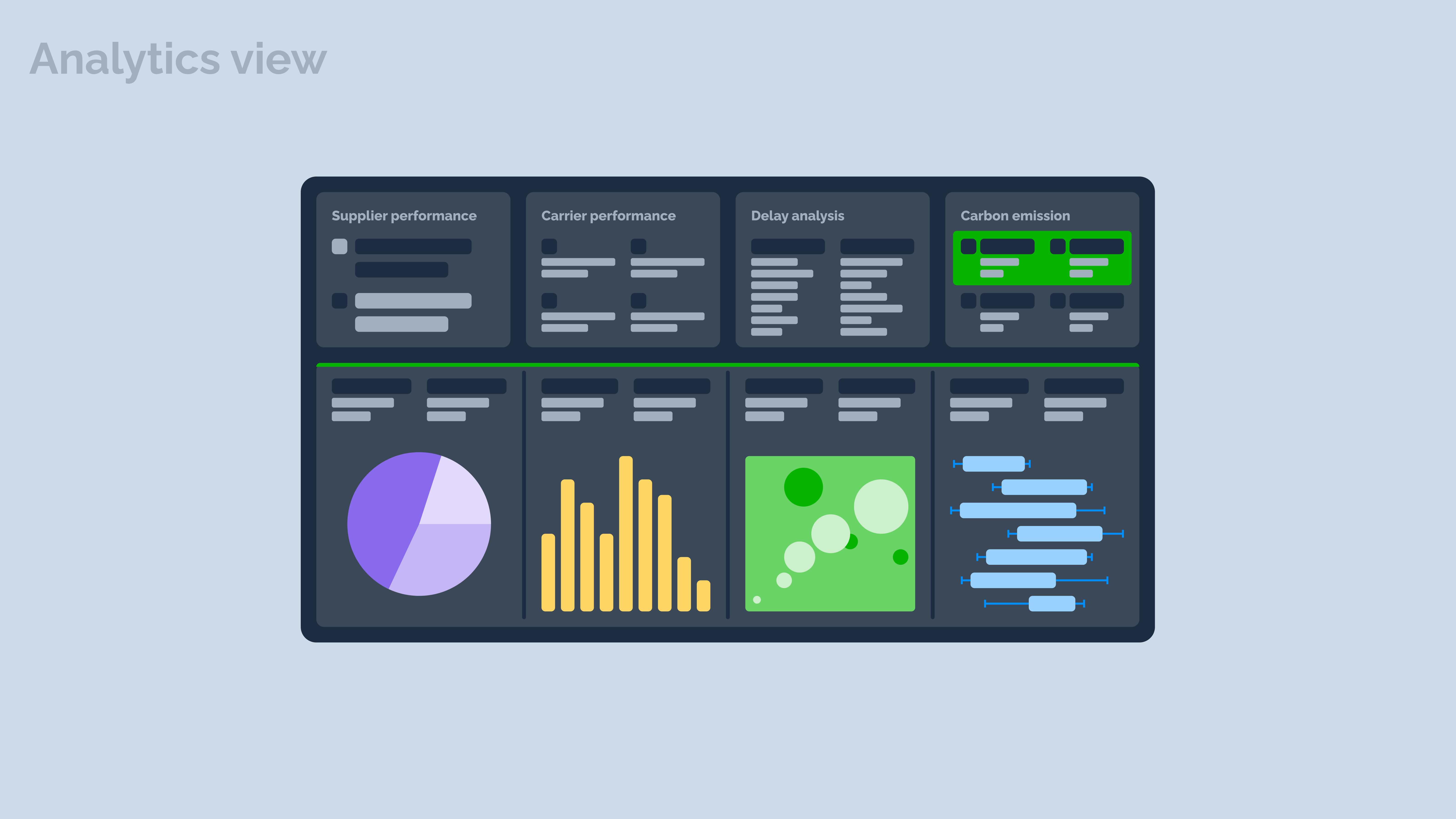
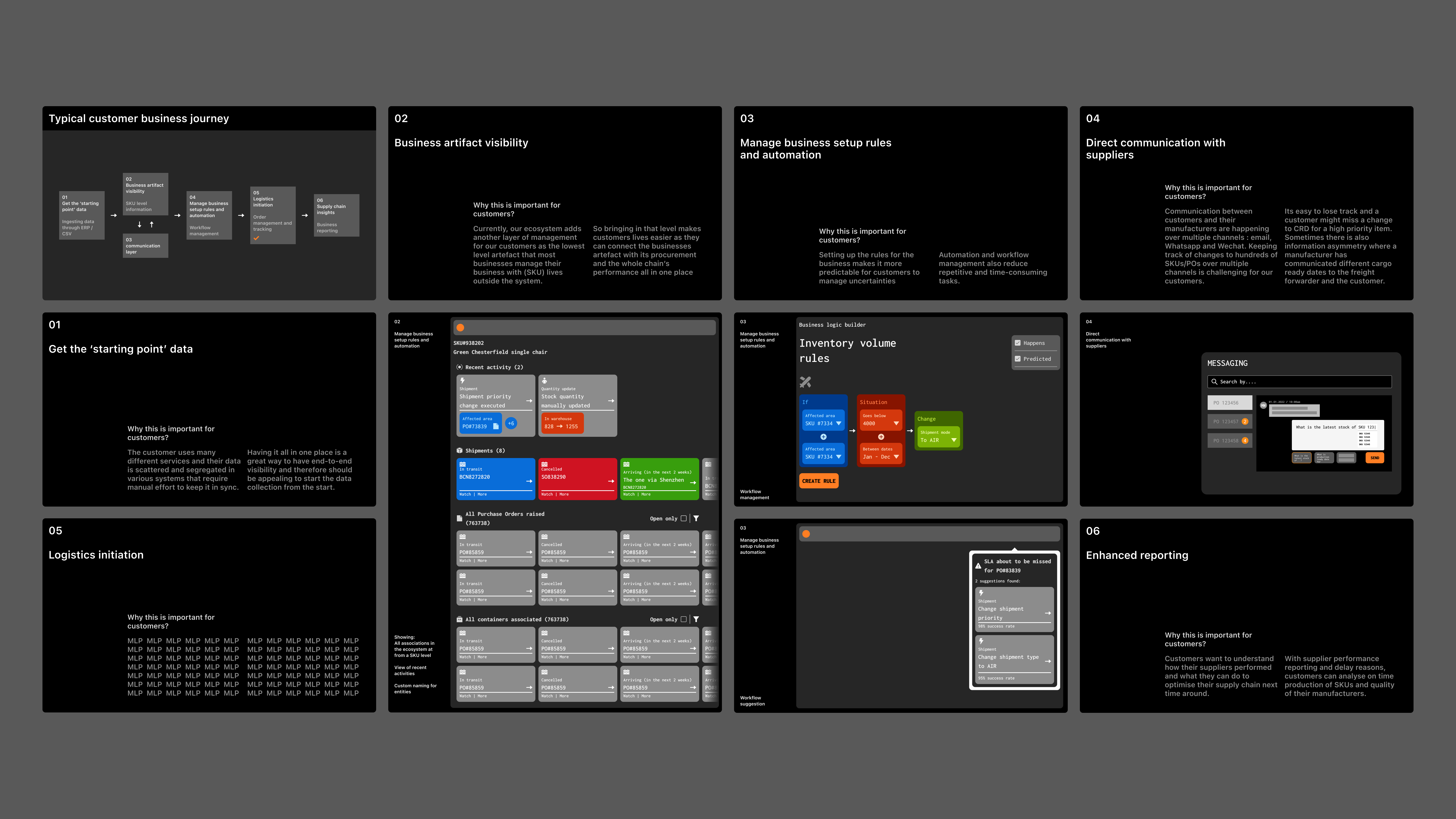
Delayed inventory is the costliest aspect of managing a business that relies on the procurement of goods. To manage this, Beacon's existing and prospective clients use several different systems and rarely embedded technology to handle delays caused by disruption. One of the autonomous teams at Beacon wanted to make a business case for this and we went about exploring the space.
We designed and presented numerous concepts and after a period of sort testing learned that the route to the market wasn't as straightforward, so we descoped our inkling and parked it up for later.
Before the user started the assessment, they took a Likert Scale questionnaire to calibrate the app. The new calibration screen adopted the same design language as the assessment itself, to get the user accustomed to it before they began the test.
Before the user started the assessment, they took a Likert Scale questionnaire to calibrate the app. The new calibration screen adopted the same design language as the assessment itself, to get the user accustomed to it before they began the test.
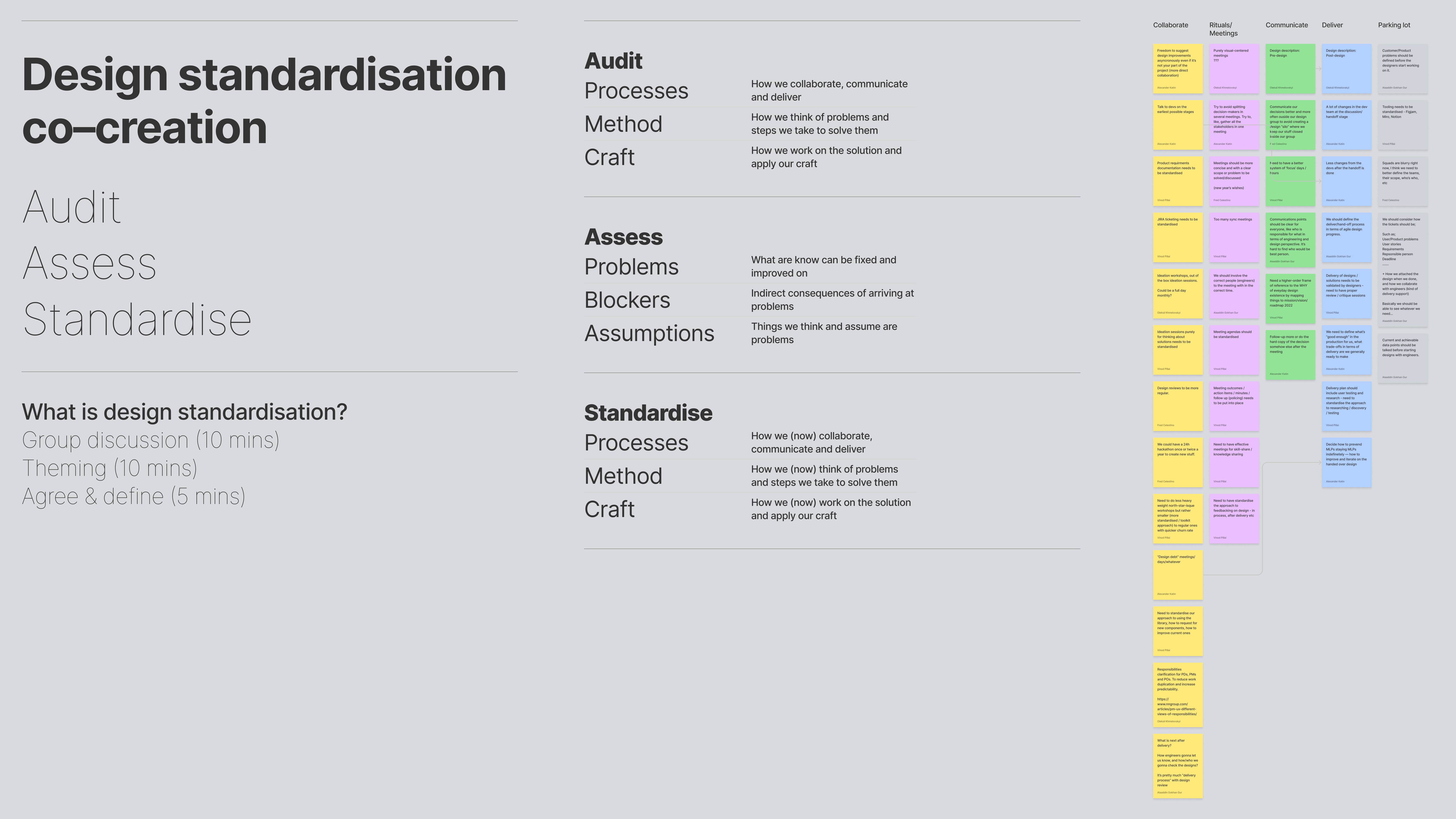
Operationalisation of the design function using several workshops and activities – some recurring, some one-offs
Assessment
Assessment
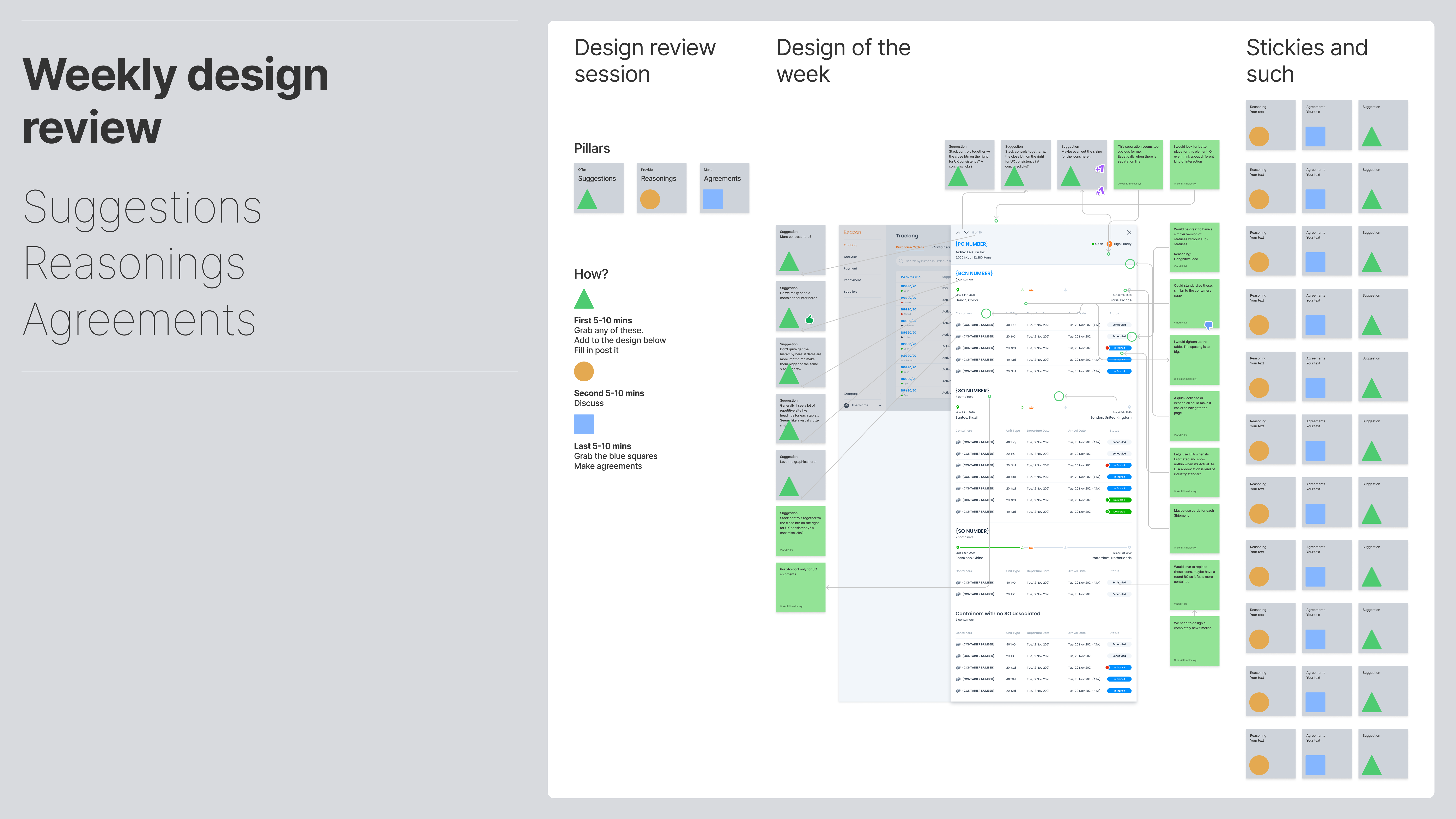
Design feedbacks, workshops and co-creation sessions
Assessment
Assessment
We grew the design function to have a 10+ team and soon we need to put a lot of things in place to allow for our 'whys and how' to be the backbone of 'design @ Beacon'. We wanted the rituals to be meanigful, timely and at minimal so we had some penceled in to allow for things like design consistency to be met while others, we had the overarching purpose definied and the rituals could be decided based on the need.
Before the user started the assessment, they took a Likert Scale questionnaire to calibrate the app. The new calibration screen adopted the same design language as the assessment itself, to get the user accustomed to it before they began the test.
Before the user started the assessment, they took a Likert Scale questionnaire to calibrate the app. The new calibration screen adopted the same design language as the assessment itself, to get the user accustomed to it before they began the test.
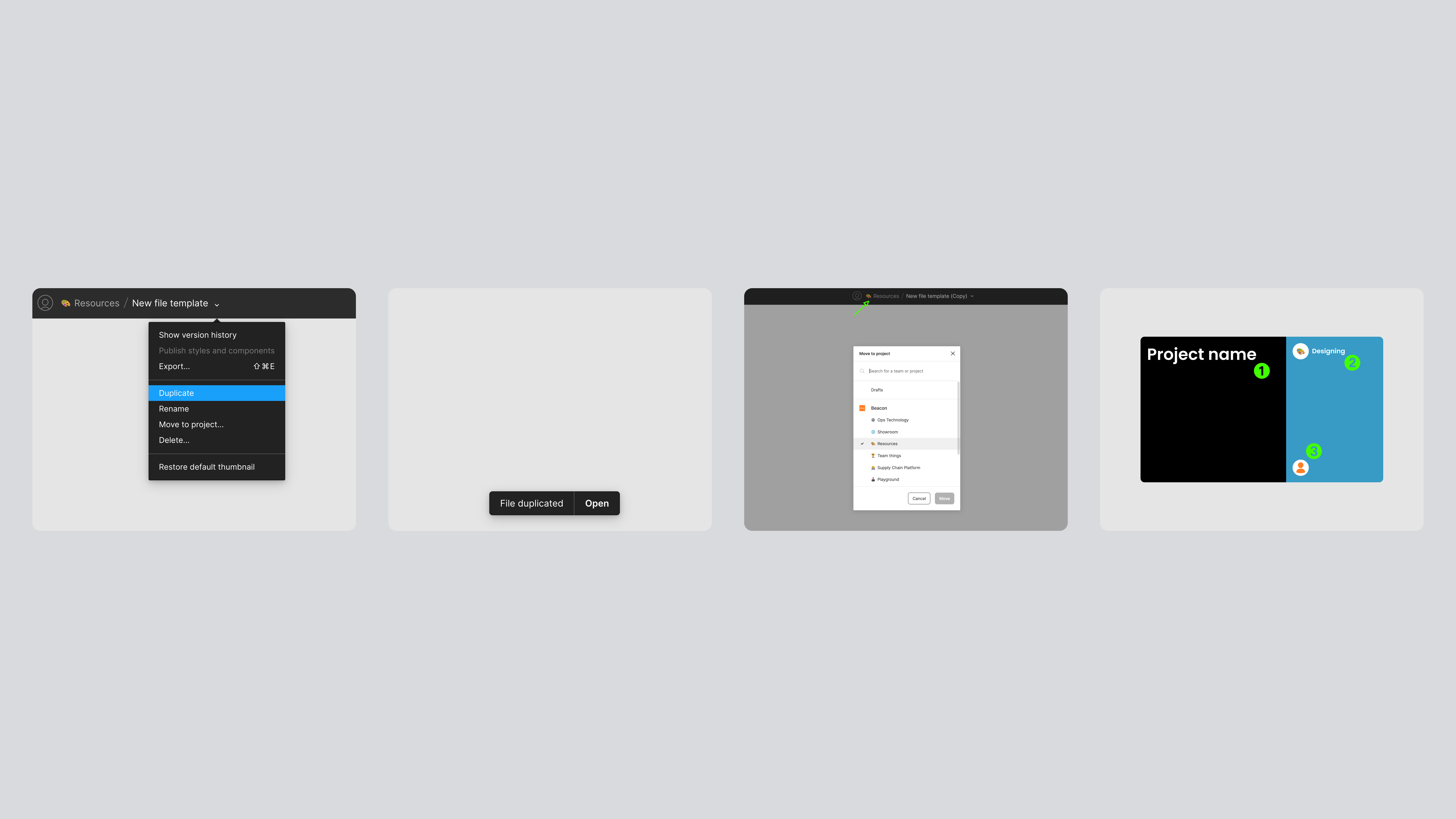
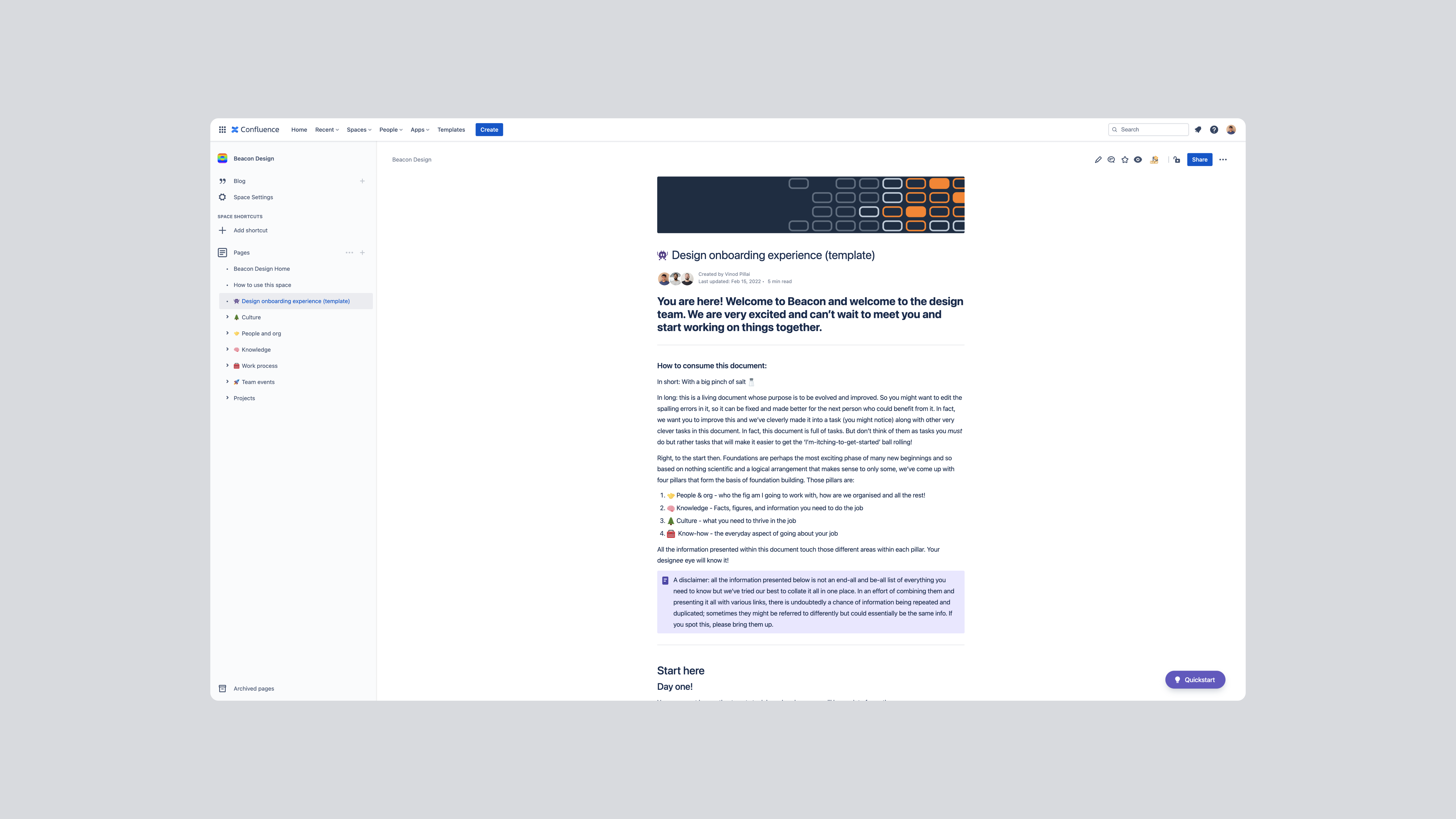
Writing guides and documentation to make it easier for new joiners to get unstuck
Assessment
Assessment
Onboarding and reboarding
Assessment
Assessment
Onboarding new designers was also part of the 'operationalising design' exercise but often times new things that get added into the new-joiners pack get missed out by those who already have been there for a while. To solve for this, we deligently tracked some of these things across the organisation and made sure there were 'reboarding' sessions for existing designers that would keep everyone at the same level of company knowledge
Before the user started the assessment, they took a Likert Scale questionnaire to calibrate the app. The new calibration screen adopted the same design language as the assessment itself, to get the user accustomed to it before they began the test.
Before the user started the assessment, they took a Likert Scale questionnaire to calibrate the app. The new calibration screen adopted the same design language as the assessment itself, to get the user accustomed to it before they began the test.
UI graphics for video explainers, marketing and client presentations
Assessment
Assessment
Graphics, mocks and all
Assessment
Assessment
Wearing many hats involved jumping between many different things that needed 'design attention'. Sometimes it was some quick fixes,, sometimes it would mean working with an external agency who were helping us create video explainers and yet other times it could be working on a client demo or external presentation.
Before the user started the assessment, they took a Likert Scale questionnaire to calibrate the app. The new calibration screen adopted the same design language as the assessment itself, to get the user accustomed to it before they began the test.
Before the user started the assessment, they took a Likert Scale questionnaire to calibrate the app. The new calibration screen adopted the same design language as the assessment itself, to get the user accustomed to it before they began the test.
More to come... (last updated 16 Feb 2024)
Footnote: LeaderAmp was designed in August 2016 and development work happened in parallel. The app went live in the Android Play Store and the Apple App Store. Some content has since been modified including LeaderAmp’s logo.
Footnote: LeaderAmp was designed in August 2016 and development work happened in parallel. The app went live in the Android Play Store and the Apple App Store. Some content has since been modified including LeaderAmp’s logo.
Other Projects

CAP table @ DealstackProduct Design
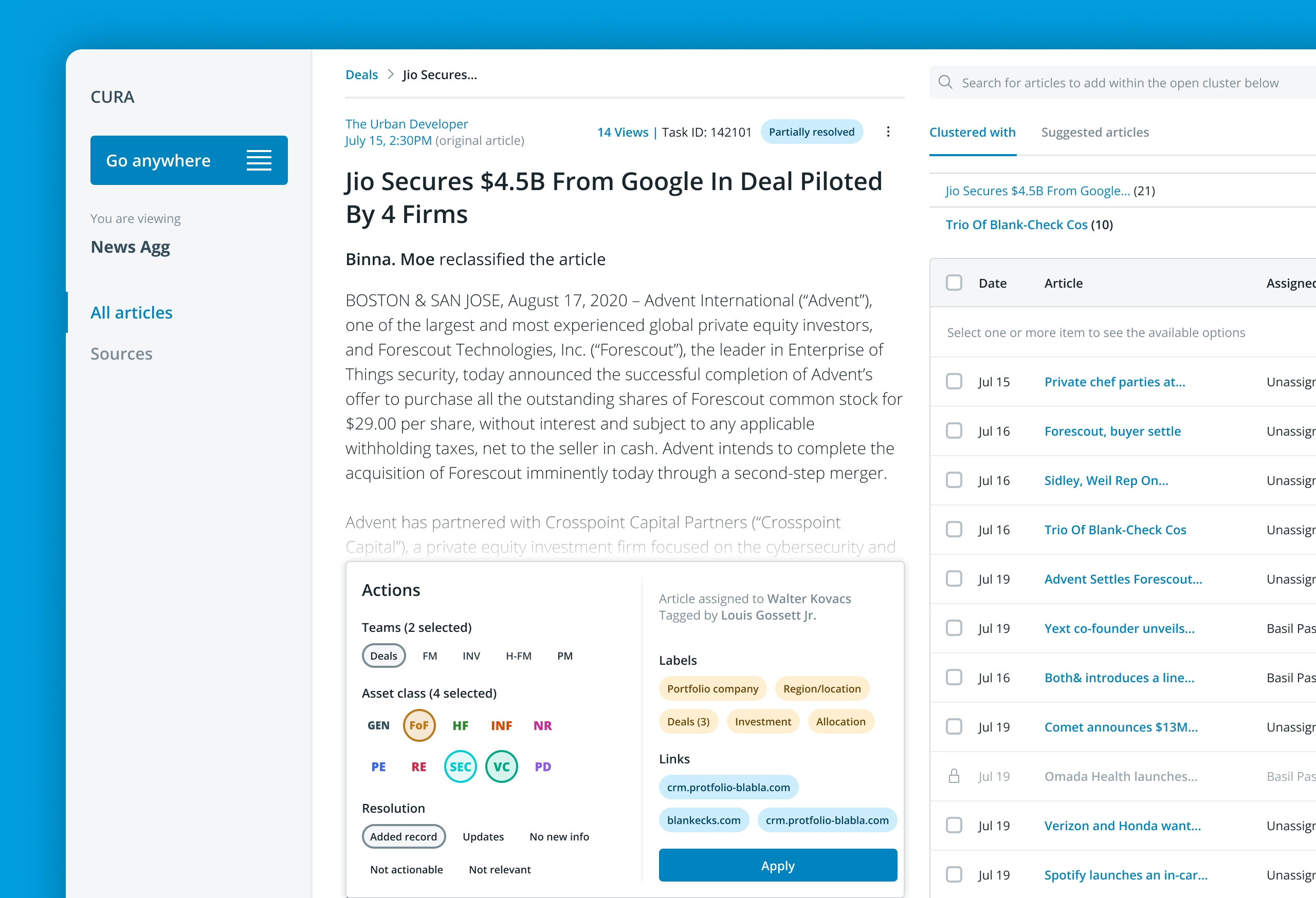
Redesigning a news aggregator tool @ PreqinProduct design

Document sharing workflow @ DealstackProduct Design

Tap Tap SignupUI + UX

Design systems design @ PreqinProduct Design

Repositioning by rebranding: the Moonraft brand storyProduct Design

SurePeople Proper HamburgerUI + UX

2018 CalendarGraphic Design
Rejected Web DesignsWeb Design

LogofolioGraphic Design
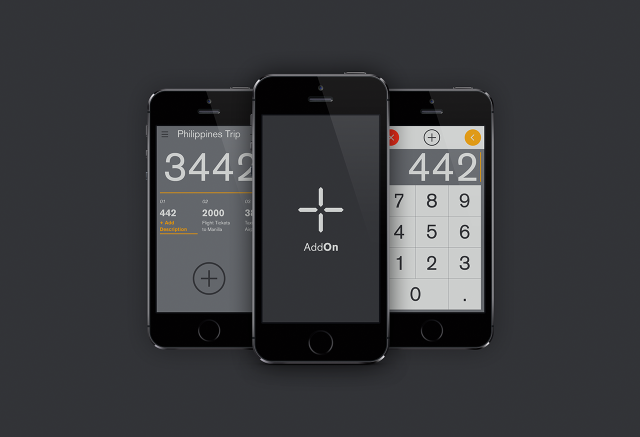
AddOn for numbersUI / UX
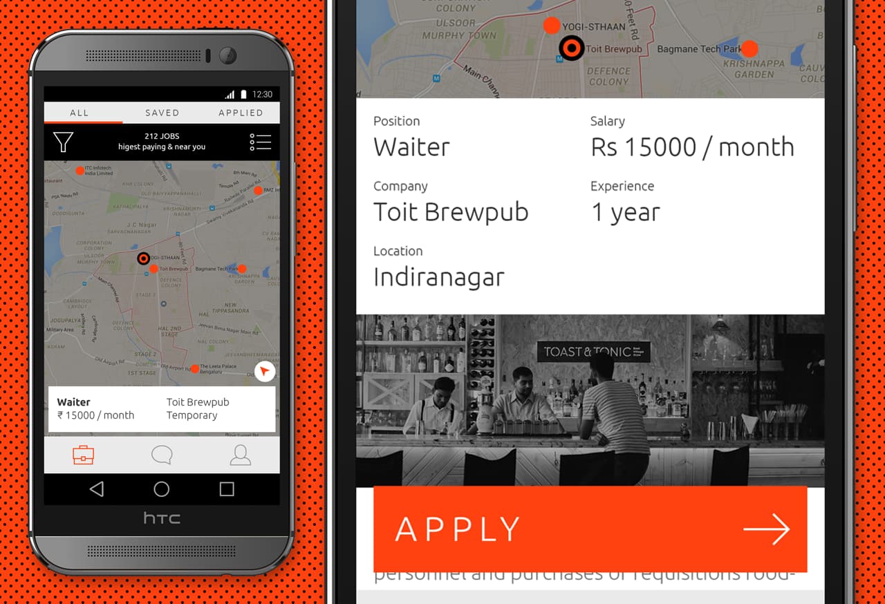
Designing an app for the grey collared job marketProduct Design

Pankaj & Priya wedding collateral designsGraphic Design

The MYLK propaganda designsGraphic Design

LogofolioGraphic Design

