Role: Design Lead
2012 – 2016
Role: Design Lead
2012 – 2016
Role: Design Lead
2012 – 2016
|
|
|
Repositioning by rebranding: the Moonraft brand story
Repositioning by rebranding: the Moonraft brand story
Repositioning by rebranding: the Moonraft brand story
Moonraft is a design services studio with offices in Bangalore and Seattle working with clients in over 30 locations worldwide with an ever-growing team of 100 plus people dedicated to making the next big leap in the next big design thing!
Moonraft is a design services studio with offices in Bangalore and Seattle working with clients in over 30 locations worldwide with an ever-growing team of 100 plus people dedicated to making the next big leap in the next big design thing!
Moonraft is a design services studio with offices in Bangalore and Seattle working with clients in over 30 locations worldwide with an ever-growing team of 100 plus people dedicated to making the next big leap in the next big design thing!
From the beginning one thing that Moonraft has always stood for is it being “A raft to go beyond”. That philosophy has internally always remained intact. The manner in which the company has grown has needed it to take new forms and shapes and has realigned and repositioned itself to continually adapt to market needs without changing the internal guiding motto.
From the beginning one thing that Moonraft has always stood for is it being “A raft to go beyond”. That philosophy has internally always remained intact. The manner in which the company has grown has needed it to take new forms and shapes and has realigned and repositioned itself to continually adapt to market needs without changing the internal guiding motto.
From the beginning one thing that Moonraft has always stood for is it being “A raft to go beyond”. That philosophy has internally always remained intact. The manner in which the company has grown has needed it to take new forms and shapes and has realigned and repositioned itself to continually adapt to market needs without changing the internal guiding motto.
My Role
My Role
My Role
Since joining in 2012, apart from working with clients on UI/UX projects with emphasis on Visual Design, a lot of my focus has been on working within the organization on branding, processes, mentoring freshers, guiding project teams, working on in-house products, internal positioning and generally keeping check on what was forming to be a very unique Moonraft story. The following is a series of work I’ve done from 2012–2016 in adding to what is now still “A raft to go beyond”
Since joining in 2012, apart from working with clients on UI/UX projects with emphasis on Visual Design, a lot of my focus has been on working within the organization on branding, processes, mentoring freshers, guiding project teams, working on in-house products, internal positioning and generally keeping check on what was forming to be a very unique Moonraft story. The following is a series of work I’ve done from 2012–2016 in adding to what is now still “A raft to go beyond”
Since joining in 2012, apart from working with clients on UI/UX projects with emphasis on Visual Design, a lot of my focus has been on working within the organization on branding, processes, mentoring freshers, guiding project teams, working on in-house products, internal positioning and generally keeping check on what was forming to be a very unique Moonraft story. The following is a series of work I’ve done from 2012–2016 in adding to what is now still “A raft to go beyond”
For the sake of convenience, I’m going to take the timeline approach to show the nature of evolution and the thinking gone at various stages through those time periods.
For the sake of convenience, I’m going to take the timeline approach to show the nature of evolution and the thinking gone at various stages through those time periods.
For the sake of convenience, I’m going to take the timeline approach to show the nature of evolution and the thinking gone at various stages through those time periods.

The original Moonraft logo, designed in 2008 by Archana Sreenivasan
|
|
|
2008
Moonraft Innovation Labs Private Limited is formed.
Moonraft Innovation Labs Private Limited is formed.
Moonraft Innovation Labs Private Limited is formed.
|
2012
2012
2012
Not broken, fix not!
Not broken, fix not!
Not broken, fix not!
I joined Moonraft in May 2012. We were around 30 Rafters (tribe of the Raft) then, with a handful of clients and just one location. Most of that year I spent on client projects here and there. I made funny posters fittingly made to describe our CEO’s state of mind at times and bunch of other things on the side. We as a company started growing fast and beginning to work with bigger clients. We had formed a Labs division. With the team size being small and it mostly being dedicated to client projects, we hadn’t begun to see it to be necessary to change anything about the brand to reposition it. There is a golden truth in recognising the value of a brand by not fixing it if isn’t broken.
I joined Moonraft in May 2012. We were around 30 Rafters (tribe of the Raft) then, with a handful of clients and just one location. Most of that year I spent on client projects here and there. I made funny posters fittingly made to describe our CEO’s state of mind at times and bunch of other things on the side. We as a company started growing fast and beginning to work with bigger clients. We had formed a Labs division. With the team size being small and it mostly being dedicated to client projects, we hadn’t begun to see it to be necessary to change anything about the brand to reposition it. There is a golden truth in recognising the value of a brand by not fixing it if isn’t broken.
I joined Moonraft in May 2012. We were around 30 Rafters (tribe of the Raft) then, with a handful of clients and just one location. Most of that year I spent on client projects here and there. I made funny posters fittingly made to describe our CEO’s state of mind at times and bunch of other things on the side. We as a company started growing fast and beginning to work with bigger clients. We had formed a Labs division. With the team size being small and it mostly being dedicated to client projects, we hadn’t begun to see it to be necessary to change anything about the brand to reposition it. There is a golden truth in recognising the value of a brand by not fixing it if isn’t broken.
|
2013
Focus internally, to build the repositioning from inside out.
Focus internally, to build the repositioning from inside out.
Focus internally, to build the repositioning from inside out.
We had a burning desire to grow and do more and be focussed in achieving those things. That year a lot of focus was on realigning the thinking by bombarding messages on mail chains, running workshops and running a lot of propaganda by printing tees, posters and all of that. I designed the posters, helped run a lot of design workshops and the process in which we ran projects.
Posters are a very important cultural representation of what lies deep within a company’s beliefs. They don’t necessarily need to be designed and printed internally, but walls can communicate an important idea - even if it is about communicating the greatness that lies in their inexistence.
This internal focus resulted in a series of regular events like TGIF’s (internal Friday status update of everything going on in the company, including finances, prospective new clients, upcoming sales targets, all in true info-open-to-all Moonraft style), On Design (design workshops), Moonblasts (Internal Moonraft organized parties), Raftburg (Internal hackathons) and so on.
We had a burning desire to grow and do more and be more focussed in achieving those things. That year a lot of focus was on realigning the thinking by bombarding messages on mail chains, running workshops and running a lot of propaganda by printing tees, posters and all of that. I designed the posters, helped run a lot of design workshops and the process in which we ran projects.
Posters are a very important cultural representation of what lies deep within a company’s beliefs. They don’t necessarily need to be designed and printed internally, but walls can communicate an important idea - even if it is about communicating the greatness that lies in their non existence.
This internal focus resulted in a series of regular events like TGIF’s (internal Friday status update of everything going on in the company, including finances, prospective new clients, upcoming sales targets, all in true info-open-to-all Moonraft style), On Design (design workshops), Moonblasts (Internal Moonraft organized parties), Raftburg (Internal hackathons) and so on.

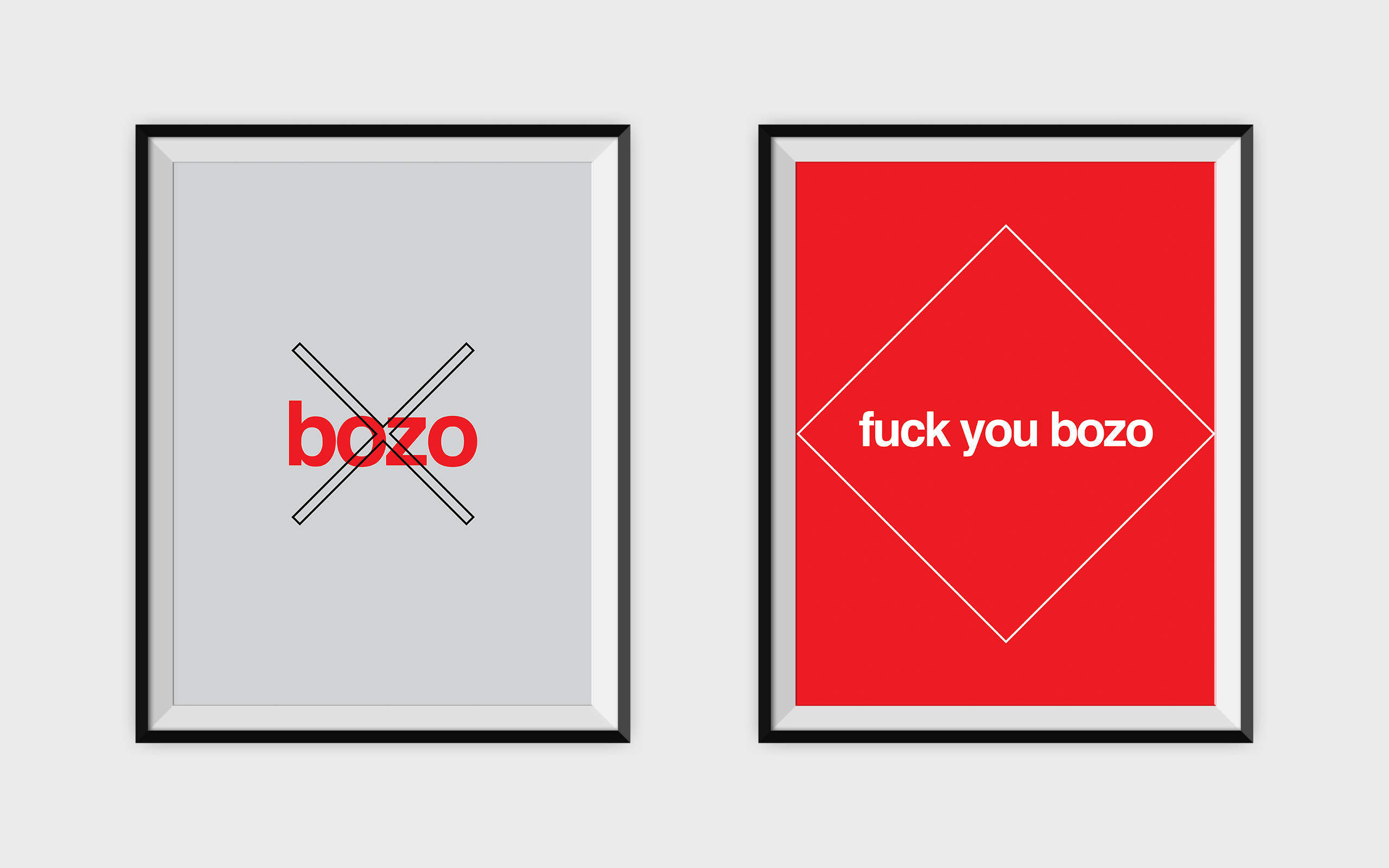
Some versions of the Bozo poster series
Some versions of the Bozo poster series
The Bozo Story
The Bozo Story
The Bozo Story
The bozo story: One evening Soma (our CEO) had returned from a business trip and he kept complaining to me about the futility of his trip owing to people he met who wasted his time. His outburst was very well timed with a recent article that he came upon Forbes called “Why Every Company Needs A ‘No Bozos’ Policy”.
The bozo story: One evening Soma (our CEO) had returned from a business trip and he kept complaining to me about the futility of his trip owing to people he met who wasted his time. His outburst was very well timed with a recent article that he came up on Forbes called “Why Every Company Needs A ‘No Bozos’ Policy”.
The bozo story: One evening Soma (our CEO) had returned from a business trip and he kept complaining to me about the futility of his trip owing to people he met who wasted his time. His outburst was very well timed with a recent article that he came up on Forbes called “Why Every Company Needs A ‘No Bozos’ Policy”.
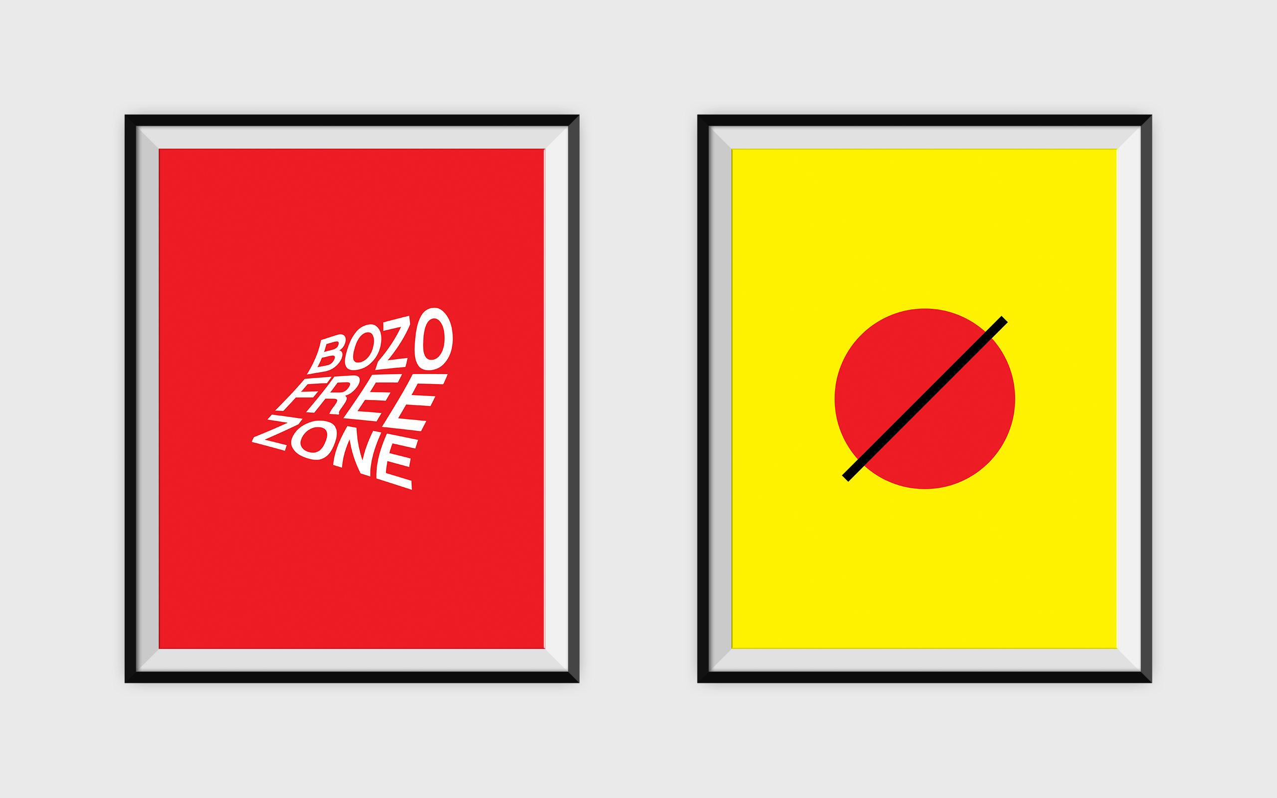
The ‘Bozo’ series was aimed not only to steer thinking internally, but it also was an attempt at keeping potential clients who walked into our offices to keep conversations to the point. It aimed to mock logo styles across various industries with the same “bozo free zone” message.
The ‘Bozo’ series was aimed not only to steer thinking internally, but it also was an attempt at keeping potential clients who walked in to our offices to keep conversations to the point. It aimed to mock logo styles across various industries with the same “bozo free zone” message.
The ‘Bozo’ series was aimed not only to steer thinking internally, but it also was an attempt at keeping potential clients who walked in to our offices to keep conversations to the point. It aimed to mock logo styles across various industries with the same “bozo free zone” message.
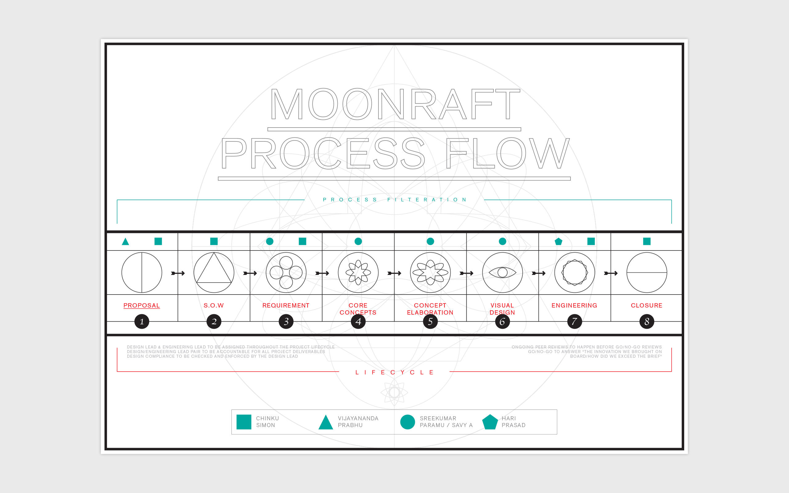
One of the many internal Moonraft process flow I designed (both the system and the poster)
|
2014
Focusing externally. Rebrand 1: becoming visible.
Focusing externally. Rebrand 1: becoming visible.
Focusing externally. Rebrand 1: becoming visible.
After the internally-focused efforts of the previous year, 2014 was geared towards the external brand positioning.
After the internally-focused efforts of the previous year, 2014 was geared towards the external brand positioning.
After the internally-focused efforts of the previous year, 2014 was geared towards the external brand positioning.
The first rebranding involved simplifying the logo and creating a brand system using colour palettes and patterns
This first rebranding exercise was aimed to make a stir. We didn’t have any qualms about being too loud or flashy: the challenge was to have something bold yet scalable. We were aiming to have the brand speak with ‘thinking’, along with a mix of classic elements of design using basic geometry and a mix of muted and vivid colours.
This first rebranding exercise was aimed to make a stir. We didn’t have any qualms about being too loud or flashy: the challenge was to have something bold yet scalable. We were aiming to have the brand speak with ‘thinking’, along with a mix of classic elements of design using basic geometry and a mix of muted and vivid colours.
This first rebranding exercise was aimed to make a stir. We didn’t have any qualms about being too loud or flashy: the challenge was to have something bold yet scalable. We were aiming to have the brand speak with ‘thinking’, along with a mix of classic elements of design using basic geometry and a mix of muted and vivid colours.

I did a complete overhaul in redesigning a new logo system. I nudged and fought to get rid of the monogram we had. Monograms have a place but if you design one with great consideration to what’s trending at that time, chances are that it wouldn’t trend too much after that time has passed. Which was the case for us. Monograms should also be simple, easy to register, scalable (in sizes big and small), extendable (work across mediums) and most definitely be able to be used in one single colour if required.
To me, it looked like it was hindering the image or even the possibility of an image that we could build upon. I firmly wanted to communicate the brand, not particularly with wanting a symbol, but rather by designing artefacts that represent the brand and create a system of overarching pattern that one could attribute to the brand. Branding isn’t about drilling down a logo into people’s head so that they never forget what your company logo looks like, branding is about communicating a system of beliefs by use of propagating a value system. That is eternally more powerful and has the capability to live through than a piece of monogram that represents a fraction of the company ethos.
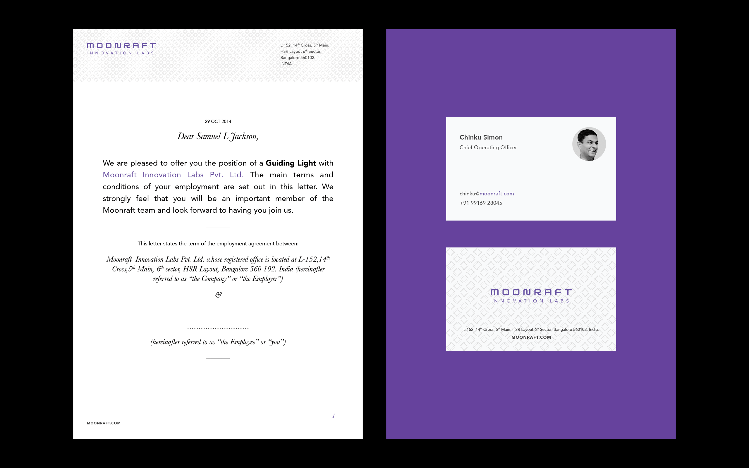
We put a lot of thought into everything we were going to put out there, including the business card on which we decided to have Rafters’ photos. The thought is that people usually have a business card lying with them for ages before they put it to use. If they see a photo of the person who gave them the card, there is an instant sense of familiarity and time doesn’t seem to have passed at all. Even in the latest avatar of the business card, this aspect has remained unchanged.
I did a complete overhaul in redesigning a new logo system. I nudged and fought to get rid of the monogram we had. Monograms have a place but if you design one with great consideration to what’s trending at that time, chances are that it wouldn’t trend too much after that time has passed. Which was the case for us. Monograms should also be simple, easy to register, scalable (in sizes big and small), extendable (work across mediums) and most definitely be able to be used in one single colour if required.
To me, it looked like it was hindering the image or even the possibility of an image that we could build upon. I firmly wanted to communicate the brand, not particularly with wanting a symbol, but rather by designing artefacts that represent the brand and create a system of overarching pattern that one could attribute to the brand. Branding isn’t about drilling down a logo into people’s head so that they never forget what your company logo looks like, branding is about communicating a system of beliefs by use of propagating a value system. That is eternally more powerful and has the capability to live through than a piece of monogram that represents a fraction of the company ethos.
We put a lot of thought into everything we were going to put out there, including the business card on which we decided to have Rafters’ photos. The thought is that people usually have a business card lying with them for ages before they put it to use. If they see a photo of the person who gave them the card, there is an instant sense of familiarity and time doesn’t seem to have passed at all. Even in the latest avatar of the business card, this aspect has remained unchanged.
An animated video I created entirely in Keynote to show the rebranding extended to the web
I designed a new website, using the vivid green in the medium that seemed fitting for it, in conjunction with the muted colours that were chosen for the print collaterals. I can’t begin explaining the importance of a website, but at the time we wanted to have one that was simple to use and straight forward, but conveying the obvious quality of our brand being spoken all across the website, paying due consideration to the tone of language for example.
I designed a new website, using the vivid green in the medium that seemed fitting for it, in conjunction with the muted colours that were chosen for the print collaterals. I can’t begin explaining the importance of a website, but at the time we wanted to have one that was simple to use and straight-forward but conveying the obvious quality of our brand being spoken all across the website, paying due consideration to the tone of language for example.
I designed a new website, using the vivid green in the medium that seemed fitting for it, in conjunction with the muted colours that were chosen for the print collaterals. I can’t begin explaining the importance of a website, but at the time we wanted to have one that was simple to use and straight-forward but conveying the obvious quality of our brand being spoken all across the website, paying due consideration to the tone of language for example.

Other collaterals I designed to create a branding pattern
The other important aspect of positioning Moonraft consistently and coherently was to bridge the internal and external branding strategy. Something as innocent looking as a t-shirt does that job. Internally it helps create and keep a tribe, it’s something if designed and printed well gets people to wear it with pride. Externally, a group of people when seen clothed similarly in awesomely branded clothing is scientifically proven to make things appear staggeringly better. Swag like tees, mugs, pencil holders and these days silver foils are all shown to work in some form of subvertising. It helped register a feeling if you were to see the same combination of colours again or a pattern used in a design or just if you read the name of the company.
The other important aspect of positioning Moonraft consistently and coherently was to bridge the internal and external branding strategy. Something as innocent looking as a t-shirt does that job. Internally it helps create and keep a tribe, it’s something that if designed and printed well gets people to wear it with pride. Externally, a group of people when seen clothed similarly in awesomely branded clothing is scientifically proven to make things appear staggeringly better. Swag like tees, mugs, pencil holders and these days silver foils are all shown to work in some form of subvertising. It helps to register a feeling if you were to see the same combination of colours again or a pattern used in a design or just if you read the name of the company.
The other important aspect of positioning Moonraft consistently and coherently was to bridge the internal and external branding strategy. Something as innocent looking as a t-shirt does that job. Internally it helps create and keep a tribe, it’s something that if designed and printed well gets people to wear it with pride. Externally, a group of people when seen clothed similarly in awesomely branded clothing is scientifically proven to make things appear staggeringly better. Swag like tees, mugs, pencil holders and these days silver foils are all shown to work in some form of subvertising. It helps to register a feeling if you were to see the same combination of colours again or a pattern used in a design or just if you read the name of the company.
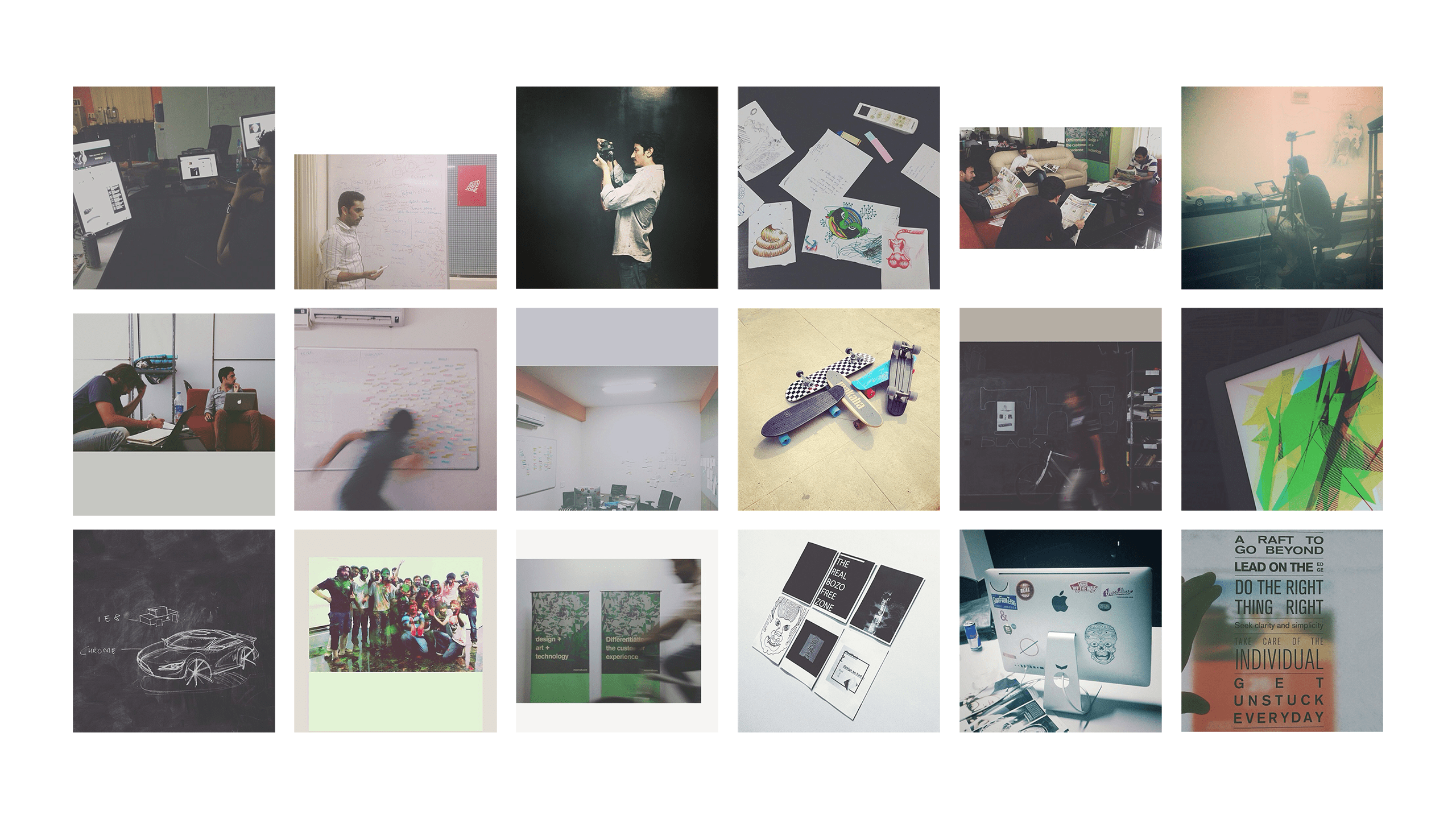
The #Moonraft instagram thingies
Photography is another great medium to leverage your brand image. Social feeds keep things more or less real time and help people identify with what’s happening in your offices, client locations or how long nights of work look like. I clicked for and maintained the Moonraft Instagram feed, at the bottom of the website, which kept the website staying fresh.
Photography is another great medium to leverage your brand image. Social feeds keep things more or less real time and help people identify with what’s happening in your offices, client locations or how long nights of work look like. I clicked for and maintained the Moonraft Instagram feed, at the bottom of the website, which kept the website staying fresh.
Photography is another great medium to leverage your brand image. Social feeds keep things more or less real time and help people identify with what’s happening in your offices, client locations or how long nights of work look like. I clicked for and maintained the Moonraft Instagram feed, at the bottom of the website, which kept the website staying fresh.
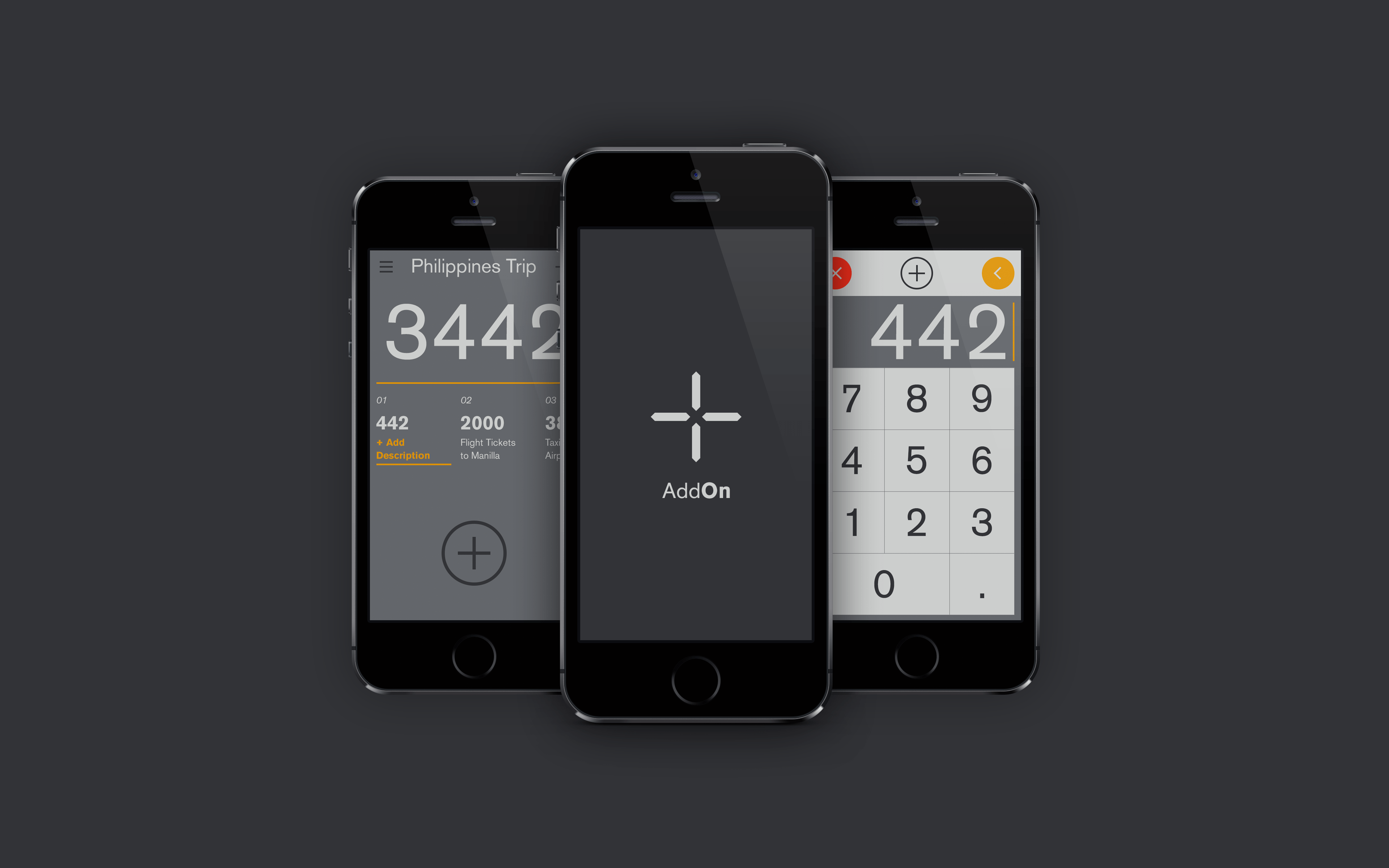
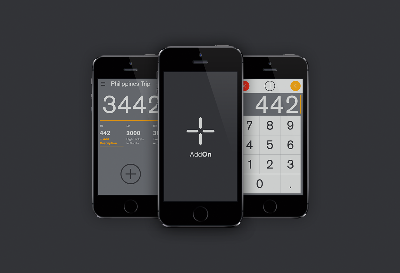
Add-On: one of the several internally designed apps at Moonraft
Side Projects: There are tons of reason why you should consider a side project to add to the perception of a brand, well, and therefore you should do it. We did a lot of side projects that year, all following a classic design aesthetics with a dash of colour that was carried on from the parent brand while consciously staying away from having splash screens that read ‘a Moonraft Product’. Add On was designed for our internal travel expenses filing system. The other internal products I designed included TruTime, Alicias-World, Blox (now Catamera) and Senseforth.
Side Projects: There are tons of reason why you should consider a side project to add to the perception of a brand, well, and therefore you should do it. We did a lot of side projects that year, all following a classic design aesthetics with a dash of colour that was carried on from the parent brand while consciously staying away from having splash screens that read ‘a Moonraft Product’. Add On was designed for our internal travel expenses filing system. The other internal products I designed included TruTime, Alicias-World, Blox (now Catamera) and Senseforth.
Side Projects: There are tons of reason why you should consider a side project to add to the perception of a brand, well, and therefore you should do it. We did a lot of side projects that year, all following a classic design aesthetics with a dash of colour that was carried on from the parent brand while consciously staying away from having splash screens that read ‘a Moonraft Product’. Add On was designed for our internal travel expenses filing system. The other internal products I designed included TruTime, Alicias-World, Blox (now Catamera) and Senseforth.
|
2015
Repositioning by Differentiating.
Repositioning by Differentiating.
Repositioning by Differentiating.
Branding by differentiating must be the oldest rule in the book, but it doesn’t mean there isn’t value in considering it’s application. Differentiating is what gets your brand its deserved attention. But differentiating without actually being different is just like celebrating Halloween on Christmas and no one showing up dressed like a nurse.
Branding by differentiating must be the oldest rule in the book, but it doesn’t mean there isn’t value in considering it’s application. Differentiating is what gets your brand its deserved attention. But differentiating without actually being different is just like celebrating Halloween on Christmas and no one showing up dressed like a nurse.
Branding by differentiating must be the oldest rule in the book, but it doesn’t mean there isn’t value in considering it’s application. Differentiating is what gets your brand its deserved attention. But differentiating without actually being different is just like celebrating Halloween on Christmas and no one showing up dressed like a nurse.
A further simplification of the logotype while maintaining the original aspects of the branding
The previous year’s strategy had done its job. Moonraft had grown rapidly in the client base and the number of people -around 110- who had come to be called Rafters. Through the years of work we had also come to be reckoned for something more premium than other players in the Indian market. There weren’t so many doing the kind of things we were doing and we were already beginning to have a premium player advantage.
The brand didn’t reflect this evolution in Moonraft and we needed to reposition again to be perceived as the company we wanted to and were fast coming to be. As well as competing internationally with direct bigwigs, all so much in with their green (literally and monetarily) cap on like Frog, Nurun, Razorfish, Adaptivepath and countless others were making us look like we were aspirational and filling the gap by an ‘aim to ape’ approach.
We clearly weren’t doing that and neither were interested in being perceived as doing so. The previous years branding strategy had worked, probably worked too well: mustn’t have been just the branding, but we did grow markedly fast and we needed to make the newer brand story a story of growth. I did a lot of study on colour theory and wild explorations on finding the right colour. I was aiming to have a one colour brand approach that could go very well with simple primary colours like blacks and whites to nicely stand out. We choose the purple. It also reflected our premium brand quality and also worked nicely on different mediums. There weren’t many companies in our industry that were using it either, which was satisfying and helped us be able to differentiate.
The previous year’s strategy had done its job. Moonraft had grown rapidly in the client base and the number of people -around 110- who had come to be called Rafters. Through the years of previous work, we had also come to be reckoned for something more premium than other players in the Indian market. There weren’t so many doing the kind of things we were doing and we were already beginning to have a premium player advantage.
The brand didn’t reflect this evolution in Moonraft and we needed to reposition again to be perceived as the company we wanted to and were fast coming to be. As well as competing internationally with direct bigwigs, all so much in with their green (literally and monetarily) cap on like Frog, Nurun, Razorfish, Adaptivepath and countless others were making us look like we were aspirational and filling the gap by an ‘aim to ape’ approach.
We clearly weren’t doing that and neither were interested in being perceived as doing so. The previous years branding strategy had worked, probably worked too well: mustn’t have been just the branding, but we did grow markedly fast and we needed to make the newer brand story a story of growth. I did a lot of study on colour theory and wild explorations on finding the right colour. I was aiming to have a one colour brand approach that could go very well with simple primary colours like blacks and whites to nicely stand out. We choose the purple. It also reflected our premium brand quality and also worked nicely on different mediums. There weren’t many companies in our industry that were using it either, which was satisfying and helped us be able to differentiate.
Brand stationery materials
Brand stationery materials
The original typeface though had managed to form a sense of identity that was going to be really difficult to replace, but somehow the tightness of the logotype was beginning to look inappropriate. The logotype was redesigned and we continued staying away from a monogram. The identity system continued to evolve with new sets of typography I designed and placed in conjunction with a minimal colour system. There were new sets of stationery I designed, keeping elements from the previous year design that had worked.
The original typeface though had managed to form a sense of identity that was going to be really difficult to replace, but somehow the tightness of the logotype was beginning to look inappropriate. The logotype was redesigned and we continued staying away from a monogram. The identity system continued to evolve with new sets of typography I designed and placed in conjunction with a minimal colour system. There were new sets of stationery I designed, keeping elements from the previous year design that had worked.
The original typeface though had managed to form a sense of identity that was going to be really difficult to replace, but somehow the tightness of the logotype was beginning to look inappropriate. The logotype was redesigned and we continued staying away from a monogram. The identity system continued to evolve with new sets of typography I designed and placed in conjunction with a minimal colour system. There were new sets of stationery I designed, keeping elements from the previous year design that had worked.

I redesigned the website. We still maintained the very usable approach and tried not to get carried away by purely wanting to design something radical for the sake of a redesign. Subtle micro-interactions along with a very organized way to navigate the website, across various devices (read upwards-responsive also: as opposed to the traditional only downward responsive websites) in a straightforward manner was the aim of the design.
I redesigned the website. We still maintained the very usable approach and tried not to get carried away by purely wanting to design something radical for the sake of a redesign. Subtle micro-interactions along with a very organized way to navigate the website, across various devices (read upwards-responsive also: as opposed to the traditional only downward responsive websites) in a straightforward manner was the aim of the design.
I redesigned the website. We still maintained the very usable approach and tried not to get carried away by purely wanting to design something radical for the sake of a redesign. Subtle micro-interactions along with a very organized way to navigate the website, across various devices (read upwards-responsive also: as opposed to the traditional only downward responsive websites) in a straightforward manner was the aim of the design.

A photoshoot of every single Rafter so we could use them on business cards and on the website
Bringing a homogeneous identity to the entire brand is very important. Many a time it’s great to limit the number of designers that can be involved in steps that form a brand story. I was lucky to be involved from the very beginning to all aspects about the Moonraft brand, which gave me a lot of flexibility and control aspects that I felt I could add on to. When we decided to make every Rafter’s photo part of the business card, it was important to me that I shoot each of them so that I could have a uniformity in the way the photos were shot along with the tone and the treatment.
Bringing a homogeneous identity to the entire brand is very important. Many a time it’s great to limit the number of designers that can be involved in steps that form a brand story. I was lucky to be involved from the very beginning to all aspects about the Moonraft brand, which gave me a lot of flexibility and control of aspects that I felt I could add on to. When we decided to make every Rafter’s photo part of the business card, it was important to me that I shoot each of them so that I could have a uniformity in the way the photos were shot along with the tone and the treatment.
Bringing a homogeneous identity to the entire brand is very important. Many a time it’s great to limit the number of designers that can be involved in steps that form a brand story. I was lucky to be involved from the very beginning to all aspects about the Moonraft brand, which gave me a lot of flexibility and control of aspects that I felt I could add on to. When we decided to make every Rafter’s photo part of the business card, it was important to me that I shoot each of them so that I could have a uniformity in the way the photos were shot along with the tone and the treatment.

As the branding evolves, the new collateral comes to take new forms and shapes to align with it. Having a fairly flexible branding system lets you be a lot more open to new ideas and puts restrictions on the story so the brand is likely to form organically. Many a time though for this to happen, the end control should be in few hands, which ensures the overall aesthetics remain unified. I’ve continued to design posters and cards for clients on several occasions all through to the latest form of the Moonraft brand.
As the branding evolves, the new collateral comes to take new forms and shapes to align with it. Having a fairly flexible branding system lets you be a lot more open to new ideas and puts lesser restrictions on the story so the brand is likely to form organically. Many a time though for this to happen, the end control should be in few hands, which ensures the overall aesthetics remain unified. I’ve continued to design posters and cards for clients on several occasions all through to the latest form of the Moonraft brand.
As the branding evolves, the new collateral comes to take new forms and shapes to align with it. Having a fairly flexible branding system lets you be a lot more open to new ideas and puts lesser restrictions on the story so the brand is likely to form organically. Many a time though for this to happen, the end control should be in few hands, which ensures the overall aesthetics remain unified. I’ve continued to design posters and cards for clients on several occasions all through to the latest form of the Moonraft brand.
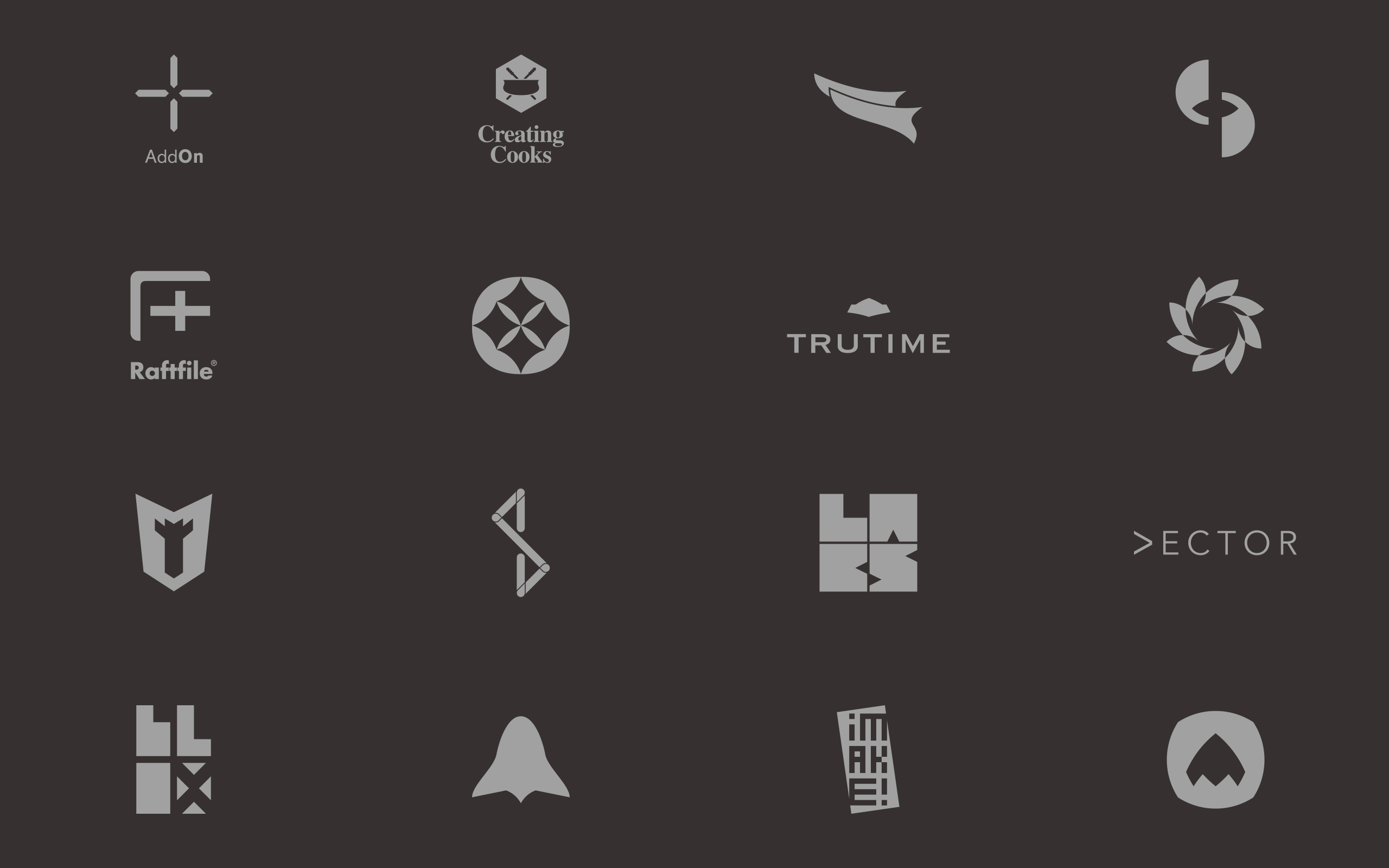
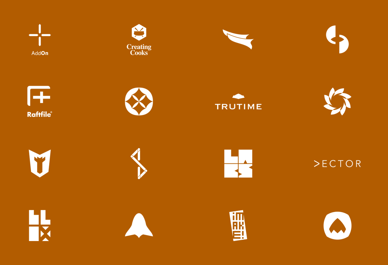
I’ve been fortunate to exercise what I feel is my birth right — to start with creating a logo — for every single internal project initiated with the company. It has given me plenty of opportunity to create and work on various logos for internal apps, products, tools and events.
I’ve been fortunate to exercise what I feel is my birth right — to start with creating a logo — for every single internal project initiated with the company. It has given me plenty of opportunities to create and work on various logos for internal apps, products, tools and events.
I’ve been fortunate to exercise what I feel is my birth right — to start with creating a logo — for every single internal project initiated with the company. It has given me plenty of opportunities to create and work on various logos for internal apps, products, tools and events.
|
2016
Going Beyond.
Going Beyond.
Going Beyond.
In the years since we first started making amendments to consciously position the brand, Moonraft has become a steadily growing design company. It’s 120+ people working in client locations all over the globe including all major cities in India, Sri Lanka, the US and South Africa in several domains such as banking, software, IT, healthcare, education, media, social enterprises etc. just to name a few.
Moonraft has made a big impact in shaping the design services game. It has been a pioneer in changing the perception of Indian design companies and it will continue to evolve and grow from what it has now become a well-revered brand name. Moonraft is now looked at as a premium design services company offering some of the best minds and talents to be ported into your next design project.
Thanks for reading. For more, obviously, check out moonraft.com
Footnote: A big thank you to Katy Jones, Meghan Zichelli, Kailash Nadh and Premshree Pillai for reading and re-reading and suggesting edits and improvements all along the way. Thanks to Blue Monkey for their poster frame freebie.
Footnote: A big thank you to Katy Jones, Meghan Zichelli, Kailash Nadh and Premshree Pillai for reading and re-reading and suggesting edits and improvements all along the way. Thanks to Blue Monkey for their poster frame freebie.
Footnote: A big thank you to Katy Jones, Meghan Zichelli, Kailash Nadh and Premshree Pillai for reading and re-reading and suggesting edits and improvements all along the way. Thanks to Blue Monkey for their poster frame freebie.
Other Projects

CAP table @ DealstackProduct Design
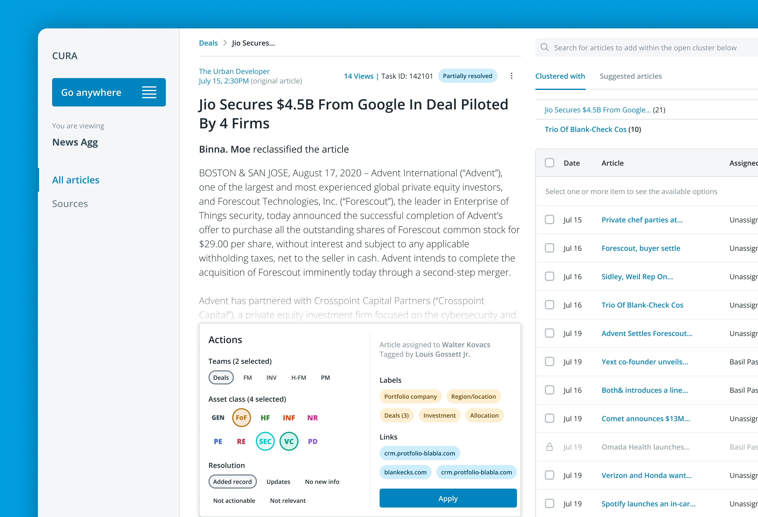
Redesigning a news aggregator tool @ PreqinProduct design
Various design works and thought leadership @ BeaconProduct Design & leadership

Document sharing workflow @ DealstackProduct Design

Tap Tap SignupUI + UX


Design systems design @ PreqinProduct Design


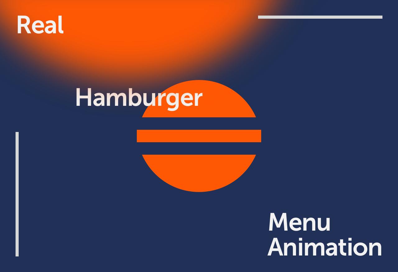
SurePeople Proper HamburgerUI + UX

2018 CalendarGraphic Design
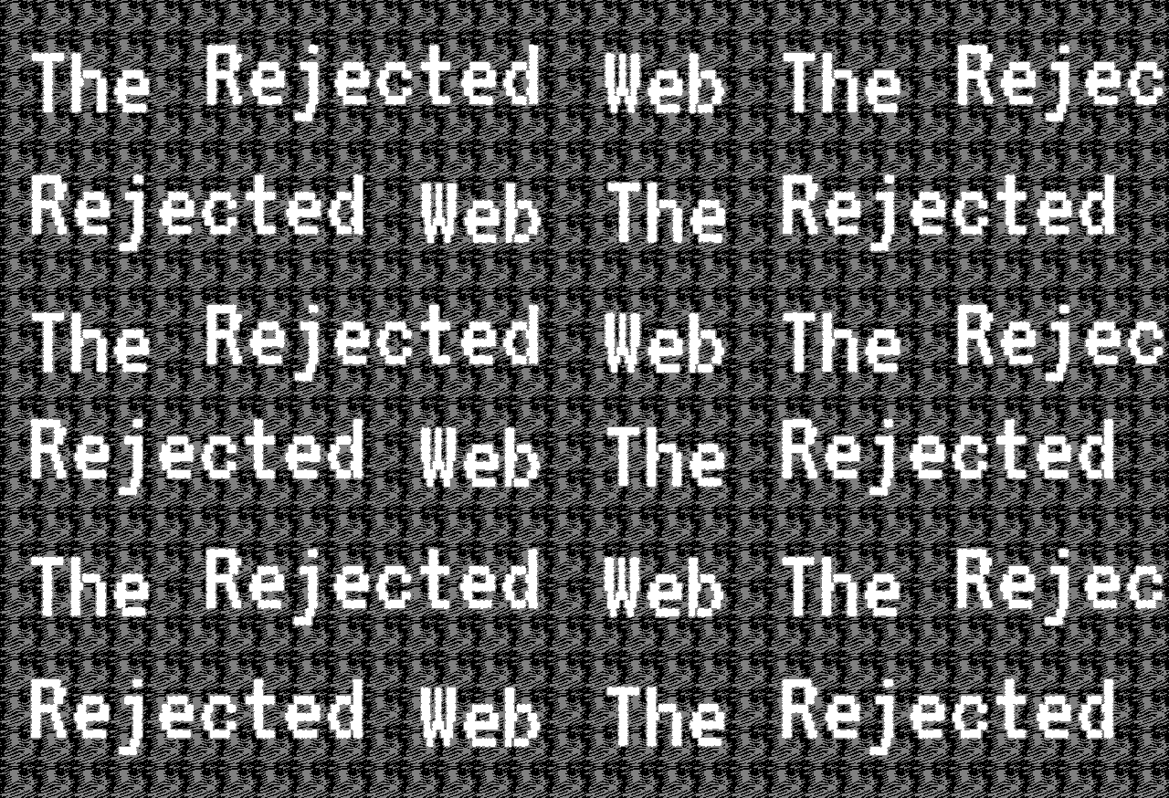
Rejected Web DesignsWeb Design
LogofolioGraphic Design
AddOn for numbersUI / UX
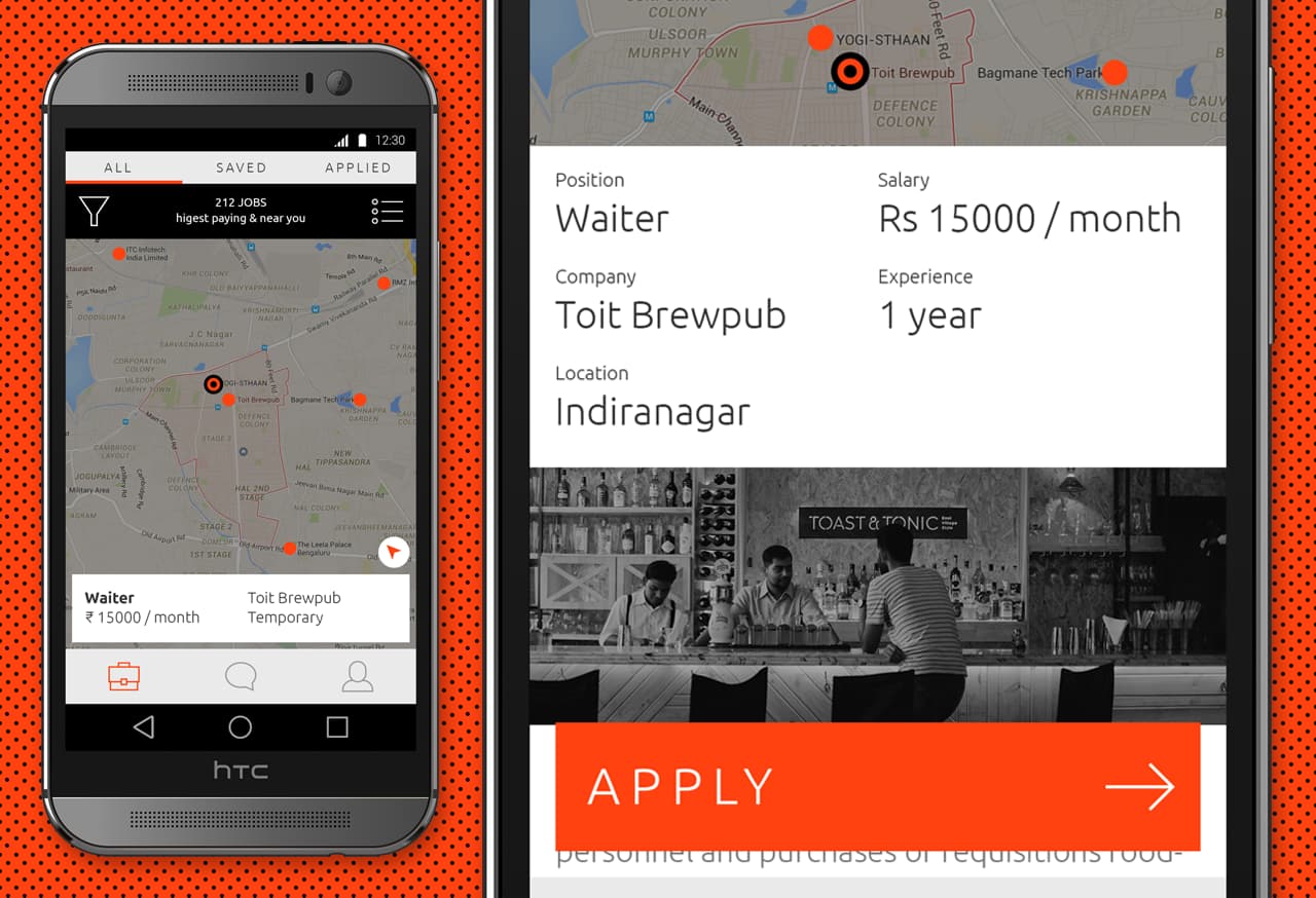
Designing an app for the grey collared job marketProduct Design

Pankaj & Priya wedding collateral designsGraphic Design
The MYLK propaganda designsGraphic Design

LogofolioGraphic Design