UX Experiments
Self initiated (2023)
SurePeople
2017
SurePeople
2017
Fastest signup process?
Real Hamburger Menu Animation
Real Hamburger Menu Animation
Good design is frictionless. In using a new product that needs a signup (on the phone), I've often been put off by the lengthy experience. So I wondered if there was a simpler way to go about it and so I came up with 'tap-tap' signup - because it (could) only takes 2 clicks (or taps)
At SurePeople I engage as a product designer working closely at fine-tuning our existing range of offering in our enterprise product suite and at other times at extending into new product line.
At SurePeople I engage as a product designer working closely at fine-tuning our existing range of offering in our enterprise product suite and at other times at extending into new product line.
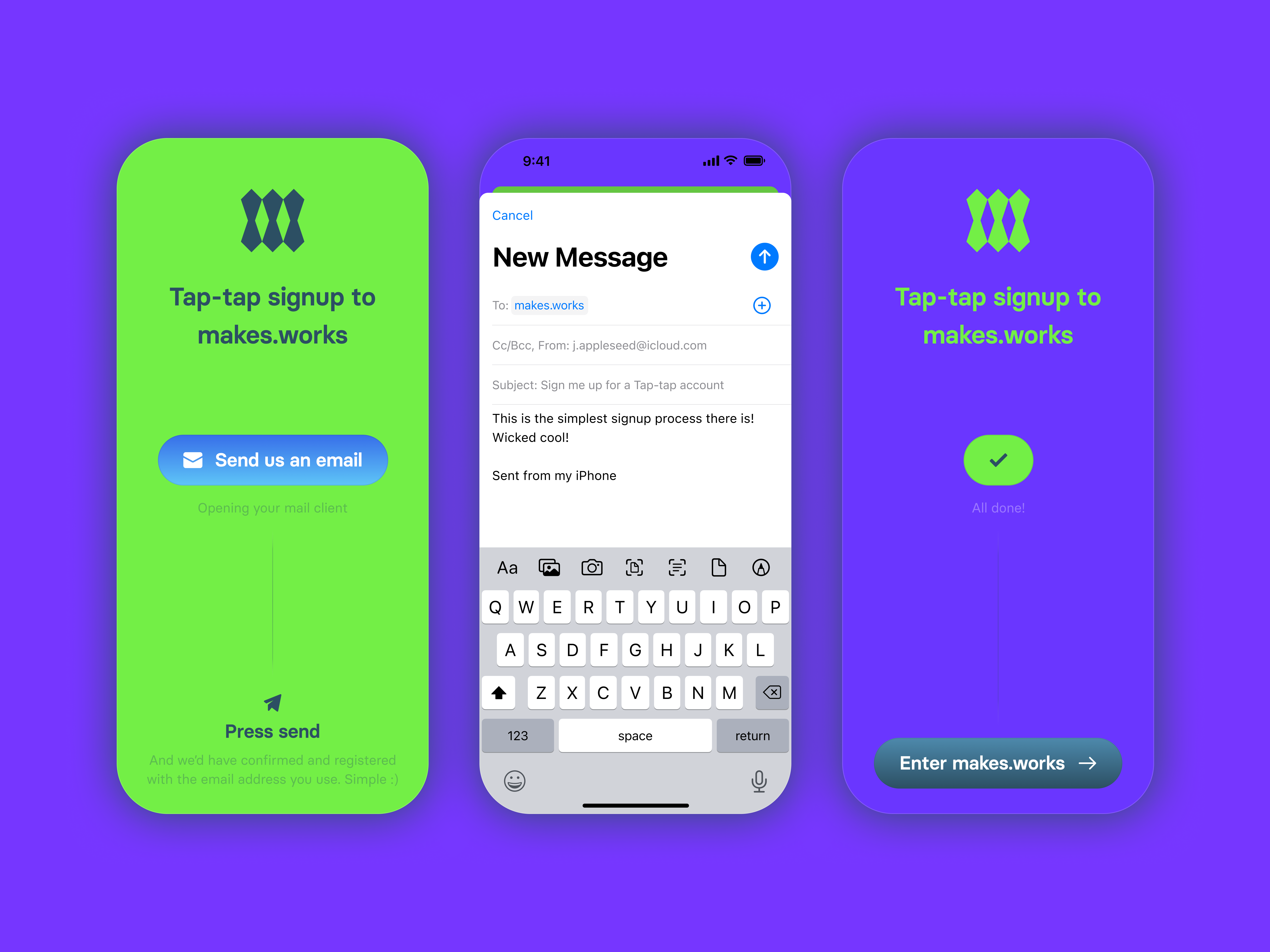
A Figma Prototype to show how it could work (click to proceed in the proto)
The roadmap has an app that we have down the line. So I visualised some early app ideas and had some fun with Flinto to create a squishy burger menu animation.
The roadmap has an app that we have down the line. So I visualised some early app ideas and had some fun with Flinto to create a squishy burger menu animation.
Other Projects

CAP table @ DealstackProduct Design
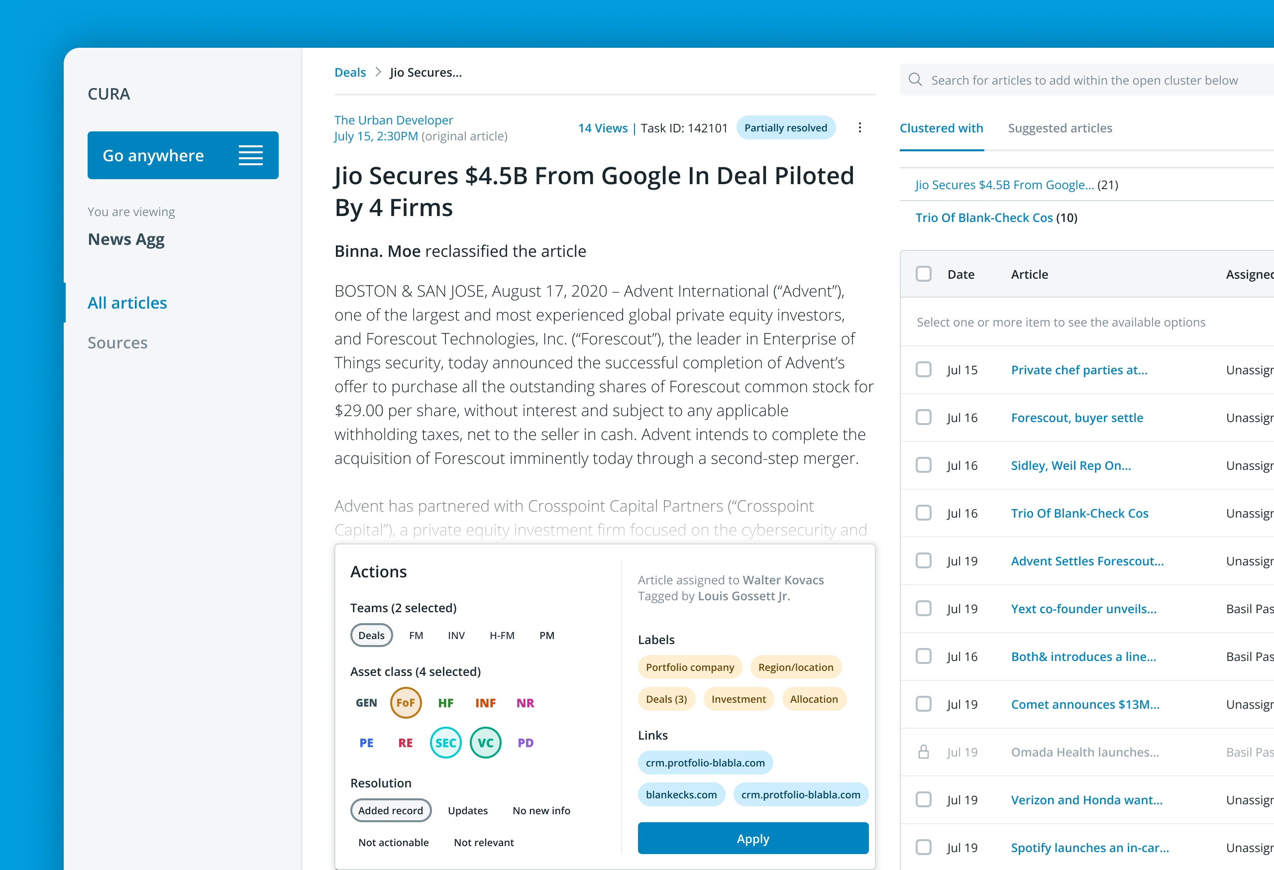
Redesigning a news aggregator tool @ PreqinProduct design
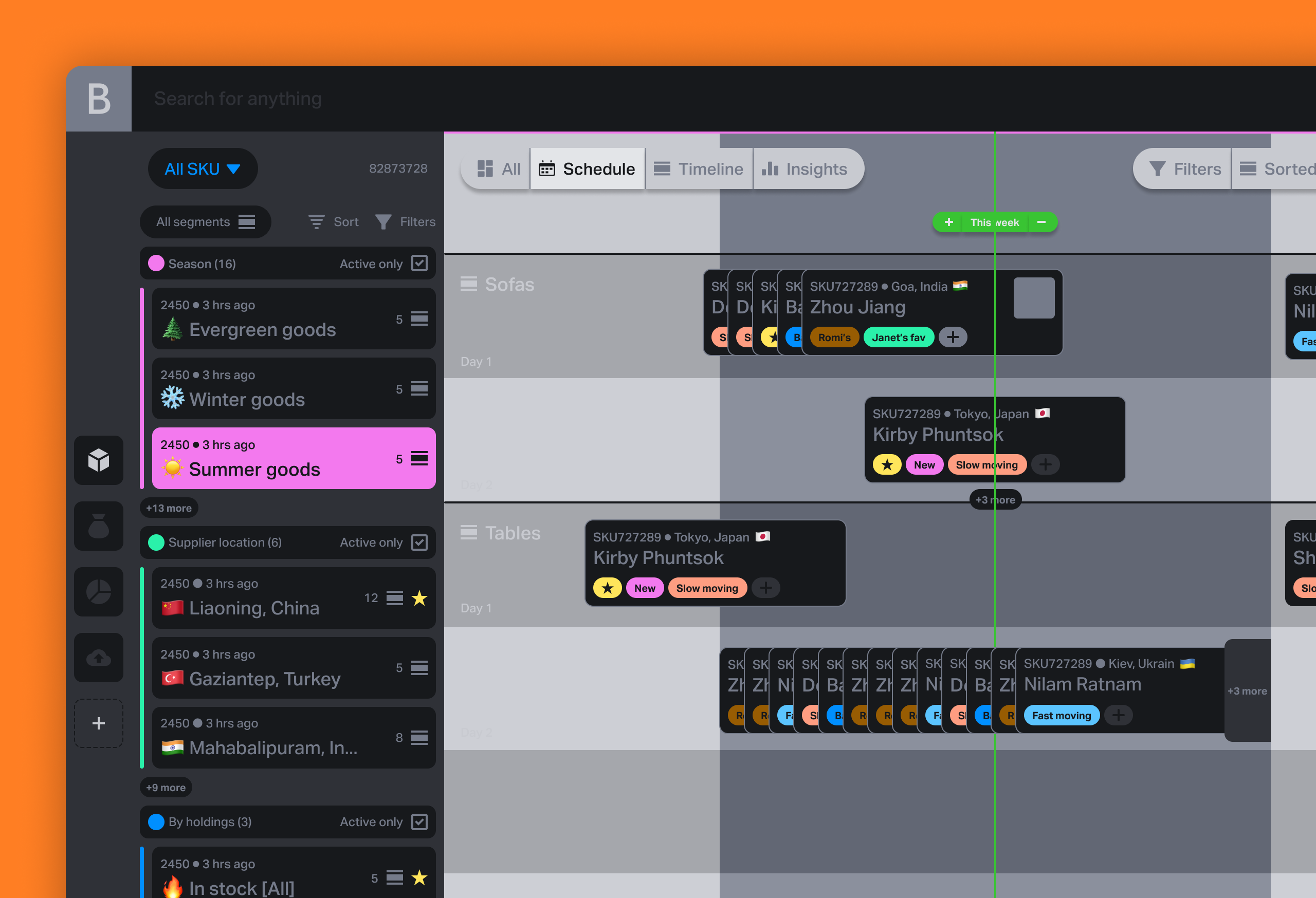
Various design works and thought leadership @ BeaconProduct Design & leadership

Document sharing workflow @ DealstackProduct Design

Design systems design @ PreqinProduct Design

Repositioning by rebranding: the Moonraft brand storyProduct Design
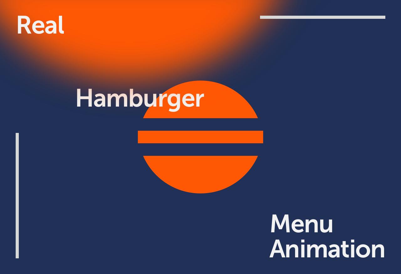
SurePeople Proper HamburgerUI + UX
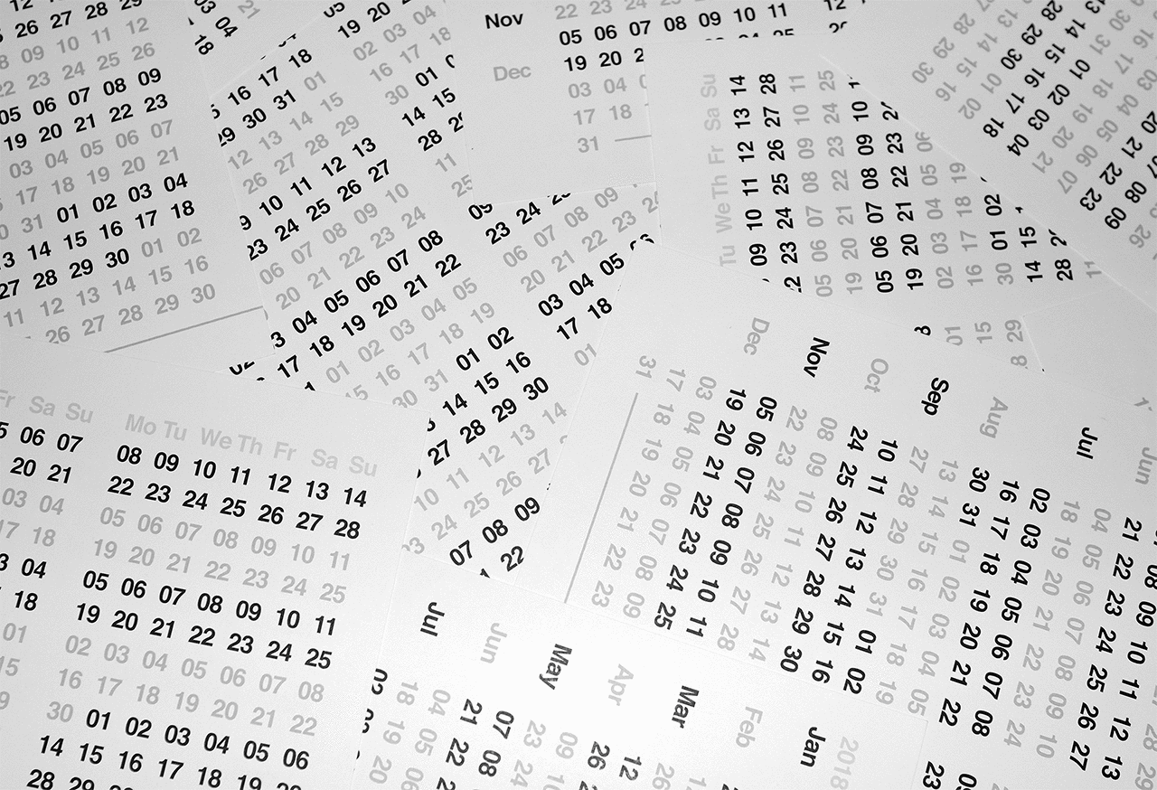
2018 CalendarGraphic Design
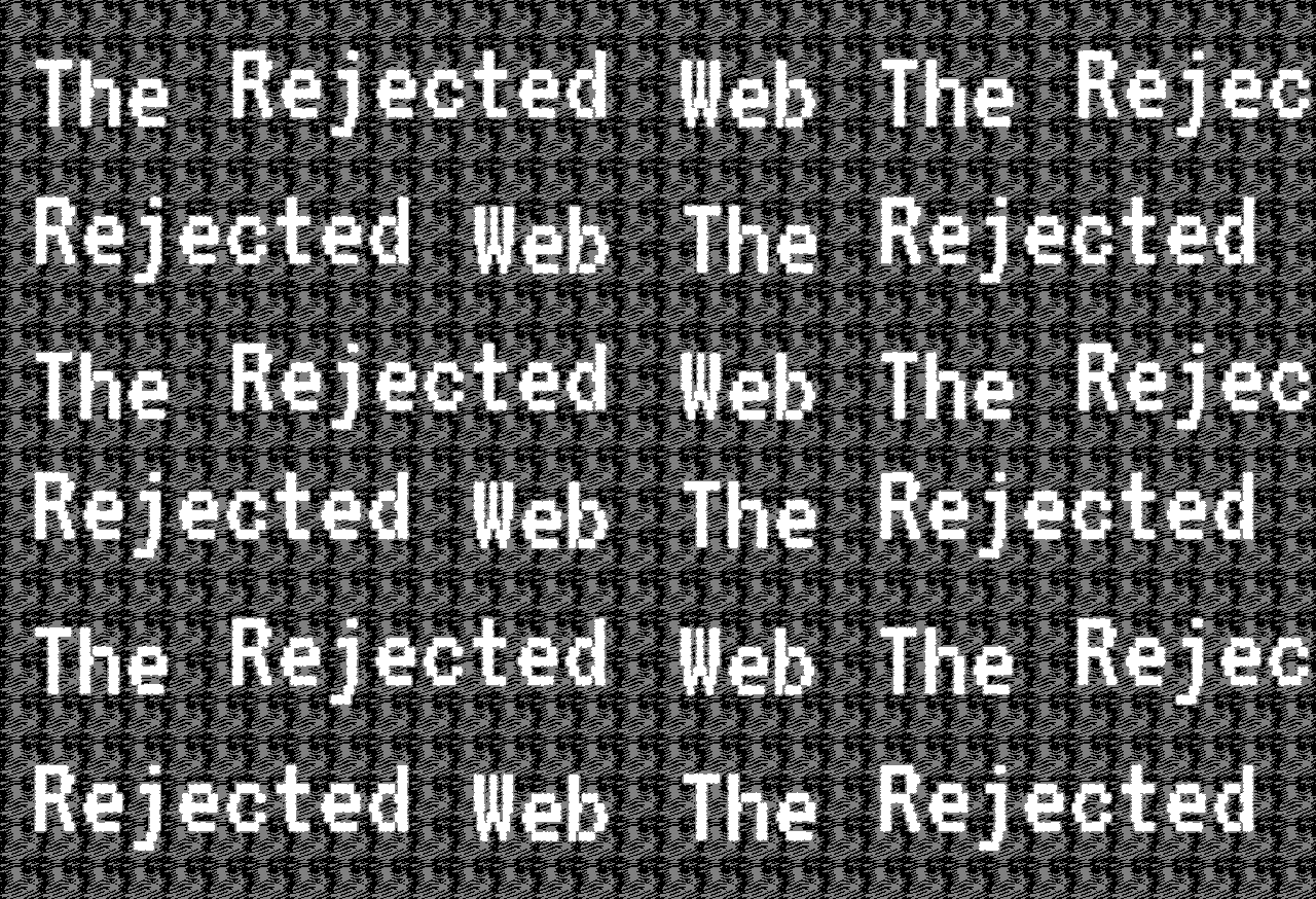
Rejected Web DesignsWeb Design
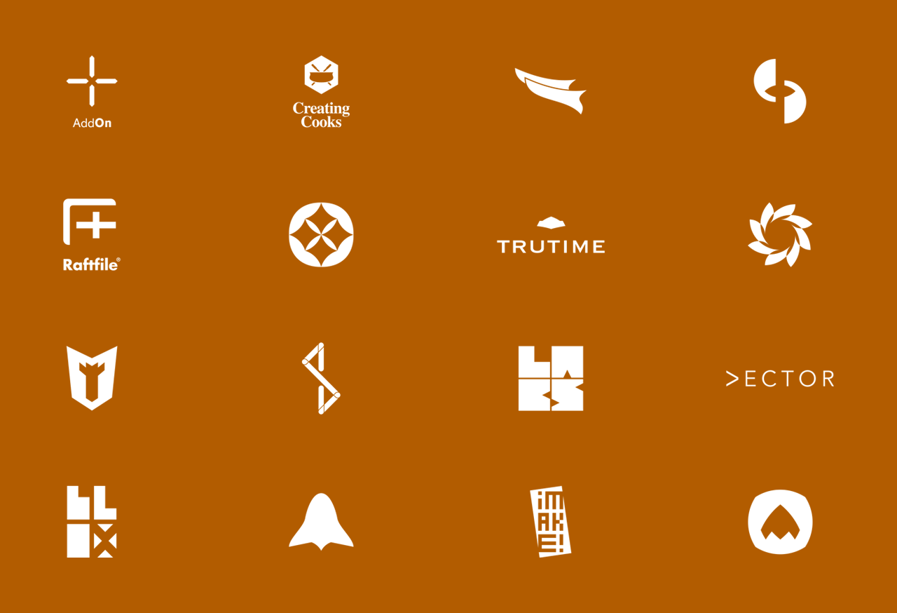
LogofolioGraphic Design
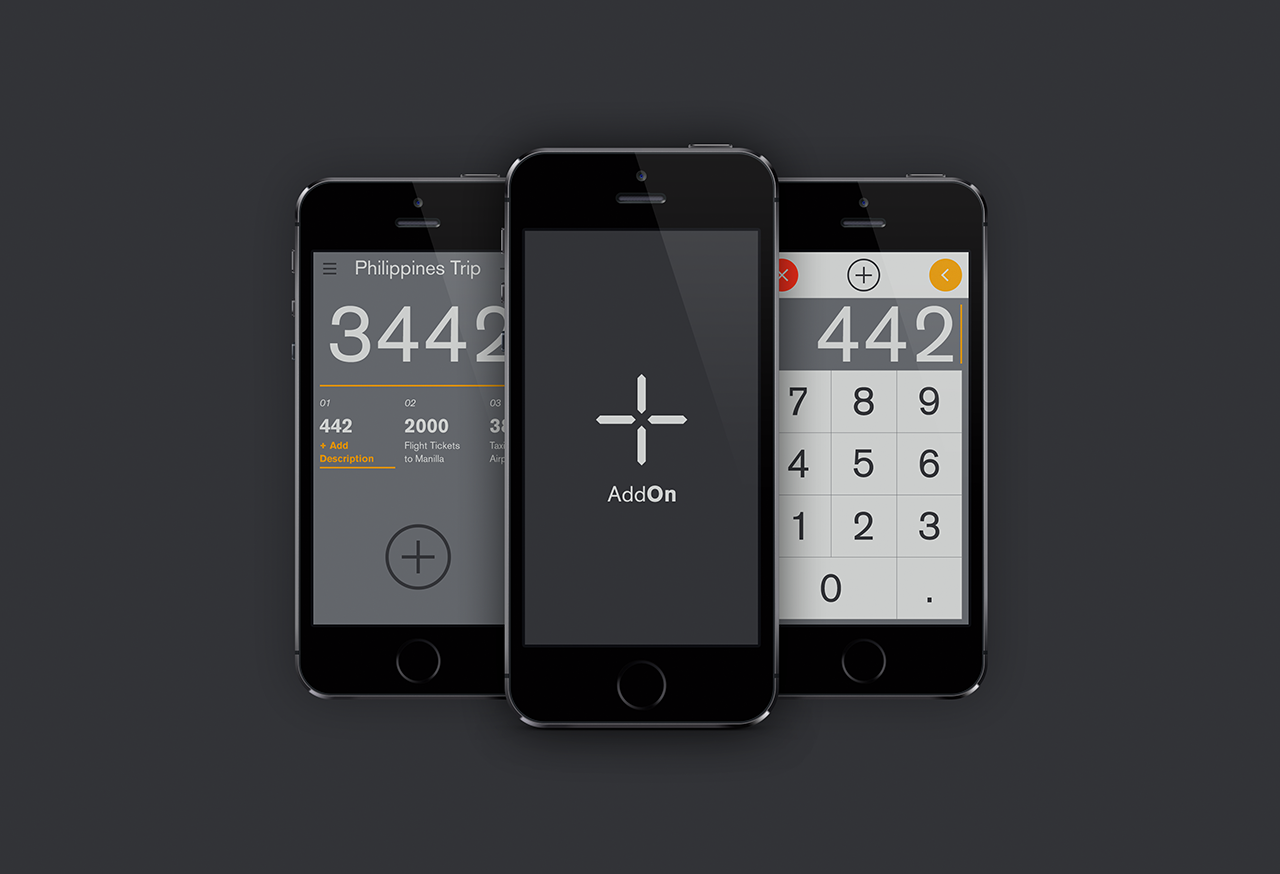
AddOn for numbersUI / UX
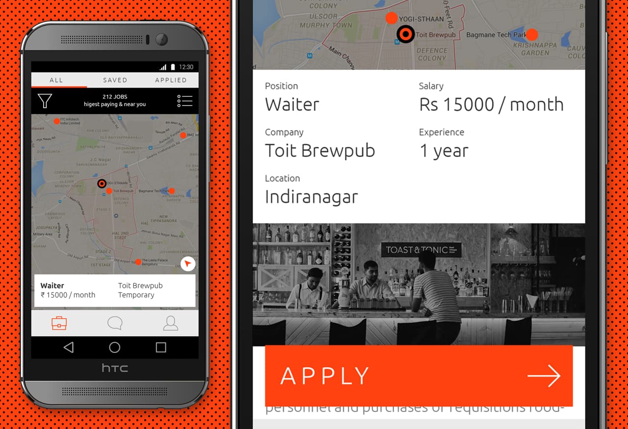
Designing an app for the grey collared job marketProduct Design

Pankaj & Priya wedding collateral designsGraphic Design

The MYLK propaganda designsGraphic Design

LogofolioGraphic Design


